\n
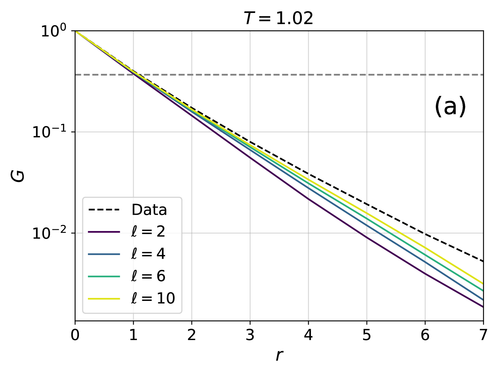
## Semi-Log Line Plot: Correlation Function G(r) for T = 1.02
### Overview
The image is a scientific line graph presented on a semi-logarithmic scale (logarithmic y-axis, linear x-axis). It displays the decay of a quantity labeled "G" as a function of a variable "r". The plot compares a "Data" series (likely experimental or simulation results) against four theoretical or model curves parameterized by a variable "ℓ". The title "T = 1.02" suggests the data corresponds to a specific temperature or time parameter. The label "(a)" in the top-right corner indicates this is likely panel (a) of a multi-part figure.
### Components/Axes
* **Title:** `T = 1.02` (centered at the top).
* **Panel Label:** `(a)` (located in the top-right corner of the plot area).
* **Y-Axis:**
* **Label:** `G` (positioned vertically to the left of the axis).
* **Scale:** Logarithmic (base 10).
* **Major Ticks/Labels:** `10^0` (top), `10^-1`, `10^-2` (bottom).
* **X-Axis:**
* **Label:** `r` (positioned horizontally below the axis).
* **Scale:** Linear.
* **Major Ticks/Labels:** `0`, `1`, `2`, `3`, `4`, `5`, `6`, `7`.
* **Legend:** Located in the bottom-left quadrant of the plot area. It contains five entries:
1. `--- Data` (black dashed line)
2. `— ℓ = 2` (solid purple line)
3. `— ℓ = 4` (solid blue line)
4. `— ℓ = 6` (solid green/teal line)
5. `— ℓ = 10` (solid yellow line)
* **Reference Line:** A horizontal, gray, dashed line is present at approximately `G ≈ 0.3` (or `3 x 10^-1`), spanning the full width of the plot.
### Detailed Analysis
**Trend Verification:** All five data series exhibit a monotonic, approximately exponential decay (appearing as straight lines on this semi-log plot) as `r` increases from 0 to 7. The lines do not cross within the plotted range.
**Data Series & Approximate Values:**
1. **Data (Black Dashed Line):**
* **Trend:** Decays the slowest among all series.
* **Key Points:** Starts at `G(0) ≈ 1.0`. At `r = 7`, `G ≈ 0.005` (or `5 x 10^-3`).
2. **ℓ = 2 (Purple Solid Line):**
* **Trend:** Decays the fastest.
* **Key Points:** Starts at `G(0) ≈ 1.0`. At `r = 7`, `G ≈ 0.001` (or `1 x 10^-3`).
3. **ℓ = 4 (Blue Solid Line):**
* **Trend:** Decays slower than ℓ=2 but faster than ℓ=6.
* **Key Points:** Starts at `G(0) ≈ 1.0`. At `r = 7`, `G ≈ 0.002` (or `2 x 10^-3`).
4. **ℓ = 6 (Green/Teal Solid Line):**
* **Trend:** Decays slower than ℓ=4 but faster than ℓ=10.
* **Key Points:** Starts at `G(0) ≈ 1.0`. At `r = 7`, `G ≈ 0.003` (or `3 x 10^-3`).
5. **ℓ = 10 (Yellow Solid Line):**
* **Trend:** Decays the slowest among the model curves (ℓ series), and is closest to the "Data" line.
* **Key Points:** Starts at `G(0) ≈ 1.0`. At `r = 7`, `G ≈ 0.004` (or `4 x 10^-3`).
**Spatial Relationships:** The model curves are ordered from fastest to slowest decay (bottom to top on the right side of the plot) as ℓ increases: ℓ=2 (lowest), ℓ=4, ℓ=6, ℓ=10 (highest). The "Data" line lies above all model curves for `r > 0`, indicating the models consistently underestimate the value of `G` at a given `r` compared to the data.
### Key Observations
1. **Systematic Model Convergence:** As the parameter ℓ increases from 2 to 10, the model curves progressively approach the "Data" curve from below. The ℓ=10 curve provides the closest match to the data across the entire range of `r`.
2. **Exponential Decay:** The linearity of all curves on the semi-log plot confirms that `G(r)` decays exponentially with `r` for both the data and the models.
3. **Common Origin:** All curves originate from the same point `(r=0, G=1)`, suggesting a normalization condition where `G(0) = 1`.
4. **Reference Threshold:** The horizontal dashed line at `G ≈ 0.3` may represent a significant threshold, such as a correlation length definition (e.g., where `G(r)` falls to `1/e ≈ 0.368` or another characteristic value).
### Interpretation
This plot demonstrates the comparison between empirical data ("Data") and a family of theoretical models for a decaying correlation function `G(r)`. The parameter `ℓ` likely represents a multipole order, a mode index, or a similar discrete parameter in the model.
The key finding is that **higher values of ℓ yield a better fit to the data**. The model with ℓ=10 most accurately reproduces the observed decay rate, while lower ℓ values (2, 4, 6) decay too rapidly. This suggests that the physical process generating the data has significant contributions from higher-order modes or moments (higher ℓ), which are necessary to capture the long-range correlations (slower decay) present in the system at `T = 1.02`.
The consistent underestimation by all models (curves below data) might indicate either:
* An incomplete model missing additional physics that sustains correlations at larger `r`.
* That the true best-fit ℓ is greater than 10.
* A systematic offset or different normalization in the model calculation.
The horizontal reference line provides a visual benchmark. For instance, the "Data" curve crosses this line at `r ≈ 1.2`, while the ℓ=10 curve crosses it at `r ≈ 1.0`, and the ℓ=2 curve crosses it at `r ≈ 0.7`. This quantifies how the predicted "correlation length" (if that's what the line represents) varies with ℓ and how it compares to the data.