## Line Chart: Correlation Function vs. Distance
### Overview
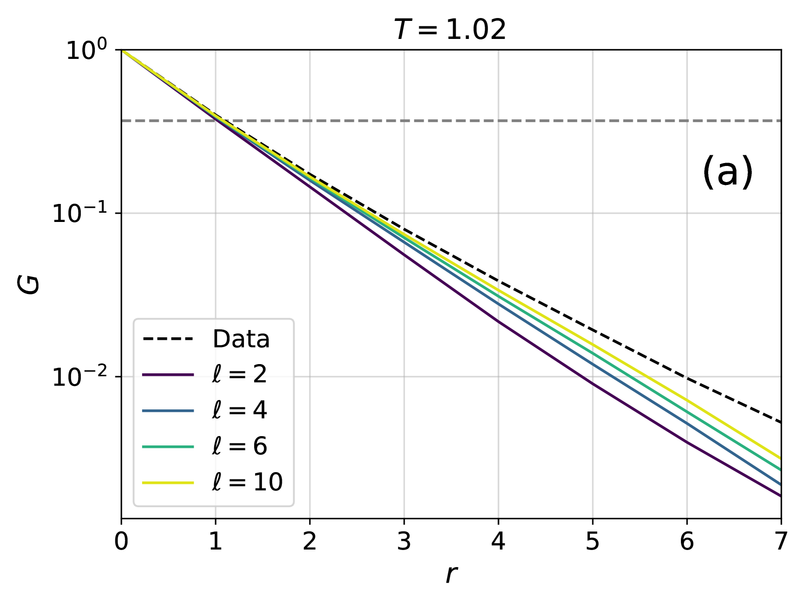
The image is a line chart displaying the correlation function (G) as a function of distance (r) for different values of a parameter 'l' at a fixed temperature T = 1.02. The chart includes a "Data" series represented by a dashed line, and four other series for l = 2, 4, 6, and 10. All series show a decreasing trend as the distance 'r' increases.
### Components/Axes
* **Title:** T = 1.02
* **X-axis:** r (distance), with tick marks at 0, 1, 2, 3, 4, 5, 6, and 7.
* **Y-axis:** G (correlation function), with a logarithmic scale. Tick marks are at 10<sup>0</sup>, 10<sup>-1</sup>, and 10<sup>-2</sup>.
* **Legend:** Located in the bottom-left corner.
* Data (black dashed line)
* l = 2 (purple line)
* l = 4 (dark blue line)
* l = 6 (green line)
* l = 10 (yellow line)
* **Annotation:** "(a)" in the top-right corner.
* A horizontal dashed line is present at approximately G = 0.3.
### Detailed Analysis
* **Data (Black Dashed Line):** Starts at G = 1.0 at r = 0 and decreases to approximately G = 0.005 at r = 7.
* **l = 2 (Purple Line):** Starts at G = 1.0 at r = 0 and decreases to approximately G = 0.002 at r = 7.
* **l = 4 (Dark Blue Line):** Starts at G = 1.0 at r = 0 and decreases to approximately G = 0.003 at r = 7.
* **l = 6 (Green Line):** Starts at G = 1.0 at r = 0 and decreases to approximately G = 0.004 at r = 7.
* **l = 10 (Yellow Line):** Starts at G = 1.0 at r = 0 and decreases to approximately G = 0.005 at r = 7.
The lines for different values of 'l' are very close to each other, especially at smaller values of 'r'. As 'r' increases, the lines diverge slightly, with the line for l = 2 being the lowest and the line for l = 10 being the highest.
### Key Observations
* All correlation functions decrease as the distance 'r' increases.
* The "Data" series (dashed line) is consistently above the other lines, indicating a slightly higher correlation function value for a given 'r'.
* The correlation functions for different 'l' values are very similar, suggesting that 'l' has a relatively small effect on the correlation function at this temperature (T = 1.02).
* The horizontal dashed line at G = 0.3 might represent a threshold or a reference value.
### Interpretation
The chart illustrates the decay of correlation as distance increases for a system at a specific temperature (T = 1.02). The different lines represent the correlation function for different values of a parameter 'l'. The fact that the lines are close together suggests that the parameter 'l' has a limited influence on the correlation function at this temperature. The "Data" series likely represents experimental or simulation data, which is being compared to theoretical predictions for different 'l' values. The horizontal line at G = 0.3 could be a critical value or a point of interest for the analysis. The overall trend indicates that correlations diminish rapidly with increasing distance, as expected in many physical systems.