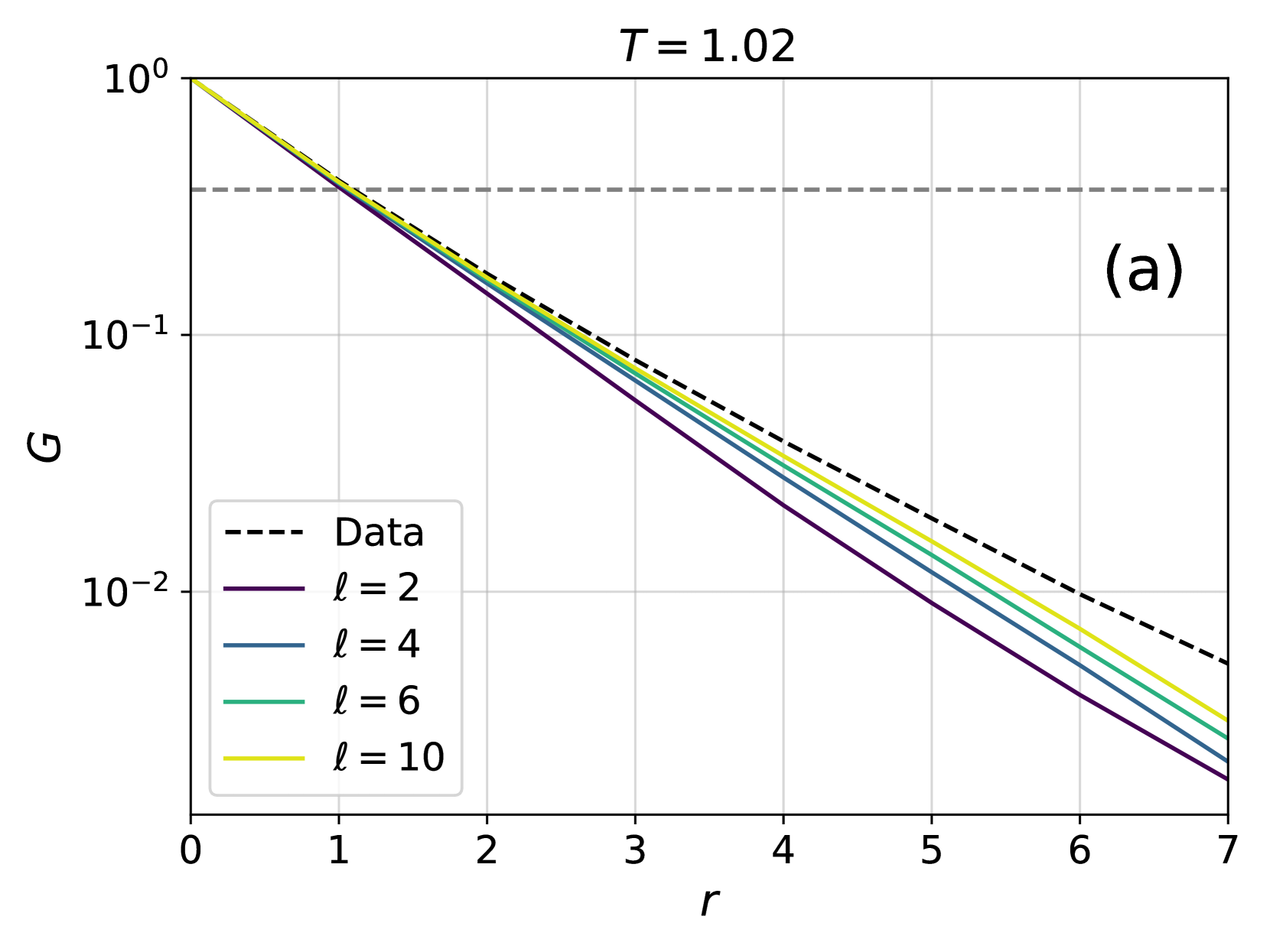
## Line Graph: G vs. r at T = 1.02
### Overview
The image is a logarithmic line graph plotting the variable **G** (y-axis, logarithmic scale from 10⁻² to 10⁰) against **r** (x-axis, linear scale from 0 to 7). The graph includes five data series: a dashed black line labeled "Data" and four solid-colored lines labeled with integer values of **l** (2, 4, 6, 10). All lines originate at **G = 10⁰** when **r = 0** and decline as **r** increases.
### Components/Axes
- **Y-axis (G)**: Logarithmic scale with ticks at 10⁻², 10⁻¹, and 10⁰.
- **X-axis (r)**: Linear scale from 0 to 7.
- **Legend**: Located in the bottom-left corner, with:
- Dashed black line: "Data"
- Solid purple line: **l = 2**
- Solid blue line: **l = 4**
- Solid green line: **l = 6**
- Solid yellow line: **l = 10**
- **Title**: "T = 1.02" at the top center.
### Detailed Analysis
1. **Data Line (Dashed Black)**:
- Starts at **G = 10⁰** (r = 0) and declines steeply, crossing **G = 10⁻¹** at **r ≈ 3.5** and **G = 10⁻²** at **r ≈ 6.5**.
- Remains the uppermost line across all **r** values.
2. **l = 10 (Yellow)**:
- Starts at **G = 10⁰** (r = 0) and declines gradually, crossing **G = 10⁻¹** at **r ≈ 4.5** and **G = 10⁻²** at **r ≈ 6.8**.
- Parallel to the Data line but less steep.
3. **l = 6 (Green)**:
- Starts at **G = 10⁰** (r = 0) and declines moderately, crossing **G = 10⁻¹** at **r ≈ 5** and **G = 10⁻²** at **r ≈ 6.5**.
- Less steep than l = 10.
4. **l = 4 (Blue)**:
- Starts at **G = 10⁰** (r = 0) and declines slowly, crossing **G = 10⁻¹** at **r ≈ 5.5** and **G = 10⁻²** at **r ≈ 6.7**.
- Least steep among the solid lines.
5. **l = 2 (Purple)**:
- Starts at **G = 10⁰** (r = 0) and declines very gradually, crossing **G = 10⁻¹** at **r ≈ 6** and **G = 10⁻²** at **r ≈ 6.9**.
- Flattest slope among all lines.
### Key Observations
- All lines converge near **G = 10⁻²** as **r** approaches 7, but none reach it within the plotted range.
- Higher **l** values correspond to slower declines in **G** (e.g., l = 10 declines slower than l = 2).
- The "Data" line (dashed black) dominates the upper region, suggesting it represents a baseline or reference trend.
### Interpretation
The graph demonstrates an inverse relationship between **G** and **r**, with **G** decreasing exponentially as **r** increases. The parameter **l** modulates the rate of decline: larger **l** values result in slower decay of **G**. The "Data" line likely represents empirical or theoretical observations, while the colored lines may correspond to modeled scenarios with varying **l** parameters. The logarithmic y-axis emphasizes multiplicative changes in **G**, highlighting sensitivity to **r** and **l**. The value **T = 1.02** (possibly a temperature or system parameter) suggests the data is context-dependent, requiring domain-specific interpretation.
**Note**: No textual information in the image is in a language other than English.