\n
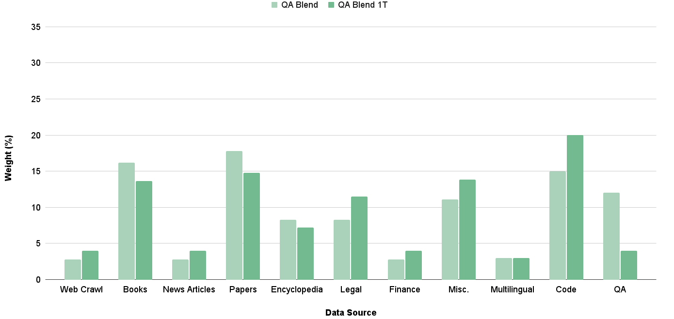
## Bar Chart: Data Source Weight Distribution
### Overview
This is a bar chart illustrating the weight (expressed as a percentage) of two data blends – "QA Blend" and "QA Blend 1T" – across various data sources. The x-axis represents the data source, and the y-axis represents the weight in percentage. Each data source has two bars representing the weight of each blend.
### Components/Axes
* **X-axis Title:** Data Source
* **Y-axis Title:** Weight (%)
* **Y-axis Scale:** 0 to 35, with increments of 5.
* **Legend:** Located at the top-right of the chart.
* QA Blend (Dark Green)
* QA Blend 1T (Light Green)
* **Data Sources (X-axis labels):** Web Crawl, Books, News Articles, Papers, Encyclopedia, Legal, Finance, Misc., Multilingual, Code, QA.
### Detailed Analysis
The chart consists of paired bars for each data source, representing the weight of "QA Blend" and "QA Blend 1T".
* **Web Crawl:** QA Blend ≈ 2%, QA Blend 1T ≈ 1%
* **Books:** QA Blend ≈ 16%, QA Blend 1T ≈ 13%
* **News Articles:** QA Blend ≈ 17%, QA Blend 1T ≈ 4%
* **Papers:** QA Blend ≈ 16%, QA Blend 1T ≈ 6%
* **Encyclopedia:** QA Blend ≈ 8%, QA Blend 1T ≈ 5%
* **Legal:** QA Blend ≈ 10%, QA Blend 1T ≈ 8%
* **Finance:** QA Blend ≈ 3%, QA Blend 1T ≈ 2%
* **Misc.:** QA Blend ≈ 11%, QA Blend 1T ≈ 10%
* **Multilingual:** QA Blend ≈ 3%, QA Blend 1T ≈ 2%
* **Code:** QA Blend ≈ 20%, QA Blend 1T ≈ 18%
* **QA:** QA Blend ≈ 11%, QA Blend 1T ≈ 5%
**Trends:**
* For most data sources, "QA Blend" generally has a higher weight than "QA Blend 1T".
* The largest difference in weight between the two blends is observed in "News Articles", where "QA Blend" is significantly higher.
* "Code" has the highest weight for both blends, with "QA Blend" reaching approximately 20%.
* "Finance" and "Multilingual" have the lowest weights for both blends, both below 3%.
### Key Observations
* "Code" is the most significant contributor to both QA blends.
* "News Articles" show a strong bias towards "QA Blend" over "QA Blend 1T".
* "Finance" and "Multilingual" contribute very little to either blend.
* The weights for "QA Blend 1T" are consistently lower than those for "QA Blend" across most data sources.
### Interpretation
The chart suggests that the "QA Blend" is more heavily influenced by sources like "Code" and "News Articles", while "QA Blend 1T" has a more even distribution across sources, though generally at lower weights. The significant difference in weight for "News Articles" could indicate that this source is particularly well-suited for the "QA Blend" methodology, or that "QA Blend 1T" struggles with the format or content of news articles. The low contribution from "Finance" and "Multilingual" might suggest these sources are less relevant to the QA process, or that the data extraction/processing for these sources is less effective. The overall pattern indicates a deliberate weighting strategy, where certain data sources are prioritized for specific QA blends. The chart provides a clear visualization of the composition of each blend, allowing for informed decisions about data source selection and weighting adjustments.