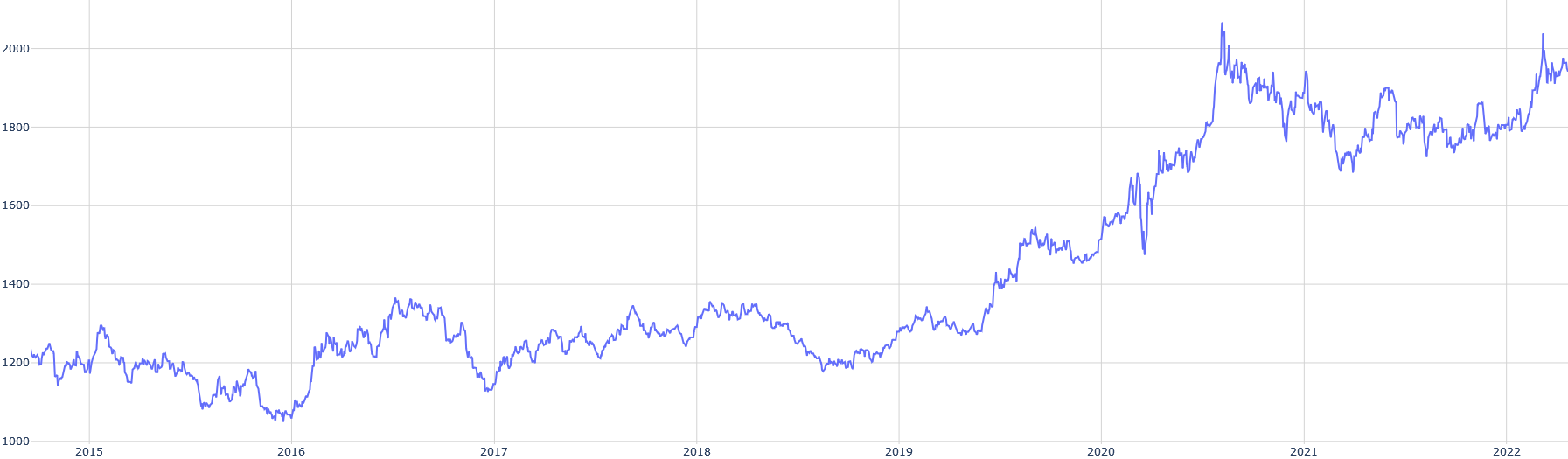
## Line Chart: Time Series Data
### Overview
The image is a line chart displaying time series data. The x-axis represents time, spanning from 2015 to 2022. The y-axis represents a numerical value, ranging from 1000 to 2000. A single blue line plots the data points over time, showing fluctuations and trends.
### Components/Axes
* **X-axis:**
* Label: Years
* Scale: 2015, 2016, 2017, 2018, 2019, 2020, 2021, 2022
* **Y-axis:**
* Label: Numerical Value (unspecified units)
* Scale: 1000, 1200, 1400, 1600, 1800, 2000
* **Data Series:**
* Color: Blue
* Trend: Fluctuating with an overall upward trend, especially pronounced after 2019.
### Detailed Analysis
* **2015:** Starts around 1200, fluctuates down to approximately 1100, then back up.
* **2016:** Begins around 1200, rises to approximately 1350, then declines.
* **2017:** Starts around 1250, fluctuates around 1300.
* **2018:** Remains relatively stable, fluctuating around 1300.
* **2019:** Starts around 1300, ends around 1400.
* **2020:** Shows a significant upward trend, rising from approximately 1400 to 1800.
* **2021:** Peaks around 1950-2000, then declines to approximately 1700-1800.
* **2022:** Fluctuates around 1800-1900, ending near 1900.
### Key Observations
* The data shows a period of relative stability between 2017 and 2019.
* A significant increase occurs in 2020.
* The highest point is reached in 2021, followed by a decline and stabilization.
### Interpretation
The line chart illustrates the trend of a numerical value over time. The period from 2015 to 2019 shows moderate fluctuations, while 2020 marks a significant turning point with a substantial increase. The peak in 2021 is followed by a correction, and the value stabilizes at a higher level in 2022 compared to the pre-2020 period. This suggests a potential shift in the underlying factors influencing the numerical value around 2020.