\n
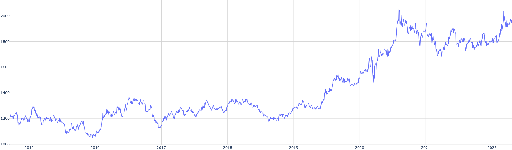
## Line Chart: Time Series Data
### Overview
The image presents a line chart depicting a time series. The chart shows a single data series fluctuating over time, with a clear upward trend beginning around 2020. The x-axis represents time, and the y-axis represents a numerical value.
### Components/Axes
* **X-axis:** Represents time, spanning from approximately 2015 to 2022. The axis is labeled with year markers.
* **Y-axis:** Represents a numerical value, ranging from approximately 1000 to 2000. The axis is labeled with numerical markers in increments of 200.
* **Data Series:** A single blue line representing the time series data.
* **Grid:** A light gray grid is present in the background to aid in reading values.
### Detailed Analysis
The data series exhibits the following behavior:
* **2015-2019:** The line fluctuates within a relatively narrow range, generally between 1200 and 1400. There are several peaks and troughs, but no significant overall trend.
* **2019-2020:** A gradual upward trend begins around late 2019, accelerating into 2020.
* **2020-2021:** A steep increase occurs in early 2020, reaching a peak of approximately 2000. The line then experiences a significant drop, followed by fluctuations between 1700 and 1900.
* **2021-2022:** The line continues to fluctuate, with a slight upward trend towards the end of the period, reaching approximately 1850-1900 by 2022.
Approximate data points (with uncertainty of +/- 25):
* **2015:** ~1250
* **2016:** Fluctuates between ~1150 and ~1350
* **2017:** Fluctuates between ~1250 and ~1400
* **2018:** Fluctuates between ~1200 and ~1450
* **2019:** Fluctuates between ~1250 and ~1450
* **Early 2020:** ~1400, rapidly increasing to ~1900
* **Mid 2020:** Peak of ~2000
* **Late 2020:** Drop to ~1700
* **2021:** Fluctuates between ~1700 and ~1900
* **2022:** ~1850-1900
### Key Observations
* The most significant feature of the chart is the dramatic increase in the data series starting in 2020.
* The period from 2015 to 2019 shows relatively stable data with minor fluctuations.
* The data after 2020 is more volatile, with larger swings in value.
### Interpretation
The chart likely represents a time series of some quantifiable metric. The initial stability from 2015-2019 suggests a consistent state or process. The sharp increase in 2020 could indicate a significant event or change that dramatically impacted the metric. The subsequent fluctuations suggest ongoing adjustments or responses to the initial change.
Without knowing what the y-axis represents, it's difficult to provide a more specific interpretation. However, the pattern suggests a system that experienced a major disruption around 2020, followed by a period of adaptation and ongoing variability. The upward trend at the end of 2022 could indicate a recovery or stabilization, but further data would be needed to confirm this. The data suggests a non-linear relationship, with a period of relative stability followed by a period of rapid change and then continued, but less dramatic, fluctuation.