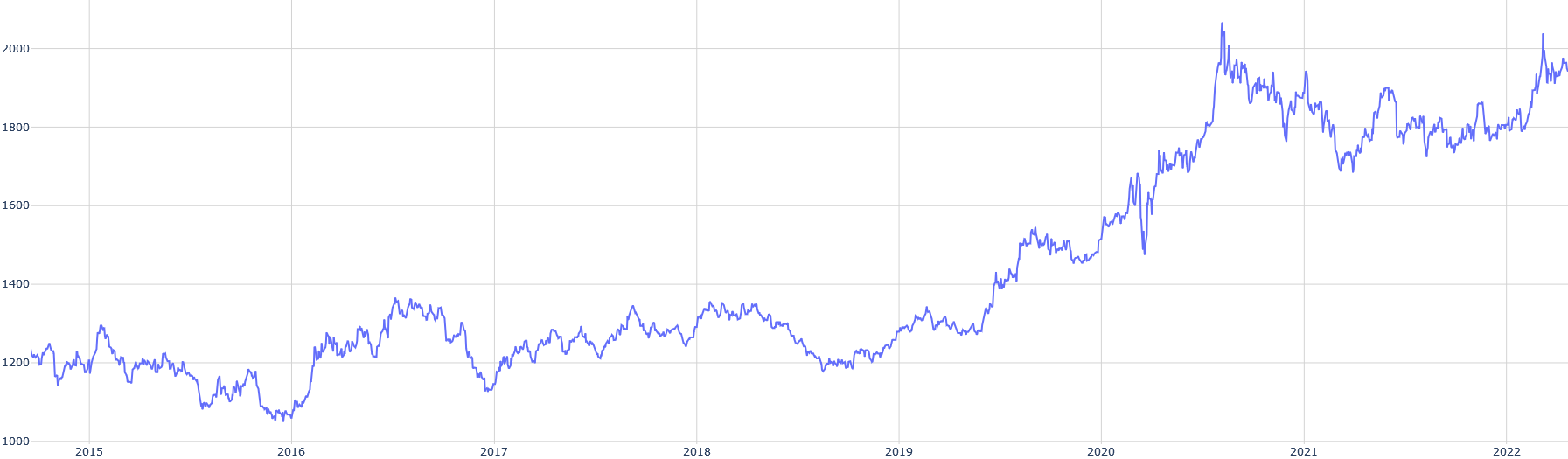
## Line Chart: Time Series Data (2015-2022)
### Overview
The image displays a single-line time series chart plotted on a white background with a light gray grid. The chart shows a fluctuating numerical value over an eight-year period, from the beginning of 2015 to the beginning of 2022. The overall trend is upward, with significant volatility and a pronounced acceleration in growth starting in late 2019/early 2020.
### Components/Axes
* **Chart Type:** Single-line chart.
* **X-Axis (Horizontal):** Represents time in years. Major tick marks and labels are present for the start of each year: `2015`, `2016`, `2017`, `2018`, `2019`, `2020`, `2021`, `2022`. The axis spans from just before 2015 to just after the start of 2022.
* **Y-Axis (Vertical):** Represents a numerical value. Major tick marks and labels are present at intervals of 200: `1000`, `1200`, `1400`, `1600`, `1800`, `2000`. The axis range is from 1000 to just above 2000.
* **Legend:** None present.
* **Title/Labels:** No chart title, axis titles, or data series labels are visible in the image.
* **Data Series:** A single, continuous blue line (approximately hex color #4a6cf7) plots the data.
### Detailed Analysis
**Trend Verification & Data Point Extraction (Approximate):**
The line's path is analyzed chronologically. Values are estimated based on the grid lines.
1. **2015:** The line begins near the `1200` level. It shows moderate volatility, dipping to a low near `1150` in mid-2015 before recovering to end the year near `1200`.
2. **2016:** The line trends downward in the first half, reaching its lowest point on the chart, approximately `1050`, around mid-2016. It then begins a recovery, ending the year near `1200`.
3. **2017:** A year of recovery and growth. The line rises from `~1200` to a peak near `1350` in mid-2017, then consolidates, ending the year around `1250`.
4. **2018:** The line fluctuates within a range, primarily between `1200` and `1350`. It shows no strong directional trend, ending the year near `1250`.
5. **2019:** The first half shows a dip to near `1200`. A sustained upward trend begins in the second half, with the line breaking above `1300` and ending the year near `1350`.
6. **2020:** This year marks a dramatic acceleration. The line rises sharply from `~1350` at the start, experiencing a brief but sharp dip to `~1450` in early 2020 (likely Q1/Q2). It then surges upward, crossing `1600` by mid-year and ending near `1750`.
7. **2021:** The line reaches its all-time high, peaking above the `2000` mark (estimated `~2050`) in the first half of the year. It then enters a period of high volatility, with a significant correction down to `~1700` before recovering to end the year near `1850`.
8. **2022 (Start):** The line begins the year with renewed upward momentum, rising from `~1850` to end the visible chart near `1950`.
### Key Observations
* **Major Low:** The lowest point on the chart (~1050) occurred in mid-2016.
* **Major High:** The highest point (~2050) was reached in the first half of 2021.
* **Volatility Shift:** Volatility (the magnitude of price swings) appears significantly higher from 2020 onward compared to the 2015-2019 period.
* **Key Turning Points:** Notable trend changes occurred in mid-2016 (bottom), early 2020 (acceleration), and early 2021 (peak).
* **Absence of Metadata:** The chart lacks a title, axis labels, or a legend, making it impossible to know what specific asset, metric, or index is being plotted without external context.
### Interpretation
The chart depicts a classic "growth with volatility" pattern. The period from 2015 to late 2019 can be characterized as a long, choppy accumulation or base-building phase, where the value oscillated within a broad range (1050-1350) without a sustained breakout.
The inflection point in late 2019/early 2020 is critical. The sharp, high-momentum breakout that followed suggests a fundamental change in market perception, adoption, or underlying conditions for whatever is being measured. The surge through 2020 and the peak in 2021 indicate a period of intense speculation or rapid growth. The subsequent high volatility and correction in 2021 suggest a market grappling with price discovery at new, higher valuations.
The final trajectory into 2022 shows resilience, with the value recovering most of its 2021 correction and trending back toward its highs. This could indicate sustained demand or a new consolidation phase at a higher plateau (~1800-2000). Without labels, this pattern is reminiscent of many financial assets (e.g., stock indices, cryptocurrencies, commodities) or technology adoption metrics that experienced a pandemic-era boom. The data strongly suggests an entity that transitioned from obscurity or stability into a high-growth, high-volatility phase.