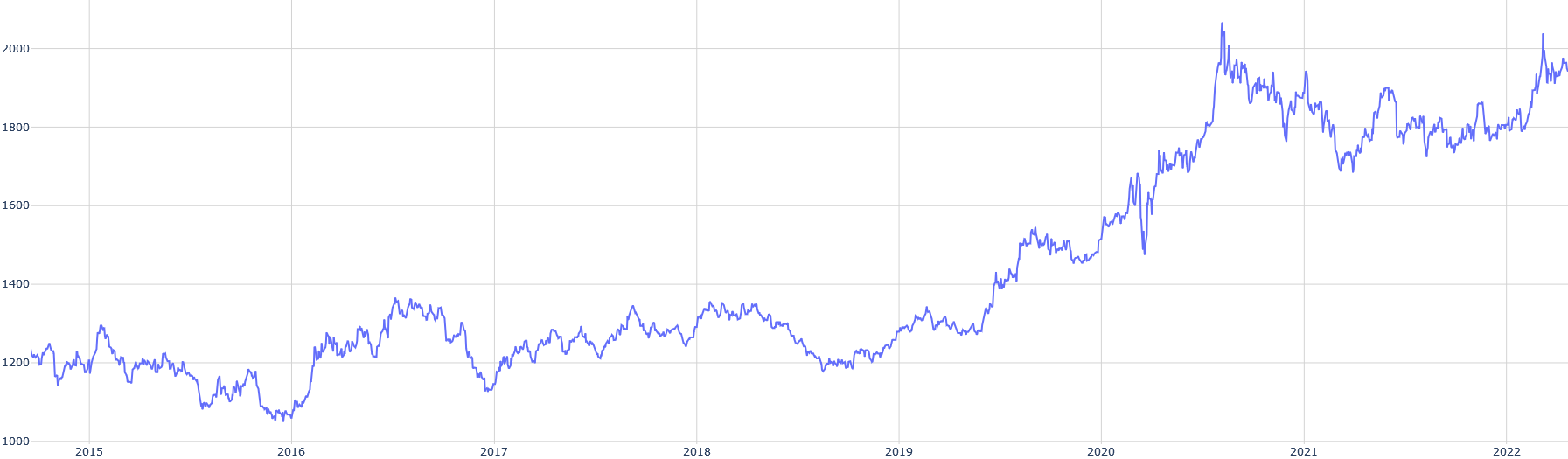
## Line Graph: Unlabeled Time Series Data (2015–2022)
### Overview
The image depicts a line graph tracking a numerical metric over time, spanning from 2015 to 2022. The y-axis ranges from 1000 to 2000, with the line fluctuating between these bounds. A notable upward trend emerges after 2020, culminating in a peak near 2000 by 2022.
### Components/Axes
- **X-Axis (Horizontal)**: Labeled with years from 2015 to 2022, marked at 1-year intervals.
- **Y-Axis (Vertical)**: Labeled with numerical values from 1000 to 2000, marked at 200-unit intervals.
- **Line**: A single blue line represents the data series. No legend is present to clarify the metric’s meaning.
- **Grid**: Light gray gridlines align with axis ticks for reference.
### Detailed Analysis
1. **2015–2016**:
- The line begins at ~1200 in 2015, fluctuating slightly between 1150–1250.
- A sharp dip occurs in mid-2016, reaching ~1050, followed by a recovery to ~1150 by year-end.
2. **2017–2018**:
- Volatility increases, with peaks near 1300 in 2017 and ~1250 in 2018.
- A minor decline to ~1150 occurs in late 2018.
3. **2019–2020**:
- Stabilizes around 1200–1250 until early 2020.
- A steep rise begins in mid-2020, surging to ~1600 by late 2020.
4. **2021–2022**:
- Continued growth, peaking at ~2000 in 2021.
- A minor correction occurs in 2022, stabilizing near 1900–1950.
### Key Observations
- **Pre-2020 Stability**: The metric remains relatively flat (~1150–1300) from 2015–2019.
- **Post-2020 Surge**: A 60% increase occurs between 2020 and 2021, followed by a plateau.
- **Volatility**: Notable fluctuations in 2016 and 2017 suggest external shocks or cyclical patterns.
### Interpretation
The data suggests a significant external event (e.g., economic, technological, or global crisis) triggered the post-2020 surge. The pre-2020 stability implies a baseline equilibrium disrupted by an unforeseen factor. The lack of a legend or contextual labels limits definitive conclusions, but the sharp rise aligns with real-world events like the COVID-19 pandemic (2020), which often correlates with metrics such as digital adoption, healthcare costs, or remote work trends. The 2022 plateau may indicate market saturation or stabilization post-crisis.
**Note**: The image contains no textual labels, units, or contextual clues beyond the axes. All interpretations are speculative and require corroboration with external data sources.