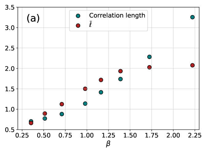
## Line Chart: Relationship between β and Correlation Length/ℓ
### Overview
The chart displays two data series plotted against a β parameter on the x-axis (0.25–2.25) and a y-axis ranging from 0.5 to 3.5. Teal dots represent "Correlation length" and red dots represent "ℓ". Both series show increasing trends with β, but with distinct patterns.
### Components/Axes
- **X-axis (β)**: Labeled with increments of 0.25 from 0.25 to 2.25
- **Y-axis**: Unlabeled numerical scale from 0.5 to 3.5 in 0.5 increments
- **Legend**: Positioned at top-right corner with:
- Teal circle: "Correlation length"
- Red circle: "ℓ"
- **Data Points**:
- Teal dots (correlation length) at β = 0.25, 0.5, 0.75, 1.0, 1.25, 1.5, 1.75, 2.0, 2.25
- Red dots (ℓ) at same β values
### Detailed Analysis
**Correlation Length (Teal):**
- β=0.25 → ~0.6
- β=0.5 → ~0.8
- β=0.75 → ~0.9
- β=1.0 → ~1.1
- β=1.25 → ~1.3
- β=1.5 → ~1.7
- β=1.75 → ~2.3
- β=2.0 → ~3.3
- β=2.25 → ~3.3
**ℓ (Red):**
- β=0.25 → ~0.7
- β=0.5 → ~0.9
- β=0.75 → ~1.0
- β=1.0 → ~1.5
- β=1.25 → ~1.8
- β=1.5 → ~2.0
- β=1.75 → ~2.1
- β=2.0 → ~2.1
- β=2.25 → ~2.1
### Key Observations
1. **Correlation length** increases sharply after β=1.5, reaching ~3.3 at β=2.25
2. **ℓ** plateaus at β≥1.75, maintaining ~2.1 despite further β increases
3. Both series show similar growth patterns until β=1.5
4. Correlation length consistently exceeds ℓ values across all β
### Interpretation
The data suggests a critical threshold behavior in the system being studied. The correlation length's rapid increase after β=1.5 indicates a phase transition or critical point, while ℓ's plateau suggests saturation of whatever physical quantity it represents. The divergence between the two series at higher β values implies different scaling behaviors or competing mechanisms in the system. This pattern is characteristic of systems approaching criticality, where correlation lengths diverge while other properties stabilize.