\n
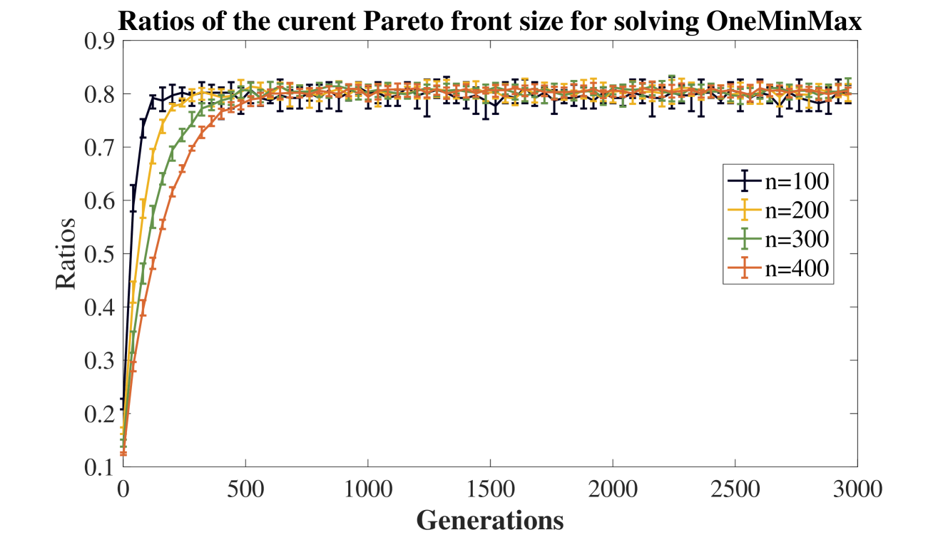
## Line Chart: Ratios of the current Pareto front size for solving OneMinMax
### Overview
This line chart depicts the ratios of the current Pareto front size as a function of generations, for solving the OneMinMax problem. The chart compares the performance for different population sizes (n=100, 200, 300, and 400). Each data series includes error bars representing the variance in the ratios.
### Components/Axes
* **Title:** "Ratios of the current Pareto front size for solving OneMinMax" (Top-center)
* **X-axis:** "Generations" (Bottom-center), ranging from 0 to 3000.
* **Y-axis:** "Ratios" (Left-center), ranging from 0.1 to 0.9.
* **Legend:** Located in the top-right corner, listing the population sizes and corresponding line colors:
* n=100 (Black)
* n=200 (Orange)
* n=300 (Green)
* n=400 (Red)
### Detailed Analysis
The chart displays four lines, each representing a different population size. Each line is accompanied by error bars.
* **n=100 (Black):** The line starts at approximately 0.15 at generation 0, rapidly increases to around 0.75 by generation 500, and then plateaus around 0.82 with some fluctuations. Error bars are relatively large initially, decreasing as generations increase.
* **n=200 (Orange):** The line begins at approximately 0.18 at generation 0, increases more quickly than the n=100 line, reaching around 0.80 by generation 500. It then plateaus around 0.85 with smaller fluctuations than the n=100 line. Error bars are initially large, decreasing with increasing generations.
* **n=300 (Green):** The line starts at approximately 0.20 at generation 0, increases rapidly, reaching around 0.82 by generation 500. It plateaus around 0.86 with minimal fluctuations. Error bars are initially large, decreasing with increasing generations.
* **n=400 (Red):** The line begins at approximately 0.22 at generation 0, increases very rapidly, reaching around 0.85 by generation 500. It plateaus around 0.88 with the smallest fluctuations of all the lines. Error bars are initially large, decreasing with increasing generations.
All lines exhibit a similar trend: a rapid increase in ratios during the first 500 generations, followed by a plateau. The lines for larger population sizes (n=300 and n=400) reach higher ratios and exhibit smaller fluctuations after the initial increase.
### Key Observations
* Larger population sizes (n=300 and n=400) consistently achieve higher ratios of Pareto front size compared to smaller population sizes (n=100 and n=200).
* The rate of increase in ratios decreases as the number of generations increases for all population sizes.
* The error bars indicate that the variance in ratios decreases as the number of generations increases, suggesting that the Pareto front size becomes more stable over time.
* The lines converge as the number of generations increases, indicating that the performance difference between different population sizes diminishes after a certain point.
### Interpretation
The data suggests that increasing the population size generally leads to a larger and more stable Pareto front size when solving the OneMinMax problem. However, the benefits of increasing the population size diminish after a certain number of generations. The initial rapid increase in ratios likely represents the exploration phase of the optimization algorithm, where the population is discovering promising solutions. The subsequent plateau indicates that the algorithm has converged to a stable set of solutions. The decreasing error bars suggest that the algorithm is becoming more confident in its solutions as the number of generations increases. The convergence of the lines at higher generation counts suggests that the marginal benefit of increasing population size decreases as the algorithm approaches its optimal solution. This information is valuable for tuning the parameters of the optimization algorithm to achieve the best performance for a given computational budget.