\n
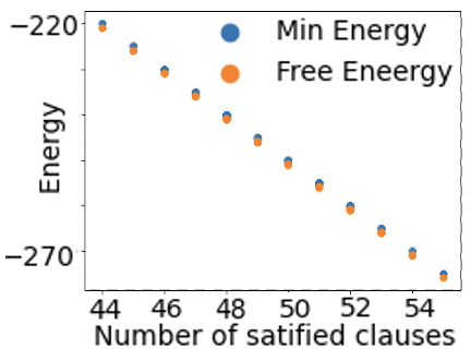
## Scatter Plot: Energy vs. Satisfied Clauses
### Overview
This image presents a scatter plot illustrating the relationship between the number of satisfied clauses and energy levels (both minimum energy and free energy). The plot displays data points for two different energy metrics as the number of satisfied clauses increases.
### Components/Axes
* **X-axis:** Number of satisfied clauses, ranging from approximately 44 to 54.
* **Y-axis:** Energy, ranging from approximately -220 to -270.
* **Legend:** Located in the top-right corner.
* Blue circles: Represent "Min Energy".
* Orange circles: Represent "Free Energy".
### Detailed Analysis
The plot shows two distinct data series.
**Min Energy (Blue):**
The blue data series exhibits a clear downward trend. As the number of satisfied clauses increases, the minimum energy decreases.
* At approximately 44 satisfied clauses, the Min Energy is around -220.
* At approximately 46 satisfied clauses, the Min Energy is around -230.
* At approximately 48 satisfied clauses, the Min Energy is around -240.
* At approximately 50 satisfied clauses, the Min Energy is around -250.
* At approximately 52 satisfied clauses, the Min Energy is around -260.
* At approximately 54 satisfied clauses, the Min Energy is around -270.
**Free Energy (Orange):**
The orange data series also demonstrates a downward trend, though it appears slightly more scattered than the Min Energy series. As the number of satisfied clauses increases, the free energy decreases.
* At approximately 44 satisfied clauses, the Free Energy is around -220.
* At approximately 46 satisfied clauses, the Free Energy is around -240.
* At approximately 48 satisfied clauses, the Free Energy is around -250.
* At approximately 50 satisfied clauses, the Free Energy is around -255.
* At approximately 52 satisfied clauses, the Free Energy is around -260.
* At approximately 54 satisfied clauses, the Free Energy is around -270.
### Key Observations
* Both energy metrics (Min Energy and Free Energy) decrease as the number of satisfied clauses increases.
* The Min Energy series appears to have a more consistent downward trend than the Free Energy series.
* The Free Energy values are generally slightly higher (less negative) than the Min Energy values for a given number of satisfied clauses.
* The data points are relatively sparse, with only a few data points for each value of satisfied clauses.
### Interpretation
The plot suggests a correlation between the number of satisfied clauses and the energy levels of a system. As the system satisfies more clauses, its energy decreases, indicating a more stable or optimal state. The difference between Min Energy and Free Energy could represent the energy cost associated with exploring different configurations or the entropy of the system. The downward trends in both series suggest that the system is moving towards a lower energy state as more clauses are satisfied. The scatter in the Free Energy data might indicate the presence of local minima or fluctuations in the system's energy landscape. The data suggests that the system is approaching a stable state as the number of satisfied clauses increases, but further investigation would be needed to understand the underlying mechanisms and the significance of the difference between Min Energy and Free Energy.