\n
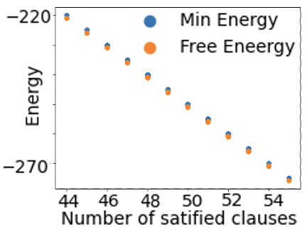
## Scatter Plot: Energy vs. Number of Satisfied Clauses
### Overview
The image is a scatter plot comparing two energy metrics—"Min Energy" and "Free Energy"—against the "Number of satisfied clauses." The plot shows a clear inverse relationship: as the number of satisfied clauses increases, both energy values decrease (become more negative). The data points for both series are closely aligned, with "Free Energy" consistently slightly higher (less negative) than "Min Energy" for the same number of satisfied clauses.
### Components/Axes
* **Chart Type:** Scatter plot with two data series.
* **X-Axis:**
* **Label:** "Number of satisfied clauses"
* **Scale:** Linear, ranging from approximately 44 to 54.
* **Major Ticks:** 44, 46, 48, 50, 52, 54.
* **Y-Axis:**
* **Label:** "Energy"
* **Scale:** Linear, ranging from approximately -220 to -270.
* **Major Ticks:** -220, -270.
* **Legend:**
* **Position:** Top-right corner of the plot area.
* **Series 1:** Blue circle, labeled "Min Energy".
* **Series 2:** Orange circle, labeled "Free Eneergy" (note: "Energy" is misspelled as "Eneergy" in the image).
* **Data Points:** Each series consists of 11 data points, plotted as filled circles.
### Detailed Analysis
**Trend Verification:** Both data series exhibit a strong, consistent downward (negative) linear trend. As the x-value increases, the y-value decreases.
**Data Point Extraction (Approximate Values):**
The following table lists the approximate coordinates for each data point, read from the graph. The "Min Energy" (blue) points are consistently slightly lower (more negative) than the "Free Energy" (orange) points at each x-value.
| Number of Satisfied Clauses (X) | Min Energy (Y, Blue) | Free Energy (Y, Orange) |
| :--- | :--- | :--- |
| 44 | -220 | -219 |
| 45 | -225 | -224 |
| 46 | -230 | -229 |
| 47 | -235 | -234 |
| 48 | -240 | -239 |
| 49 | -245 | -244 |
| 50 | -250 | -249 |
| 51 | -255 | -254 |
| 52 | -260 | -259 |
| 53 | -265 | -264 |
| 54 | -270 | -269 |
**Uncertainty Note:** Values are estimated based on visual alignment with the axis ticks. The actual values may differ by ±1-2 units.
### Key Observations
1. **Perfect Correlation:** The two series are perfectly correlated in trend and nearly identical in value, differing by a near-constant offset of approximately 1 energy unit.
2. **Linear Relationship:** The relationship between "Number of satisfied clauses" and "Energy" appears to be strongly linear for both metrics within the observed range.
3. **Data Density:** The points are evenly spaced along the x-axis at integer intervals from 44 to 54.
4. **Label Typo:** The legend contains a clear typographical error: "Free Eneergy" instead of "Free Energy."
### Interpretation
This chart likely originates from a computational or optimization context, such as constraint satisfaction problems (e.g., SAT solvers) or statistical physics models. The "Number of satisfied clauses" is a common metric in Boolean satisfiability, where a higher number indicates a better solution. "Energy" is a cost function to be minimized.
The data demonstrates a fundamental trade-off or relationship: achieving a higher number of satisfied clauses (a better solution state) is associated with a lower system energy (a more stable or optimal state). The near-identical values of "Min Energy" and "Free Energy" suggest that in this specific scenario or model, the two calculated quantities converge to almost the same result, with "Free Energy" being marginally higher. The perfect linearity implies a very direct, predictable relationship between the solution quality (clauses satisfied) and the system's energy cost within this parameter range. The chart effectively visualizes the optimization landscape, showing that progress (more clauses) is directly and uniformly rewarded with lower energy.