# Technical Document Extraction: Receiver Operating Characteristic (ROC) Curve
## 1. Component Isolation
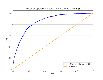
* **Header:** Contains the main title of the chart.
* **Main Chart Area:** A square plot area with a grid, containing two data series (a solid curve and a dashed diagonal line).
* **Axes:** Horizontal (X) and Vertical (Y) axes with numerical scales and labels.
* **Legend:** Located in the bottom-right quadrant of the plot area.
---
## 2. Metadata and Labels
* **Title:** Receiver Operating Characteristic Curve (Training)
* **Y-Axis Label:** TPR (True Positive Rate)
* **X-Axis Label:** FPR (False Positive Rate)
* **Language:** English
---
## 3. Axis Scales and Markers
Both axes represent probabilities/rates ranging from 0.0 to 1.0.
| Axis | Minimum | Maximum | Major Tick Intervals |
| :--- | :--- | :--- | :--- |
| **X-Axis (FPR)** | 0.0 | 1.0 | 0.2 (0.0, 0.2, 0.4, 0.6, 0.8, 1.0) |
| **Y-Axis (TPR)** | 0.0 | 1.0 | 0.2 (0.0, 0.2, 0.4, 0.6, 0.8, 1.0) |
---
## 4. Legend and Data Series Analysis
The legend is positioned at approximately **[x=0.85, y=0.1]** relative to the plot area.
### Series 1: ROC Curve
* **Color:** Dark Blue
* **Line Style:** Solid
* **Legend Label:** ROC curve (area = 0.85)
* **Trend Verification:** The line starts at the origin (0,0) and slopes upward with a steep initial gradient. As it moves toward the top-right, the slope decreases (concave down), indicating diminishing returns in True Positive Rate for every increase in False Positive Rate. It eventually reaches the point (1,1).
* **Key Data Points (Estimated):**
* (0.0, 0.0)
* (0.1, 0.5)
* (0.2, 0.75)
* (0.4, 0.9)
* (0.6, 0.97)
* (1.0, 1.0)
### Series 2: Baseline
* **Color:** Orange/Gold
* **Line Style:** Dashed
* **Legend Label:** Baseline
* **Trend Verification:** This is a perfectly linear diagonal line starting at (0,0) and ending at (1,1). It represents a "Random Classifier" with an Area Under the Curve (AUC) of 0.5.
* **Key Data Points:**
* Linear progression where FPR = TPR (e.g., 0.2, 0.2; 0.5, 0.5; 0.8, 0.8).
---
## 5. Technical Summary
This image displays the performance of a classification model on a training dataset.
* **Performance Metric:** The Area Under the Curve (AUC) is explicitly stated as **0.85**.
* **Interpretation:** Since the dark blue ROC curve stays significantly above the orange dashed baseline (AUC 0.5), the model demonstrates strong predictive power. An AUC of 0.85 suggests that there is an 85% chance that the model will be able to distinguish between positive and negative classes correctly.
* **Visual Characteristics:** The plot includes a light gray grid to facilitate the reading of specific coordinate values. The curve is relatively smooth, suggesting a continuous probability output from the classifier.