\n
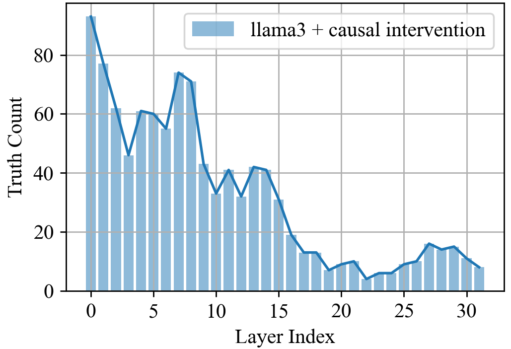
## Chart: Truth Count vs. Layer Index
### Overview
The image presents a bar chart visualizing the relationship between "Truth Count" and "Layer Index". The chart displays the distribution of truth counts across different layers, presumably within a model (llama3 + causal intervention). The chart uses a filled area under a line to represent the data.
### Components/Axes
* **X-axis:** "Layer Index" ranging from 0 to 32. The axis is marked with integer values.
* **Y-axis:** "Truth Count" ranging from 0 to 80. The axis is marked with integer values in increments of 20.
* **Data Series:** "llama3 + causal intervention" represented by a light blue filled area under a line.
* **Legend:** Located in the top-right corner, labeling the data series as "llama3 + causal intervention" with a corresponding light blue color.
### Detailed Analysis
The data series "llama3 + causal intervention" exhibits a complex trend.
* **Initial Peak (Layers 0-2):** The truth count starts at approximately 80 at Layer Index 0, then decreases rapidly.
* **Fluctuation (Layers 2-10):** The truth count fluctuates between approximately 55 and 75, with peaks around Layer Index 2 and Layer Index 8.
* **Decline (Layers 10-20):** A significant decline in truth count is observed from Layer Index 10 to Layer Index 20, decreasing from approximately 40 to approximately 10.
* **Stabilization (Layers 20-32):** The truth count stabilizes between approximately 10 and 20 for the remaining layers, with minor fluctuations.
Here's an approximate reconstruction of the data points:
| Layer Index | Truth Count (approx.) |
|---|---|
| 0 | 80 |
| 2 | 60 |
| 4 | 60 |
| 5 | 55 |
| 6 | 65 |
| 7 | 70 |
| 8 | 75 |
| 9 | 65 |
| 10 | 40 |
| 12 | 35 |
| 14 | 40 |
| 15 | 30 |
| 16 | 20 |
| 18 | 15 |
| 20 | 10 |
| 22 | 12 |
| 24 | 10 |
| 25 | 15 |
| 27 | 18 |
| 30 | 15 |
| 32 | 12 |
### Key Observations
* The highest truth counts are concentrated in the initial layers (0-10).
* There is a sharp decrease in truth count after Layer Index 10.
* The truth count remains relatively low and stable in the later layers (20-32).
* The data is not perfectly smooth, exhibiting fluctuations even within the declining and stable phases.
### Interpretation
The chart suggests that the "truth" or accuracy of the model (llama3 + causal intervention) is highest in the earlier layers and diminishes as the data progresses through deeper layers. This could indicate that the initial layers capture the most important features or patterns, while later layers introduce noise or less relevant information. The stabilization of the truth count in the later layers might suggest a baseline level of accuracy that is maintained despite the overall decline. The fluctuations throughout the chart could be due to the complexity of the data or the specific interventions applied. The sharp decline after layer 10 is a notable feature, and further investigation would be needed to understand the cause of this drop. It could be related to the model's architecture, the training data, or the causal intervention itself.