## Scatter Plot Matrix: Comparison of ERM, IRM, and Oracle Models
### Overview
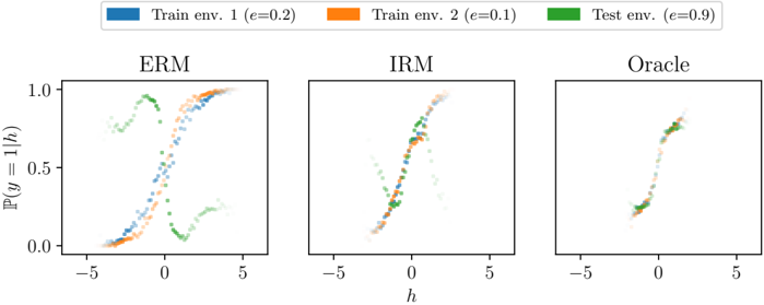
The image presents a comparative visualization of three different machine learning approaches—Empirical Risk Minimization (ERM), Invariant Risk Minimization (IRM), and an Oracle model—across three distinct environments. The plots visualize the conditional probability $\mathbb{P}(y=1|h)$ as a function of a learned feature representation $h$. The goal is to demonstrate how well each method generalizes across environments with different underlying distributions (labeled $e=0.2$, $e=0.1$, and $e=0.9$).
### Components/Axes
* **Legend (Top):**
* **Blue:** Train env. 1 ($e=0.2$)
* **Orange:** Train env. 2 ($e=0.1$)
* **Green:** Test env. ($e=0.9$)
* **Axes:**
* **Y-axis:** $\mathbb{P}(y=1|h)$, representing the probability of the target variable $y=1$ given the feature $h$. The scale ranges from 0.0 to 1.0.
* **X-axis:** $h$, representing the learned feature or representation. The scale ranges from -5 to 5.
* **Sub-plots:**
* **ERM (Left):** Displays the results of standard Empirical Risk Minimization.
* **IRM (Center):** Displays the results of Invariant Risk Minimization.
* **Oracle (Right):** Displays the results of an Oracle model (the ground truth).
### Detailed Analysis
#### 1. ERM (Left Plot)
* **Visual Trend:** The data series are highly divergent. The training environments (Blue/Orange) follow a positive correlation (rising from bottom-left to top-right), while the test environment (Green) follows a complex, non-monotonic path.
* **Data Points:**
* **Blue/Orange (Train):** These points cluster along a sigmoid-like curve, starting near $\mathbb{P}=0$ at $h=-4$ and rising to $\mathbb{P}=1$ at $h=4$.
* **Green (Test):** This series is an outlier. It starts at $\mathbb{P} \approx 0.8$ at $h=-4$, dips significantly to $\mathbb{P} \approx 0.1$ at $h=1$, and rises slightly to $\mathbb{P} \approx 0.3$ at $h=4$.
* **Observation:** The model has learned a representation that works for training environments but fails completely on the test environment.
#### 2. IRM (Center Plot)
* **Visual Trend:** The data series are significantly more aligned compared to ERM. All three colors follow a similar upward-sloping sigmoid path.
* **Data Points:**
* All three colors (Blue, Orange, Green) overlap closely.
* The curve rises from $\mathbb{P} \approx 0.1$ at $h=-2$ to $\mathbb{P} \approx 0.9$ at $h=2$.
* **Observation:** The model has successfully learned an invariant representation, as the conditional probability $\mathbb{P}(y|h)$ is consistent across all three environments.
#### 3. Oracle (Right Plot)
* **Visual Trend:** The data series are perfectly aligned.
* **Data Points:**
* Blue, Orange, and Green points are superimposed on top of each other, forming a single, clean sigmoid curve.
* The curve transitions from $\mathbb{P} \approx 0.2$ at $h=-1$ to $\mathbb{P} \approx 0.8$ at $h=1$.
* **Observation:** This represents the ideal scenario where the model has perfect knowledge of the underlying data-generating process, independent of the environment.
### Key Observations
* **Failure of ERM:** The ERM plot demonstrates a classic failure of generalization. The model relies on spurious correlations present in the training environments ($e=0.2, 0.1$) that do not exist in the test environment ($e=0.9$).
* **Success of IRM:** The IRM plot demonstrates that the algorithm successfully ignores environment-specific noise and learns a feature $h$ that is invariant across environments.
* **Convergence:** The progression from ERM to IRM to Oracle shows a clear improvement in the alignment of the conditional probability distributions across environments.
### Interpretation
This visualization is a textbook demonstration of **Out-of-Distribution (OOD) Generalization**.
* **ERM** minimizes risk on the training set but fails to account for the fact that the relationship between $h$ and $y$ might change in new environments. It "overfits" to the specific spurious correlations of the training data.
* **IRM** is designed to solve this by learning a representation $h$ such that the optimal classifier on top of $h$ is the same across all environments. The center plot confirms that IRM achieves this, as the curves for all three environments are nearly identical.
* **The Oracle** serves as the benchmark. The fact that the IRM plot closely resembles the Oracle plot suggests that IRM is an effective method for discovering causal or invariant features that remain stable even when the environment changes.