## Scatter Plots: Empirical Risk Minimization (ERM), Invariant Risk Minimization (IRM), and Oracle
### Overview
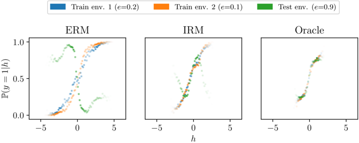
The image presents three scatter plots, arranged horizontally. Each plot visualizes the relationship between 'h' and 'P(y=1|h)' under different learning paradigms: Empirical Risk Minimization (ERM), Invariant Risk Minimization (IRM), and an "Oracle" method. Each plot displays data points colored according to the training environment they originate from.
### Components/Axes
* **X-axis:** Labeled 'h', ranging approximately from -5 to 5.
* **Y-axis:** Labeled 'P(y = 1 | h)', representing the conditional probability of y=1 given h, ranging approximately from 0.0 to 1.0.
* **Legend:** Located at the top-center of the image.
* Blue: "Train env. 1 (e=0.2)"
* Orange: "Train env. 2 (e=0.1)"
* Green: "Test env. (e=0.9)"
* **Titles:** Each plot has a title indicating the learning paradigm: "ERM", "IRM", and "Oracle".
### Detailed Analysis or Content Details
**ERM Plot (Left)**
* **Blue Points (Train env. 1):** The points form a roughly S-shaped curve, starting near (approximately -5, 0.0) and ending near (approximately 5, 1.0). The curve exhibits a steep slope around h=0.
* **Orange Points (Train env. 2):** Similar to the blue points, these also form an S-shaped curve, but are shifted slightly to the right. They start near (approximately -5, 0.0) and end near (approximately 5, 1.0). The curve exhibits a steep slope around h=0.
* **Green Points (Test env.):** These points are clustered around h=0, with a relatively narrow spread. They form a near-vertical line, indicating a strong correlation between h and P(y=1|h) in the test environment.
**IRM Plot (Center)**
* **Blue Points (Train env. 1):** The points form a roughly S-shaped curve, starting near (approximately -5, 0.0) and ending near (approximately 5, 1.0). The curve exhibits a steep slope around h=0.
* **Orange Points (Train env. 2):** Similar to the blue points, these also form an S-shaped curve, but are shifted slightly to the right. They start near (approximately -5, 0.0) and end near (approximately 5, 1.0). The curve exhibits a steep slope around h=0.
* **Green Points (Test env.):** These points are clustered around h=0, with a relatively narrow spread. They form a near-vertical line, indicating a strong correlation between h and P(y=1|h) in the test environment.
**Oracle Plot (Right)**
* **Blue Points (Train env. 1):** The points form a very tight, almost vertical line centered around h=0.
* **Orange Points (Train env. 2):** The points form a very tight, almost vertical line centered around h=0.
* **Green Points (Test env.):** The points form a very tight, almost vertical line centered around h=0.
### Key Observations
* In the ERM and IRM plots, the training environments (blue and orange) exhibit a clear S-shaped relationship between 'h' and 'P(y=1|h)'. The test environment (green) shows a very different, almost vertical relationship.
* The Oracle plot shows all three environments converging to a single, vertical line at h=0. This suggests the Oracle method perfectly aligns the learned representation with the test environment.
* The 'e' values in the legend (0.2, 0.1, 0.9) likely represent some parameter related to the environment, potentially the noise level or a causal effect.
### Interpretation
The plots demonstrate the impact of different learning paradigms on generalization. ERM learns to minimize error on the training data, resulting in a good fit for both training environments but a poor fit for the test environment. IRM attempts to learn representations that are invariant across environments, leading to a better fit for the test environment compared to ERM, but still showing a discrepancy. The Oracle method, presumably with access to perfect information, achieves perfect alignment between all environments.
The divergence between the training and test environments in the ERM and IRM plots highlights the challenge of domain adaptation and the importance of learning representations that generalize well to unseen environments. The Oracle plot serves as an ideal benchmark, illustrating the potential benefits of invariant representation learning. The 'e' values suggest that the test environment (e=0.9) is significantly different from the training environments (e=0.2 and e=0.1), making generalization more difficult. The vertical lines in the Oracle plot suggest that the optimal solution involves a simple decision boundary based on 'h', regardless of the environment.