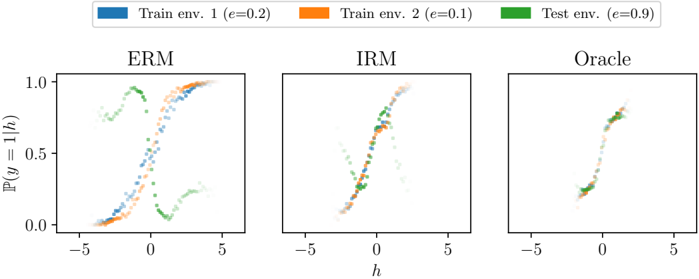
## Scatter Plot Comparison: ERM, IRM, and Oracle Performance
### Overview
The image displays three horizontally arranged scatter plots comparing the performance of three different methods—ERM, IRM, and Oracle—across two training environments and one test environment. Each plot visualizes the relationship between a variable `h` (x-axis) and the predicted probability `ℙ(y=1|h)` (y-axis). The data points are colored according to their environment of origin, as defined by a shared legend.
### Components/Axes
* **Legend (Top Center):**
* **Blue Square:** `Train env. 1 (e=0.2)`
* **Orange Square:** `Train env. 2 (e=0.1)`
* **Green Square:** `Test env. (e=0.9)`
* **Subplot Titles (Centered above each plot):** `ERM`, `IRM`, `Oracle`
* **X-axis (Common to all plots):** Label: `h`. Scale: Linear, with major ticks at -5, 0, and 5.
* **Y-axis (Common to all plots):** Label: `ℙ(y=1|h)`. Scale: Linear, with major ticks at 0.0, 0.5, and 1.0.
### Detailed Analysis
**1. ERM Plot (Left):**
* **Trend Verification:**
* **Train env. 1 (Blue):** Points form a clear, tight sigmoidal (S-shaped) curve, rising from near 0.0 at h=-5 to near 1.0 at h=5.
* **Train env. 2 (Orange):** Points follow a very similar tight sigmoidal curve, closely overlapping the blue points.
* **Test env. (Green):** Points show a dramatically different distribution. A significant cluster forms a separate, lower sigmoidal curve (rising from ~0.0 to ~0.3). Another cluster of green points is scattered in the upper-left quadrant (h ≈ -3 to 0, ℙ ≈ 0.7 to 1.0), deviating completely from the training trend.
* **Key Observation:** The model trained with ERM fits the training environments well but fails catastrophically on the test environment, showing two distinct and erroneous prediction patterns.
**2. IRM Plot (Center):**
* **Trend Verification:**
* **Train env. 1 (Blue) & Train env. 2 (Orange):** Points from both training environments are tightly clustered along a single, consistent sigmoidal curve.
* **Test env. (Green):** Points are now much more aligned with the training trend. They follow the same sigmoidal shape but exhibit greater spread/variance around the central curve compared to the training points. The separate, erroneous cluster seen in the ERM plot is absent.
* **Key Observation:** The IRM method successfully learns a predictor that is invariant across training environments and generalizes much more effectively to the test environment, though with increased uncertainty (spread).
**3. Oracle Plot (Right):**
* **Trend Verification:**
* **All Environments (Blue, Orange, Green):** Points from all three environments are tightly clustered along a single, very narrow sigmoidal curve. There is minimal spread or deviation.
* **Key Observation:** This represents the ideal or ground-truth relationship. The near-perfect overlap of all data points indicates that with perfect knowledge (the "Oracle"), the prediction `ℙ(y=1|h)` depends solely on `h` and is consistent across all environments.
### Key Observations
1. **Generalization Gap:** The ERM plot visually demonstrates a severe generalization gap, where the model's behavior on the test distribution (green) is fundamentally different from its behavior on the training distributions (blue/orange).
2. **Invariance Improvement:** The IRM plot shows a marked improvement in invariance. The test data (green) now follows the same functional form as the training data, indicating the model has learned a more robust, environment-invariant relationship.
3. **Oracle as Benchmark:** The Oracle plot serves as the gold standard, showing the target relationship that the other methods aim to approximate. The tightness of its curve highlights the noise or confounding factors present in the other scenarios.
4. **Epsilon (e) Values:** The legend indicates different `e` values for each environment (0.2, 0.1, 0.9). The test environment has a significantly higher `e` value, which likely represents a higher level of noise, a different causal mechanism, or a distribution shift that the ERM model fails to handle.
### Interpretation
This figure is a diagnostic visualization for machine learning robustness, specifically comparing Empirical Risk Minimization (ERM) with Invariant Risk Minimization (IRM).
* **What the data suggests:** The data demonstrates the core problem ERM faces with spurious correlations. The ERM model learns a predictor that works for the specific training environments but relies on features that change in the test environment, leading to failure. IRM, by seeking predictors whose optimal behavior is invariant across environments, learns a more causal and transferable relationship between `h` and `y`, resulting in better generalization.
* **Relationship between elements:** The three plots form a narrative: Problem (ERM's failure), Proposed Solution (IRM's improvement), and Ideal Goal (Oracle's perfection). The shared axes and legend allow for direct visual comparison of how each method's predictions for the *same* underlying data points (`h` values) differ across environments.
* **Notable Anomalies:** The most striking anomaly is the bimodal distribution of the green (test) points in the ERM plot. This suggests the ERM model is applying two different, incorrect "rules" to the test data, likely because it picked up on two different spurious cues present in the training environments that do not hold in the test environment. The IRM method successfully collapses this bimodality back into a single, correct trend.