## Line Chart: Probability Distribution Across Training and Test Environments
### Overview
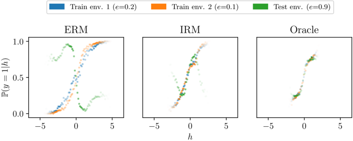
The image displays three line charts comparing probability distributions (P(y=1|h)) across three environments: ERM (Empirical Risk Minimization), IRM (Integrated Risk Minimization), and Oracle. Each chart shows three data series representing training environments with different error rates (e=0.2, e=0.1) and a test environment (e=0.9). The x-axis represents a parameter "h" ranging from -5 to 5, while the y-axis shows probability values between 0 and 1.
### Components/Axes
- **X-axis**: Parameter "h" (range: -5 to 5)
- **Y-axis**: Probability P(y=1|h) (range: 0 to 1)
- **Legend**:
- Blue: Train env. 1 (e=0.2)
- Orange: Train env. 2 (e=0.1)
- Green: Test env. (e=0.9)
- **Panels**:
- Left: ERM
- Center: IRM
- Right: Oracle
### Detailed Analysis
#### ERM Panel
- **Blue (Train env. 1)**: Starts near 0 at h=-5, rises sharply to ~0.8 at h=0.5, then dips to ~0.3 at h=5.
- **Orange (Train env. 2)**: Begins at ~0.2 at h=-5, peaks at ~0.9 at h=0, then drops to ~0.1 at h=5.
- **Green (Test env.)**: Starts at ~0.1 at h=-5, rises to ~0.7 at h=1.5, dips to ~0.2 at h=3, then rises again to ~0.6 at h=5.
#### IRM Panel
- **Blue (Train env. 1)**: Smooth curve peaking at ~0.7 at h=0.5, then declines to ~0.3 at h=5.
- **Orange (Train env. 2)**: Starts at ~0.1 at h=-5, peaks at ~0.6 at h=0.5, then drops to ~0.2 at h=5.
- **Green (Test env.)**: Begins at ~0.05 at h=-5, peaks at ~0.5 at h=0.5, then dips to ~0.1 at h=5.
#### Oracle Panel
- All three lines (blue, orange, green) overlap closely, peaking at ~0.8 at h=0.5 and declining to ~0.3 at h=5. Data points are densely clustered, indicating minimal variance.
### Key Observations
1. **ERM Variance**: The ERM panel shows significant divergence between training and test environments, particularly in the green (test) line's W-shaped pattern.
2. **IRM Smoothing**: IRM curves are smoother and more tightly grouped than ERM, suggesting better generalization.
3. **Oracle Consistency**: The Oracle panel demonstrates near-identical performance across all environments, with lines overlapping almost perfectly.
4. **Test Environment Sensitivity**: The green (test) line in ERM exhibits a pronounced dip at h=3, absent in other panels, indicating potential overfitting or data distribution shifts.
### Interpretation
The charts illustrate how different risk minimization strategies (ERM vs. IRM) affect model performance across environments with varying error rates. ERM's pronounced divergence between training and test environments (especially in the green line) suggests it may overfit to specific training conditions. IRM's smoother curves imply improved robustness, while the Oracle panel represents an idealized scenario where all environments align perfectly. The test environment's higher error rate (e=0.9) in ERM highlights challenges in generalizing to more error-prone conditions. These patterns underscore the importance of risk-aware training strategies in handling distributional shifts.