# Technical Document Extraction: Probability Density Graph
## Image Type
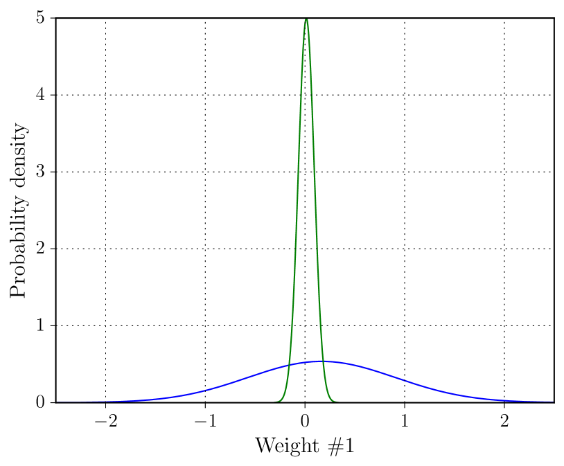
Line graph depicting probability density distributions.
## Axis Labels and Markers
- **X-axis**: "Weight #1" with markers at -2, -1, 0, 1, 2.
- **Y-axis**: "Probability density" with markers at 0, 1, 2, 3, 4, 5.
## Legend
- **Location**: Bottom-right corner.
- **Labels**:
- **Blue**: "Normal Distribution"
- **Green**: "Peak Distribution"
## Data Series Analysis
### Blue Line (Normal Distribution)
- **Trend**: Symmetric bell curve centered at x=0.
- **Key Points**:
- Peaks at y≈0.5 (x=0).
- Gradually declines to near 0 at x=±2.
- **Verification**: Matches standard normal distribution shape.
### Green Line (Peak Distribution)
- **Trend**: Narrow, sharp peak at x=0.
- **Key Points**:
- Peaks at y=5 (x=0).
- Rapidly declines to 0 at x=±0.1.
- **Verification**: Contrasts with blue line's spread; localized maximum.
## Component Isolation
1. **Header**: No explicit header text.
2. **Main Chart**:
- Gridlines: Dotted lines at x=±1, ±2 and y=1, 2, 3, 4.
- No annotations or embedded text within the plot area.
3. **Footer**: No footer text.
## Language and Data
- **Language**: English (no non-English text present).
- **Data Tables**: None present.
## Spatial Grounding
- **Legend**: Confirmed at bottom-right; colors match line assignments (blue=Normal, green=Peak).
## Summary
The graph compares two probability density functions:
1. **Normal Distribution** (blue): Broad, symmetric curve.
2. **Peak Distribution** (green): Sharp, localized spike at x=0.
No numerical data tables or additional categories are provided.