## Histogram: Price and Duration Distributions of o1-Preview
### Overview
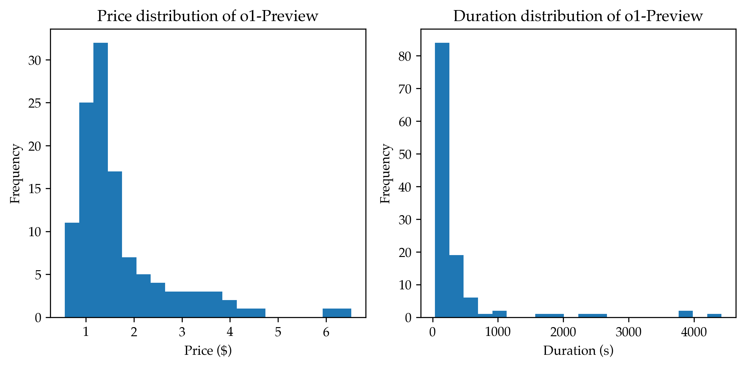
The image presents two histograms side-by-side. The left histogram displays the price distribution of "o1-Preview," while the right histogram shows the duration distribution of the same. Both histograms use frequency on the y-axis and price (in dollars) or duration (in seconds) on the x-axis.
### Components/Axes
**Left Histogram: Price Distribution**
* **Title:** Price distribution of o1-Preview
* **X-axis:** Price ($)
* Scale: 0 to 6, with tick marks at each integer value (1, 2, 3, 4, 5, 6).
* **Y-axis:** Frequency
* Scale: 0 to 30, with tick marks at intervals of 5 (5, 10, 15, 20, 25, 30).
**Right Histogram: Duration Distribution**
* **Title:** Duration distribution of o1-Preview
* **X-axis:** Duration (s)
* Scale: 0 to 4000, with tick marks at intervals of 1000 (1000, 2000, 3000, 4000).
* **Y-axis:** Frequency
* Scale: 0 to 80, with tick marks at intervals of 10 (10, 20, 30, 40, 50, 60, 70, 80).
### Detailed Analysis
**Left Histogram: Price Distribution**
* The distribution is heavily skewed to the right.
* The highest frequency occurs at a price of approximately $1, with a frequency of roughly 25.
* The frequency decreases as the price increases.
* Approximate Frequencies:
* $1: ~25
* $1.5: ~32
* $2: ~17
* $2.5: ~7
* $3: ~5
* $3.5: ~4
* $4: ~3
* $4.5: ~2
* $5: ~0
* $5.5: ~0
* $6: ~1
**Right Histogram: Duration Distribution**
* The distribution is heavily skewed to the right.
* The highest frequency occurs at a duration of approximately 0 seconds, with a frequency of roughly 83.
* The frequency decreases rapidly as the duration increases.
* Approximate Frequencies:
* 0s: ~83
* 500s: ~19
* 1000s: ~6
* 1500s: ~2
* 2000s: ~2
* 2500s: ~1
* 3000s: ~2
* 3500s: ~1
* 4000s: ~2
* 4500s: ~1
### Key Observations
* Both price and duration distributions are right-skewed, indicating that most items have low prices and short durations.
* There are a few items with significantly higher prices and durations, creating the long tail in the distributions.
### Interpretation
The histograms suggest that the "o1-Preview" dataset consists primarily of items with low prices and short durations. The right skew indicates the presence of outliers with higher prices and longer durations, but these are relatively rare compared to the majority of the data. This could imply that the dataset represents a service or product where most transactions are quick and inexpensive, but some involve more extended use or higher costs.