## Chart Type: Pie Chart
### Overview
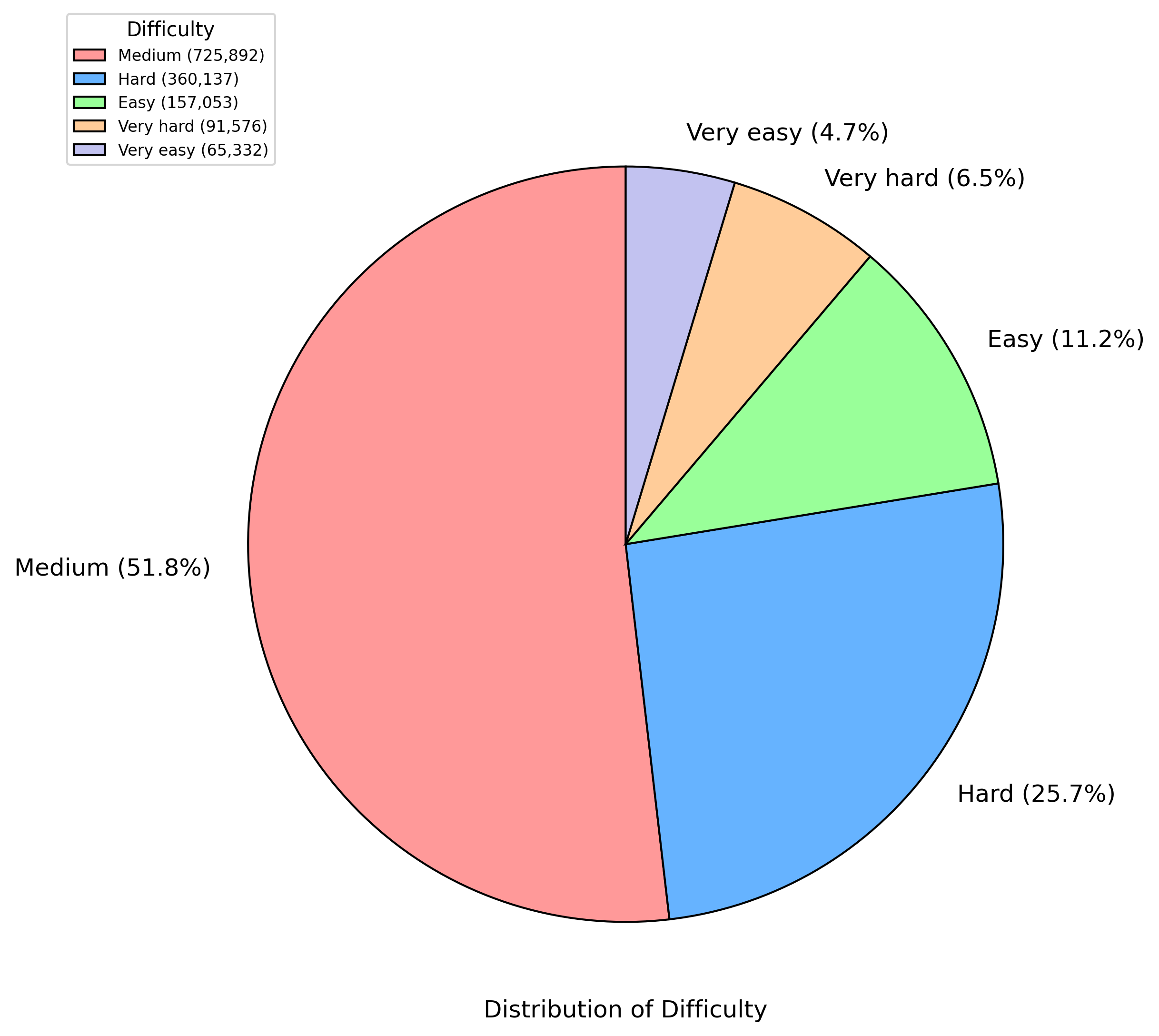
The image is a pie chart illustrating the distribution of difficulty levels. The chart is divided into five categories: Medium, Hard, Easy, Very hard, and Very easy. Each category is represented by a different color and its corresponding percentage and numerical value are displayed.
### Components/Axes
* **Title:** Distribution of Difficulty (located at the bottom center of the chart)
* **Legend:** Located at the top-left corner of the chart.
* **Medium:** Light red color, value (725,892)
* **Hard:** Light blue color, value (360,137)
* **Easy:** Light green color, value (157,053)
* **Very hard:** Light orange color, value (91,576)
* **Very easy:** Light purple color, value (65,332)
* **Pie Chart Slices:**
* **Medium:** Light red, 51.8%
* **Hard:** Light blue, 25.7%
* **Easy:** Light green, 11.2%
* **Very hard:** Light orange, 6.5%
* **Very easy:** Light purple, 4.7%
### Detailed Analysis
The pie chart is divided into five slices, each representing a different difficulty level. The size of each slice corresponds to the percentage of the total distribution that it represents.
* **Medium:** The largest slice, colored light red, represents 51.8% of the distribution, corresponding to a value of 725,892.
* **Hard:** The second-largest slice, colored light blue, represents 25.7% of the distribution, corresponding to a value of 360,137.
* **Easy:** The third-largest slice, colored light green, represents 11.2% of the distribution, corresponding to a value of 157,053.
* **Very hard:** The fourth-largest slice, colored light orange, represents 6.5% of the distribution, corresponding to a value of 91,576.
* **Very easy:** The smallest slice, colored light purple, represents 4.7% of the distribution, corresponding to a value of 65,332.
### Key Observations
* The "Medium" difficulty level accounts for the majority (51.8%) of the distribution.
* The "Hard" difficulty level is the second most common, accounting for 25.7% of the distribution.
* The "Very easy" and "Very hard" difficulty levels are the least common, accounting for 4.7% and 6.5% of the distribution, respectively.
### Interpretation
The pie chart indicates that the distribution of difficulty levels is skewed towards the "Medium" and "Hard" categories. This suggests that most of the tasks or activities being measured are of moderate difficulty. The relatively small percentages for "Very easy" and "Very hard" suggest that these extreme difficulty levels are less common. The data implies a general tendency towards tasks that are neither too simple nor overly challenging.