\n
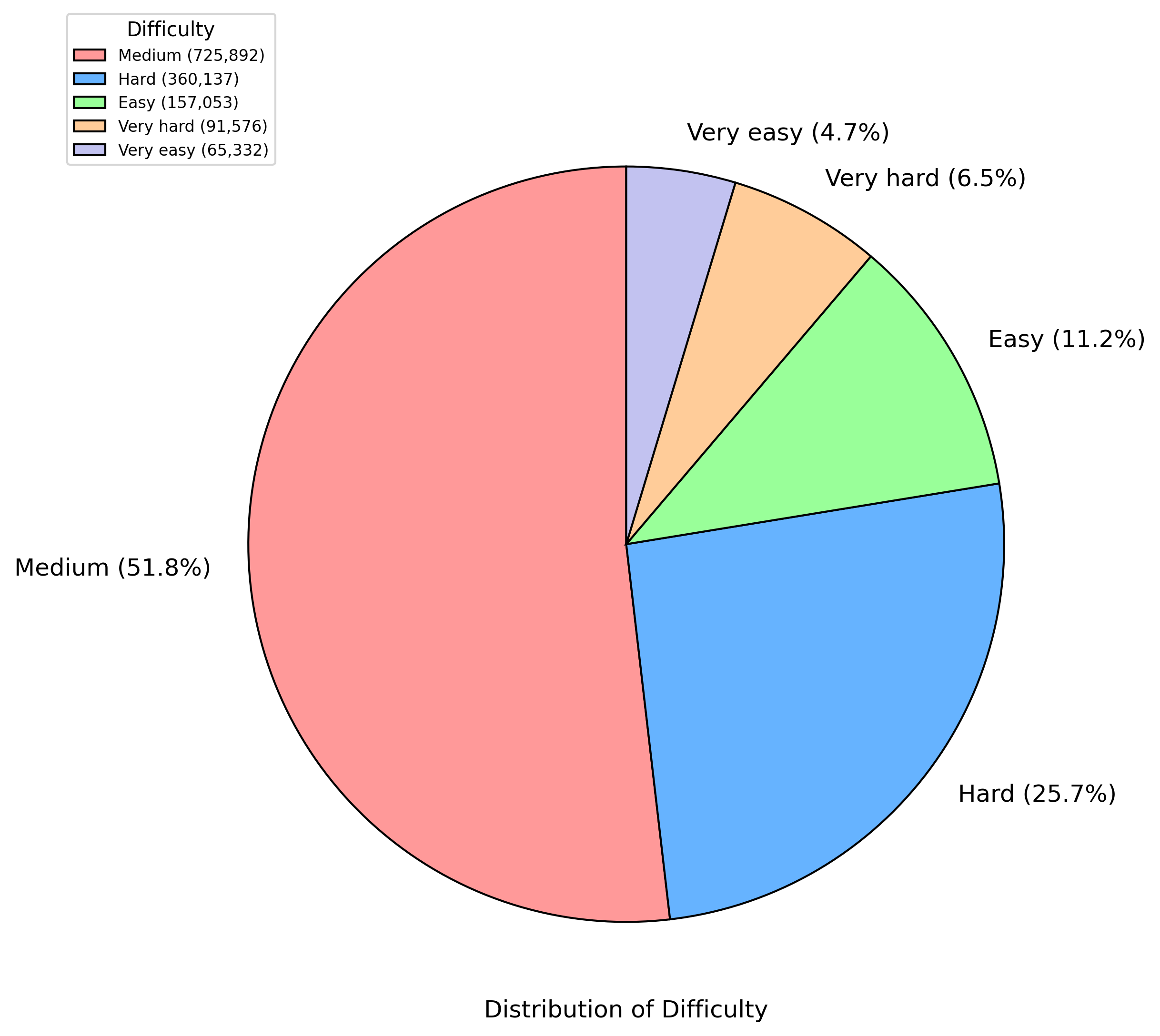
## Pie Chart: Distribution of Difficulty
### Overview
This image presents a pie chart illustrating the distribution of difficulty levels for a set of items (likely questions or tasks). The chart displays the percentage breakdown for each difficulty category: Very easy, Easy, Medium, Hard, and Very hard.
### Components/Axes
* **Title:** "Distribution of Difficulty" - positioned at the bottom center of the image.
* **Legend:** Located in the top-left corner of the image. It maps colors to difficulty levels and provides the corresponding counts in parentheses.
* Medium: Red (725,892)
* Hard: Blue (360,137)
* Easy: Green (157,053)
* Very hard: Orange (91,576)
* Very easy: Gray (65,332)
* **Pie Slices:** Each slice represents a difficulty level, with the size of the slice proportional to its percentage of the total. Each slice is labeled with the difficulty level and its percentage.
### Detailed Analysis
The pie chart shows the following distribution of difficulty levels:
* **Medium:** 51.8% (Red slice, largest portion of the pie)
* **Hard:** 25.7% (Blue slice, second largest portion)
* **Easy:** 11.2% (Green slice)
* **Very hard:** 6.5% (Orange slice)
* **Very easy:** 4.7% (Gray slice, smallest portion)
The total number of items represented is the sum of the counts for each difficulty level: 725,892 + 360,137 + 157,053 + 91,576 + 65,332 = 1,400,000 (approximately).
### Key Observations
* The majority of items are of Medium difficulty (51.8%).
* Hard difficulty items represent a significant portion (25.7%).
* Very easy items are the least represented (4.7%).
* The distribution is heavily skewed towards Medium and Hard difficulties.
### Interpretation
The data suggests that the set of items being analyzed is primarily composed of Medium and Hard difficulty levels. This could indicate a deliberate design choice to challenge users or a natural distribution based on the subject matter. The relatively small proportion of Very easy items suggests that the set is not intended for beginners or those seeking simple tasks. The difference between the number of Medium and Hard items is significant, suggesting that the set is more focused on providing a moderate challenge than a very difficult one. The data could be used to assess the overall difficulty of a test, a game, or a collection of tasks, and to identify areas where more easy or very easy items might be needed to provide a more balanced experience.