## Pie Chart: Distribution of Difficulty
### Overview
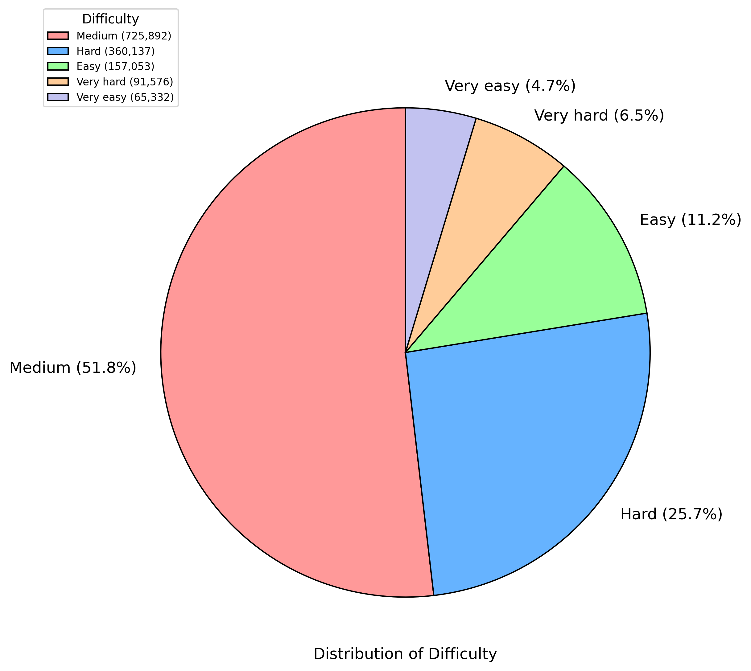
This image is a pie chart titled "Distribution of Difficulty." It visually represents the proportional distribution of items (likely problems, tasks, or questions) across five distinct difficulty levels. The chart includes a legend in the top-left corner and direct labels on each slice showing the percentage of the total.
### Components/Axes
* **Chart Title:** "Distribution of Difficulty" (located at the bottom center of the image).
* **Legend:** Positioned in the top-left corner. It is titled "Difficulty" and lists five categories with associated colors and absolute counts.
* **Data Slices:** Five colored slices, each labeled with a category name and its percentage of the whole. The slices are arranged clockwise starting from the top.
* **Language:** All text in the image is in English.
### Detailed Analysis
The chart breaks down a total dataset of 1,400,000 items (sum of counts from legend) into five difficulty categories. The data is as follows, listed clockwise from the top of the pie:
1. **Very easy**
* **Color:** Light purple/lavender (matches legend).
* **Position:** Top slice, starting at the 12 o'clock position.
* **Percentage:** 4.7%
* **Absolute Count (from legend):** 65,332
2. **Very hard**
* **Color:** Light orange/peach (matches legend).
* **Position:** Immediately clockwise from "Very easy."
* **Percentage:** 6.5%
* **Absolute Count (from legend):** 91,576
3. **Easy**
* **Color:** Light green (matches legend).
* **Position:** Immediately clockwise from "Very hard."
* **Percentage:** 11.2%
* **Absolute Count (from legend):** 157,053
4. **Hard**
* **Color:** Medium blue (matches legend).
* **Position:** Immediately clockwise from "Easy," occupying the lower-right quadrant.
* **Percentage:** 25.7%
* **Absolute Count (from legend):** 360,137
5. **Medium**
* **Color:** Light red/salmon (matches legend).
* **Position:** The largest slice, occupying the entire left half and part of the lower-right quadrant, from approximately the 6 o'clock position back to 12 o'clock.
* **Percentage:** 51.8%
* **Absolute Count (from legend):** 725,892
**Data Verification:** The percentages sum to 99.9% (4.7 + 6.5 + 11.2 + 25.7 + 51.8), which is within rounding error of 100%. The absolute counts sum to 1,400,000. The color of each slice corresponds exactly to its entry in the legend.
### Key Observations
* **Dominant Category:** The "Medium" difficulty level is the overwhelming majority, comprising more than half (51.8%) of all items.
* **Secondary Category:** "Hard" is the second-largest segment at 25.7%, making up about a quarter of the total.
* **Skew Towards Higher Difficulty:** Combining "Hard" and "Very hard" accounts for 32.2% of items. In contrast, combining "Easy" and "Very easy" accounts for only 15.9%. The distribution is skewed towards medium and harder difficulties.
* **Smallest Segment:** "Very easy" is the smallest category at 4.7%.
### Interpretation
This chart demonstrates a clear design or natural clustering of difficulty within the analyzed dataset. The central tendency is strongly towards "Medium" difficulty, suggesting this is the standard or most common level. The significant proportion of "Hard" items indicates a substantial subset designed to challenge users or separate performance levels. The relatively small percentage of "Easy" and "Very easy" items implies they may serve as introductory or baseline tasks rather than the core focus. The distribution is not symmetrical; there is a heavier tail on the harder side of the spectrum. This pattern is common in educational testing, skill assessments, or puzzle sets where the goal is to measure a range of abilities with a focus on differentiating at the intermediate to advanced levels.