## Line Chart: Accuracy vs. Thinking Compute for Different Methods
### Overview
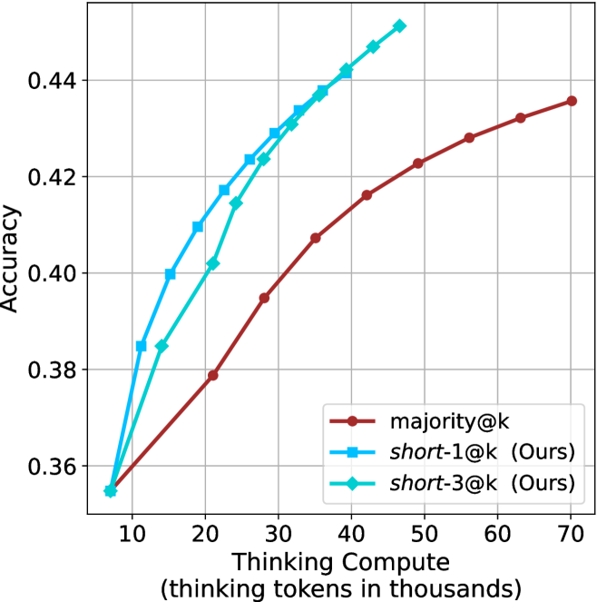
The image is a line chart comparing the performance of three different methods in terms of accuracy as a function of computational effort (thinking tokens). The chart demonstrates that two proposed methods ("short-1@k" and "short-3@k") achieve higher accuracy than a baseline method ("majority@k") for equivalent or lower computational cost.
### Components/Axes
* **Chart Type:** Line chart with markers.
* **X-Axis:**
* **Label:** `Thinking Compute (thinking tokens in thousands)`
* **Scale:** Linear, ranging from approximately 5 to 70.
* **Major Ticks:** 10, 20, 30, 40, 50, 60, 70.
* **Y-Axis:**
* **Label:** `Accuracy`
* **Scale:** Linear, ranging from approximately 0.35 to 0.45.
* **Major Ticks:** 0.36, 0.38, 0.40, 0.42, 0.44.
* **Legend:** Located in the bottom-right quadrant of the chart area.
* **Red line with circle markers:** `majority@k`
* **Blue line with square markers:** `short-1@k (Ours)`
* **Cyan line with diamond markers:** `short-3@k (Ours)`
* **Grid:** Light gray grid lines are present for both major x and y ticks.
### Detailed Analysis
**Data Series and Trends:**
1. **`majority@k` (Red line, circle markers):**
* **Trend:** Shows a steady, concave-down upward slope. The rate of accuracy improvement slows as compute increases.
* **Approximate Data Points:**
* (10, 0.355)
* (20, 0.378)
* (30, 0.395)
* (40, 0.407)
* (50, 0.416)
* (60, 0.422)
* (70, 0.435)
2. **`short-1@k (Ours)` (Blue line, square markers):**
* **Trend:** Shows a steep, nearly linear upward slope, consistently above the red line. It achieves the highest accuracy values on the chart for a given compute level.
* **Approximate Data Points:**
* (10, 0.355) - Starts at the same point as the other series.
* (20, 0.417)
* (30, 0.429)
* (40, 0.442)
* (50, 0.450) - Highest visible point on the chart.
3. **`short-3@k (Ours)` (Cyan line, diamond markers):**
* **Trend:** Shows a steep upward slope, very close to but slightly below the blue line (`short-1@k`). It is consistently above the red baseline.
* **Approximate Data Points:**
* (10, 0.355) - Starts at the same point as the other series.
* (20, 0.402)
* (30, 0.423)
* (40, 0.438)
* (50, 0.448)
### Key Observations
* **Common Origin:** All three methods begin at approximately the same accuracy (~0.355) when thinking compute is 10,000 tokens.
* **Performance Hierarchy:** For all compute levels >10k tokens, the order of performance from highest to lowest accuracy is: `short-1@k` > `short-3@k` > `majority@k`.
* **Efficiency Gap:** The performance gap between the proposed methods (blue/cyan) and the baseline (red) widens significantly as compute increases from 10k to 40k tokens.
* **Diminishing Returns:** All curves show signs of diminishing returns (flattening slope) at higher compute levels, but the baseline (`majority@k`) flattens most noticeably.
### Interpretation
This chart presents a compelling case for the efficiency of the authors' proposed methods (`short-1@k` and `short-3@k`). The core message is that these methods deliver superior accuracy (a ~5-7 percentage point advantage at 40k-50k tokens) compared to the `majority@k` baseline while using the same or fewer computational resources (thinking tokens).
The near-overlap of the two "short" methods suggests that the specific variant (`-1` vs `-3`) has a minor impact compared to the fundamental advantage they both hold over the baseline. The data implies that the proposed techniques are more effective at converting computational "thinking" into accurate outcomes. The widening gap in the mid-range of compute (20k-40k tokens) is particularly notable, indicating this is where the new methods offer the greatest relative benefit. The chart effectively argues that investing thinking tokens yields a better return on accuracy with the authors' approach.