\n
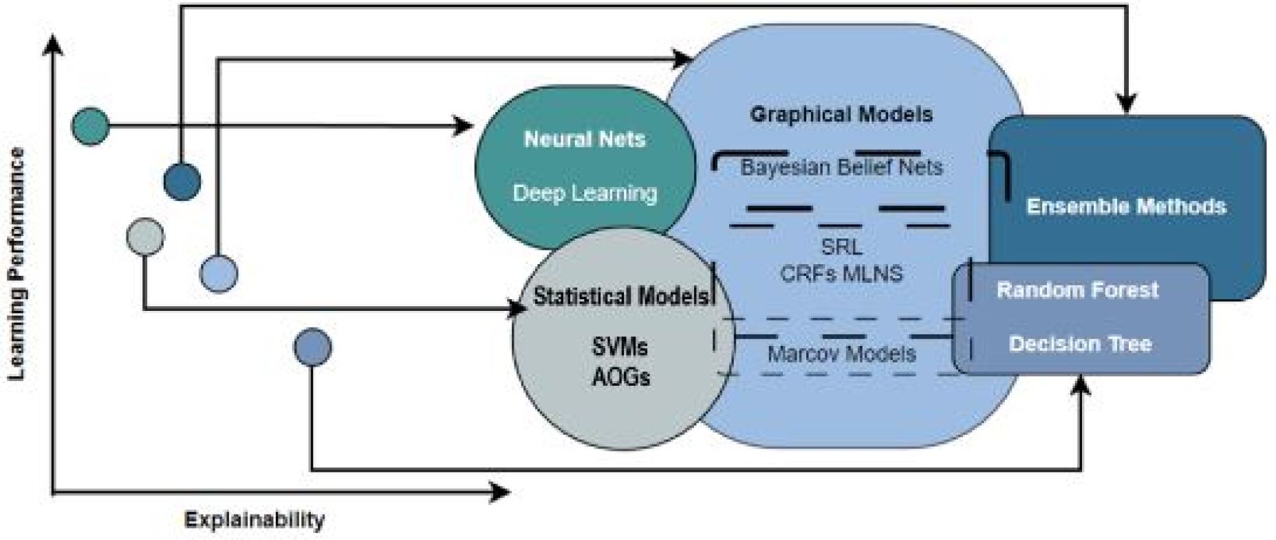
## Diagram: Machine Learning Model Landscape
### Overview
The image is a diagram illustrating a landscape of machine learning models, positioned based on their relative "Learning Performance" and "Explainability". The diagram uses overlapping circles and rectangles to represent different model categories, with arrows indicating relationships and flow between them. There are also several data points scattered around the diagram, presumably representing specific models or instances.
### Components/Axes
* **Axes:**
* Y-axis: "Learning Performance" (vertical)
* X-axis: "Explainability" (horizontal)
* **Model Categories (represented by shapes):**
* Neural Nets (Green Circle)
* Deep Learning (Text within circle)
* Graphical Models (Light Blue Circle)
* Bayesian Belief Nets (Text within circle)
* Statistical Models (Grey Circle)
* SVMs (Text within circle)
* AOGs (Text within circle)
* Ensemble Methods (Dark Blue Rectangle)
* Random Forest (Text within rectangle)
* Decision Tree (Text within rectangle)
* **Connecting Lines:** Dashed lines connect Statistical Models to Graphical Models and Ensemble Methods.
* **Data Points:** Five circular data points of varying sizes and shades of grey are scattered around the diagram.
### Detailed Analysis
The diagram positions models along a spectrum of Learning Performance and Explainability.
* **Neural Nets:** Located towards the upper-left, suggesting high learning performance but lower explainability.
* **Graphical Models:** Positioned slightly to the right of Neural Nets, indicating a balance between learning performance and explainability.
* **Statistical Models:** Located towards the lower-left, suggesting lower learning performance but potentially higher explainability.
* **Ensemble Methods:** Positioned towards the upper-right, suggesting high learning performance and relatively high explainability.
* **Data Points:**
* Top-left: Small, dark grey circle. (Approx. Learning Performance: 8, Explainability: 2)
* Top-center: Medium, dark grey circle. (Approx. Learning Performance: 9, Explainability: 4)
* Center-left: Small, light grey circle. (Approx. Learning Performance: 5, Explainability: 3)
* Bottom-center: Medium, light grey circle. (Approx. Learning Performance: 3, Explainability: 6)
* Bottom-right: Small, dark grey circle. (Approx. Learning Performance: 2, Explainability: 8)
The dashed lines indicate relationships between model types:
* Statistical Models connect to Graphical Models.
* Statistical Models connect to Ensemble Methods.
* Graphical Models connect to Ensemble Methods.
### Key Observations
* There's a general trend of increasing learning performance as explainability decreases, and vice-versa.
* Ensemble Methods appear to offer a good balance between the two.
* The data points are scattered, suggesting that within each category, there's variation in performance and explainability.
* The diagram doesn't provide specific numerical values for performance or explainability, only relative positioning.
### Interpretation
This diagram presents a conceptual map of machine learning models, highlighting the trade-off between learning performance and explainability. It suggests that choosing a model involves balancing these two factors based on the specific application.
The positioning of the models implies a hierarchy or relationship. For example, the connections between Statistical Models and other categories suggest that Statistical Models can serve as a foundation or component for more complex models. The data points likely represent individual models or datasets, demonstrating the variability within each category.
The diagram is a simplification of a complex landscape. It doesn't account for other important factors like computational cost, data requirements, or model complexity. However, it provides a useful framework for understanding the relative strengths and weaknesses of different machine learning approaches. The diagram is a qualitative representation, and the exact positioning of the models is subjective and depends on the specific context.