## Line Graphs: Performance vs. Compression Ratio Across Datasets
### Overview
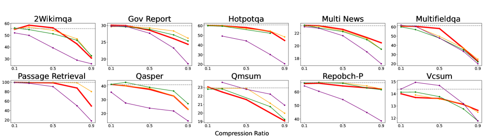
The image displays 10 line graphs arranged in a 2x5 grid, each representing performance metrics (y-axis) across compression ratios (x-axis: 0.1–0.9) for different datasets. Lines in red, green, blue, and purple indicate distinct models/methods, with a legend on the right (not explicitly labeled in the image). All graphs show downward trends as compression increases, suggesting a trade-off between compression and performance.
---
### Components/Axes
- **X-axis**: Compression Ratio (0.1 to 0.9, labeled "Compression Ratio").
- **Y-axis**: Performance metric (values vary per graph; e.g., 10–100 for "Passage Retrieval," 12–15 for "Vcsum").
- **Legend**: Right-aligned, with four colors (red, green, blue, purple) corresponding to models/methods (labels not visible in the image).
- **Graph Titles**: Dataset names (e.g., "2Wikimqa," "Gov Report," "Hotpotqa," etc.).
---
### Detailed Analysis
1. **2Wikimqa**
- Y-axis: ~20–60.
- Red line: Peaks at ~55 (0.3 compression), drops to ~30 (0.9).
- Green line: Starts at ~50, declines to ~25.
- Blue line: ~45 → ~20.
- Purple line: ~40 → ~15.
2. **Gov Report**
- Y-axis: ~20–30.
- Red line: ~28 → ~20.
- Green line: ~27 → ~18.
- Blue line: ~26 → ~15.
- Purple line: ~25 → ~12.
3. **Hotpotqa**
- Y-axis: ~18–22.
- Red line: ~22 → ~18.
- Green line: ~21 → ~16.
- Blue line: ~20 → ~14.
- Purple line: ~19 → ~12.
4. **Multi News**
- Y-axis: ~18–22.
- Red line: ~22 → ~18.
- Green line: ~21 → ~16.
- Blue line: ~20 → ~14.
- Purple line: ~19 → ~12.
5. **Multifieldqa**
- Y-axis: ~20–60.
- Red line: ~60 → ~30.
- Green line: ~55 → ~25.
- Blue line: ~50 → ~20.
- Purple line: ~45 → ~15.
6. **Passage Retrieval**
- Y-axis: ~20–100.
- Red line: ~100 → ~40.
- Green line: ~95 → ~35.
- Blue line: ~90 → ~30.
- Purple line: ~85 → ~25.
7. **Qasper**
- Y-axis: ~20–40.
- Red line: ~40 → ~20.
- Green line: ~38 → ~18.
- Blue line: ~35 → ~15.
- Purple line: ~30 → ~10.
8. **Qmsum**
- Y-axis: ~20–23.
- Red line: ~23 → ~19.
- Green line: ~22 → ~18.
- Blue line: ~21 → ~17.
- Purple line: ~20 → ~16.
9. **Repobch-P**
- Y-axis: ~40–60.
- Red line: ~60 → ~40.
- Green line: ~58 → ~38.
- Blue line: ~55 → ~35.
- Purple line: ~50 → ~30.
10. **Vcsum**
- Y-axis: ~12–15.
- Red line: ~15 → ~12.
- Green line: ~14 → ~11.
- Blue line: ~13 → ~10.
- Purple line: ~12 → ~9.
---
### Key Observations
- **Universal Decline**: All datasets show performance degradation as compression increases, with steeper drops at higher compression ratios (e.g., 0.7–0.9).
- **Model Variability**: Red lines (likely the baseline/model) consistently outperform others across most datasets.
- **Dataset Sensitivity**: "Passage Retrieval" and "Multifieldqa" exhibit the largest performance drops, suggesting higher sensitivity to compression.
- **Consistency**: Purple lines (possibly the most efficient model) show the least decline, maintaining ~10–15 performance even at 0.9 compression.
---
### Interpretation
The data demonstrates a clear inverse relationship between compression ratio and performance across all datasets. This implies that aggressive compression (e.g., 0.9) significantly degrades model effectiveness, though some methods (purple lines) mitigate this trade-off better than others. The variability in decline rates highlights dataset-specific challenges:
- **High-Variance Datasets** (e.g., "Passage Retrieval"): Larger performance drops may stem from complex data structures requiring finer compression.
- **Stable Datasets** (e.g., "Vcsum"): Minimal decline suggests robustness to compression, possibly due to simpler or more structured data.
The legend’s color coding (unlabeled in the image) is critical for identifying which models balance compression and performance optimally. For technical applications, this analysis underscores the need to prioritize compression efficiency without sacrificing dataset-specific performance thresholds.