## Scatter Plot: Music Genre Distribution
### Overview
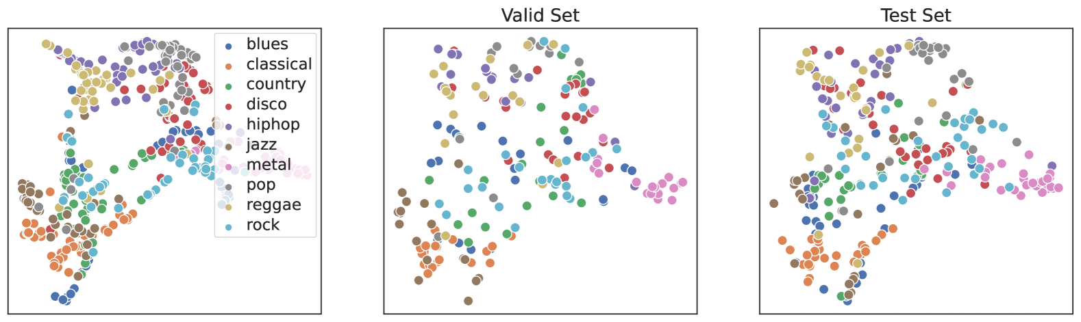
The scatter plot displays the distribution of various music genres across different data sets. The genres are represented by different colors, and the data points are scattered across the plot to show the spread and clustering of each genre.
### Components/Axes
- **X-axis**: Represents the range of values for one variable, likely the popularity or frequency of the genre.
- **Y-axis**: Represents the range of values for another variable, likely the diversity or variety of the genre.
- **Legend**: Located on the left side of the plot, it associates each color with a specific music genre.
- **Data Points**: Each point on the plot corresponds to a music genre and is colored according to the legend.
### Detailed Analysis or Content Details
- **Valid Set**: The data points in the "Valid Set" are more densely clustered, indicating a higher concentration of certain genres.
- **Test Set**: The "Test Set" shows a more dispersed distribution of genres, suggesting a broader range of musical styles.
### Key Observations
- **Clusters**: There are distinct clusters of genres, such as blues, jazz, and rock, which are more concentrated in the "Valid Set".
- **Outliers**: Some genres, like disco and hip-hop, are more spread out in the "Test Set".
- **Trends**: The overall trend shows a higher concentration of certain genres in the "Valid Set" compared to the "Test Set".
### Interpretation
The scatter plot suggests that the genres with higher popularity or frequency are more concentrated in the "Valid Set", indicating a more reliable or representative sample. The "Test Set" shows a broader range of genres, which could imply that the data is more diverse or that the "Test Set" is a smaller or less representative sample. The presence of outliers in the "Test Set" suggests variability in the data that may not be present in the "Valid Set".