TECHNICAL ASSET FINGERPRINT
514c63b0e55c04dd1571d0bd
Click to view fullscreen
Press ESC or click to close
FOUND IN PAPERS
EXPERT: healer-alpha-free VERSION 1
RUNTIME: free/openrouter/healer-alpha
INTEL_VERIFIED
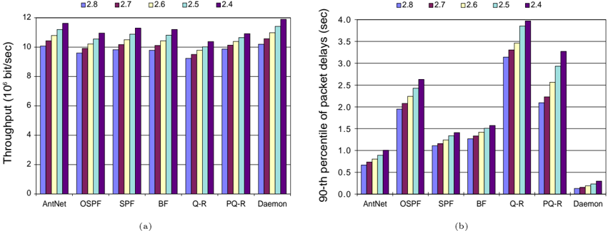
## Bar Charts: Network Protocol Performance Comparison
### Overview
The image displays two side-by-side grouped bar charts, labeled (a) and (b), comparing the performance of seven network routing/forwarding protocols or algorithms across five different configurations or scenarios. The charts measure two distinct performance metrics: throughput and packet delay.
### Components/Axes
**Common Elements:**
* **Legend:** Positioned at the top center of the entire figure. It defines five data series, labeled with numerical identifiers, each associated with a unique color:
* **2.8:** Blue
* **2.7:** Maroon/Dark Red
* **2.6:** Light Yellow/Cream
* **2.5:** Light Blue/Cyan
* **2.4:** Purple
* **X-Axis (Both Charts):** Lists seven categories (protocols/algorithms). From left to right: `AntNet`, `OSPF`, `SPF`, `BF`, `Q-R`, `PQ-R`, `Daemon`.
* **Chart Labels:** `(a)` is centered below the left chart. `(b)` is centered below the right chart.
**Chart (a) - Left:**
* **Title/Y-Axis Label:** `Throughput (10^6 bit/sec)` (Millions of bits per second).
* **Y-Axis Scale:** Linear scale from 0 to 12, with major tick marks every 2 units (0, 2, 4, 6, 8, 10, 12).
**Chart (b) - Right:**
* **Title/Y-Axis Label:** `90-th percentile of packet delays (sec)` (Seconds).
* **Y-Axis Scale:** Linear scale from 0.0 to 4.0, with major tick marks every 0.5 units (0.0, 0.5, 1.0, 1.5, 2.0, 2.5, 3.0, 3.5, 4.0).
### Detailed Analysis
**Chart (a): Throughput Analysis**
* **General Trend:** For most protocols, throughput generally increases as the legend value decreases (from 2.8 to 2.4). The purple bar (2.4) is consistently the tallest within each group.
* **Protocol-Specific Data Points (Approximate values in 10^6 bit/sec):**
* **AntNet:** Shows a steady increase. Blue (2.8) ≈ 10.0, Maroon (2.7) ≈ 10.5, Yellow (2.6) ≈ 10.8, Light Blue (2.5) ≈ 11.0, Purple (2.4) ≈ 11.5.
* **OSPF:** Similar increasing trend but slightly lower overall than AntNet. Blue ≈ 9.5, Maroon ≈ 10.0, Yellow ≈ 10.5, Light Blue ≈ 10.8, Purple ≈ 11.0.
* **SPF:** Bars are relatively close in height. Blue ≈ 10.0, Maroon ≈ 10.2, Yellow ≈ 10.5, Light Blue ≈ 10.8, Purple ≈ 11.2.
* **BF:** Clear increasing trend. Blue ≈ 9.8, Maroon ≈ 10.0, Yellow ≈ 10.5, Light Blue ≈ 10.8, Purple ≈ 11.2.
* **Q-R:** Shows a dip in the middle bars. Blue ≈ 9.2, Maroon ≈ 9.5, Yellow ≈ 9.8, Light Blue ≈ 10.0, Purple ≈ 10.5.
* **PQ-R:** Steady increase. Blue ≈ 9.8, Maroon ≈ 10.0, Yellow ≈ 10.5, Light Blue ≈ 10.8, Purple ≈ 11.0.
* **Daemon:** Highest overall throughput. Blue ≈ 10.2, Maroon ≈ 10.5, Yellow ≈ 11.0, Light Blue ≈ 11.5, Purple ≈ 11.9.
**Chart (b): 90th Percentile Packet Delay Analysis**
* **General Trend:** There is no uniform trend across all protocols. Some show increasing delay with lower legend values (e.g., OSPF, Q-R), while others are more stable or show mixed patterns.
* **Protocol-Specific Data Points (Approximate values in seconds):**
* **AntNet:** Low delay, slight increase. Blue ≈ 0.65, Maroon ≈ 0.75, Yellow ≈ 0.85, Light Blue ≈ 0.90, Purple ≈ 1.00.
* **OSPF:** Significant increase. Blue ≈ 1.90, Maroon ≈ 2.05, Yellow ≈ 2.25, Light Blue ≈ 2.40, Purple ≈ 2.60.
* **SPF:** Moderate increase. Blue ≈ 1.10, Maroon ≈ 1.15, Yellow ≈ 1.25, Light Blue ≈ 1.35, Purple ≈ 1.45.
* **BF:** Similar to SPF, slightly higher. Blue ≈ 1.25, Maroon ≈ 1.30, Yellow ≈ 1.40, Light Blue ≈ 1.50, Purple ≈ 1.60.
* **Q-R:** Highest delays, strong increase. Blue ≈ 3.10, Maroon ≈ 3.30, Yellow ≈ 3.50, Light Blue ≈ 3.80, Purple ≈ 3.90.
* **PQ-R:** High delays, increase. Blue ≈ 2.10, Maroon ≈ 2.20, Yellow ≈ 2.60, Light Blue ≈ 2.95, Purple ≈ 3.30.
* **Daemon:** Very low delay, minimal variation. All bars are below 0.5. Blue ≈ 0.15, Maroon ≈ 0.18, Yellow ≈ 0.22, Light Blue ≈ 0.28, Purple ≈ 0.35.
### Key Observations
1. **Performance Trade-off:** There is a clear inverse relationship between throughput and delay for several protocols. `Daemon` achieves the highest throughput *and* the lowest delay, making it the top performer in both metrics. Conversely, `Q-R` has moderate throughput but suffers from the highest packet delays.
2. **Impact of Configuration (Legend):** The configuration labeled `2.4` (purple) consistently yields the highest throughput for all protocols. However, its effect on delay is protocol-dependent: it increases delay significantly for `OSPF`, `Q-R`, and `PQ-R`, but only marginally for `AntNet` and `Daemon`.
3. **Protocol Clustering:** Protocols can be loosely grouped:
* **High-Throughput, Low-Delay:** `Daemon`.
* **High-Throughput, Moderate/High-Delay:** `AntNet`, `SPF`, `BF`, `PQ-R`.
* **Moderate-Throughput, High-Delay:** `Q-R`.
* **Lower-Throughput, Moderate-Delay:** `OSPF`.
4. **Anomaly:** The `Q-R` protocol in chart (a) shows a non-monotonic trend where the middle configurations (2.7, 2.6) have slightly lower throughput than the extremes (2.8, 2.4), which is not seen in other protocols.
### Interpretation
This data likely comes from a simulation or experimental study evaluating routing algorithms under different network conditions or parameter settings (represented by the legend values 2.4-2.8). The findings suggest:
* **`Daemon` is the most efficient protocol** in this test, excelling in both moving data quickly (throughput) and delivering it promptly (low delay). This could indicate an optimized, perhaps centralized or highly adaptive, algorithm.
* **`Q-R` and `PQ-R` (possibly Queue-based or Predictive Queue-based Routing) prioritize throughput but at a significant cost to latency.** This might be acceptable for bulk data transfer but problematic for real-time applications. The high 90th percentile delay indicates tail latency issues, meaning a significant fraction of packets experience very long delays.
* **Traditional protocols like `OSPF` (Open Shortest Path First) and `SPF` (Shortest Path First) show middling performance,** which is expected as they are designed for stability and simplicity rather than peak performance under all conditions.
* The **legend values (2.4-2.8) likely represent a key system parameter** such as network load, traffic burstiness, or a configuration threshold. The general trend of higher throughput at `2.4` suggests this setting might correspond to a less congested or more favorable operating point for these algorithms.
In summary, the charts provide a multi-metric comparison that reveals critical performance trade-offs, highlighting `Daemon` as a superior solution and exposing the latency weaknesses of queue-based approaches (`Q-R`, `PQ-R`) in the tested scenarios.
DECODING INTELLIGENCE...