\n
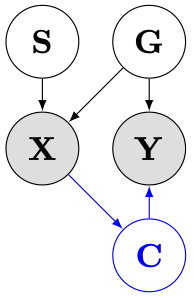
## Diagram: Causal Network
### Overview
The image depicts a directed acyclic graph representing a causal network. It shows relationships between variables labeled S, G, X, Y, and C, with arrows indicating the direction of influence. The nodes are represented as circles, with varying fill colors to potentially indicate different types of variables.
### Components/Axes
The diagram consists of five nodes:
* **S:** Located at the top-left.
* **G:** Located at the top-right.
* **X:** Located in the center-left, with a gray fill.
* **Y:** Located in the center-right, with a gray fill.
* **C:** Located at the bottom-center, with a blue outline.
There are five directed edges (arrows):
* S -> X (Black arrow)
* G -> X (Gray arrow)
* G -> Y (Black arrow)
* X -> C (Blue arrow)
* Y -> C (Black arrow)
### Detailed Analysis or Content Details
The diagram illustrates the following relationships:
1. **S influences X:** Variable S has a direct causal effect on variable X.
2. **G influences X and Y:** Variable G has a direct causal effect on both variable X and variable Y.
3. **X and Y influence C:** Variables X and Y both have a direct causal effect on variable C.
The arrows indicate the direction of causality. The gray fill of nodes X and Y might indicate they are intermediate variables or latent variables, while the blue outline of C might indicate it is the outcome variable of interest.
### Key Observations
* Variable C is influenced by two variables, X and Y.
* Variable X is influenced by two variables, S and G.
* Variable G acts as a common cause for both X and Y.
* The diagram represents a relatively simple causal structure.
### Interpretation
This diagram likely represents a simplified model of a causal system. It suggests that the outcome variable C is dependent on both X and Y, which are in turn influenced by S and G. The structure implies that intervening on S or G could potentially affect C, either directly or indirectly through X and Y. The diagram could be used to illustrate a hypothesis about the relationships between these variables, or to guide further investigation into the causal mechanisms at play. The different colors of the nodes and arrows may indicate different types of relationships or variables, but without further context, the specific meaning of these color distinctions is unclear. The diagram is a visual representation of a structural causal model, which is a tool used in causal inference to represent and reason about causal relationships.