## Comparative Line Charts: Model Performance Across Layers
### Overview
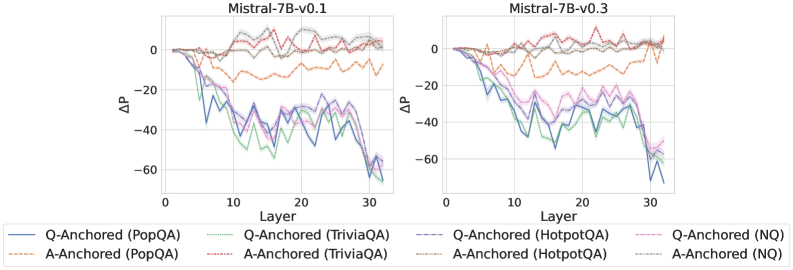
The image displays two side-by-side line charts comparing the performance change (ΔP) across 30 layers of two language model versions: **Mistral-7B-v0.1** (left chart) and **Mistral-7B-v0.3** (right chart). Each chart plots the performance delta for four different question-answering (QA) datasets, using two distinct anchoring methods: "Q-Anchored" (solid lines) and "A-Anchored" (dashed lines).
### Components/Axes
* **Chart Titles:**
* Left Chart: `Mistral-7B-v0.1`
* Right Chart: `Mistral-7B-v0.3`
* **X-Axis (Both Charts):**
* Label: `Layer`
* Scale: Linear, from 0 to 30, with major ticks at 0, 10, 20, 30.
* **Y-Axis (Both Charts):**
* Label: `ΔP` (Delta P, likely representing a change in performance or probability).
* Scale: Linear, from -60 to 0, with major ticks at -60, -40, -20, 0.
* **Legend (Located below both charts):**
* The legend contains 8 entries, mapping line color and style to a specific dataset and anchoring method.
* **Q-Anchored (Solid Lines):**
* Blue: `Q-Anchored (PopQA)`
* Green: `Q-Anchored (TriviaQA)`
* Purple: `Q-Anchored (HotpotQA)`
* Pink: `Q-Anchored (NQ)`
* **A-Anchored (Dashed Lines):**
* Orange: `A-Anchored (PopQA)`
* Red: `A-Anchored (TriviaQA)`
* Brown: `A-Anchored (HotpotQA)`
* Gray: `A-Anchored (NQ)`
### Detailed Analysis
**Chart 1: Mistral-7B-v0.1**
* **A-Anchored Lines (Dashed):** All four dashed lines (Orange, Red, Brown, Gray) remain relatively high and stable, fluctuating mostly between ΔP = -20 and 0 across all layers. They show minor dips but no severe downward trend.
* **Q-Anchored Lines (Solid):** All four solid lines (Blue, Green, Purple, Pink) show a pronounced downward trend as layer number increases.
* They start near ΔP = 0 at Layer 0.
* They begin a steep decline around Layer 5-10.
* They reach their lowest points (most negative ΔP) between Layers 25-30.
* **Approximate Trough Values (Layer ~30):**
* Blue (PopQA): ~ -60
* Green (TriviaQA): ~ -55
* Purple (HotpotQA): ~ -50
* Pink (NQ): ~ -45
* The lines are tightly clustered, with Blue (PopQA) generally being the lowest.
**Chart 2: Mistral-7B-v0.3**
* **A-Anchored Lines (Dashed):** Similar to v0.1, the dashed lines remain in the upper region (ΔP between -20 and 0). The Orange (PopQA) line appears slightly more volatile, with a notable dip around Layer 15.
* **Q-Anchored Lines (Solid):** The downward trend is even more severe and consistent compared to v0.1.
* The decline starts earlier, around Layer 3-5.
* The lines are more tightly grouped during the descent.
* They reach lower troughs overall.
* **Approximate Trough Values (Layer ~30):**
* Blue (PopQA): ~ -65
* Green (TriviaQA): ~ -60
* Purple (HotpotQA): ~ -55
* Pink (NQ): ~ -50
* The final drop from Layer 25 to 30 is particularly sharp for all Q-Anchored series.
### Key Observations
1. **Anchoring Method Dominance:** Across both model versions and all datasets, the **A-Anchored (dashed) method consistently results in significantly higher ΔP values** (closer to zero) than the Q-Anchored (solid) method. This is the most striking pattern.
2. **Layer-Dependent Degradation:** Performance change (ΔP) for the Q-Anchored method degrades dramatically with increasing layer depth. The effect is non-linear, with the steepest decline occurring in the middle to later layers (10-30).
3. **Model Version Comparison:** The degradation trend for Q-Anchored methods is **more severe in Mistral-7B-v0.3** than in v0.1. The lines descend faster and reach lower minima in the v0.3 chart.
4. **Dataset Variation:** Within the Q-Anchored group, the **PopQA dataset (Blue line) consistently shows the largest negative ΔP**, followed by TriviaQA, HotpotQA, and NQ. This hierarchy is consistent across both model versions.
5. **Stability of A-Anchored:** The A-Anchored lines, while showing some noise, do not exhibit the systematic layer-dependent collapse seen in the Q-Anchored lines.
### Interpretation
This data suggests a fundamental difference in how information is processed or retained across the layers of the Mistral-7B model depending on the anchoring strategy.
* **A-Anchored vs. Q-Anchored:** The "A-Anchored" method (likely anchoring on the *Answer*) appears to create a more stable representation that is robust to the transformations occurring across the model's depth. In contrast, the "Q-Anchored" method (anchoring on the *Question*) leads to representations that progressively diverge or degrade as they pass through subsequent layers, resulting in a large negative ΔP. This could indicate that answer-centric representations are more invariant within the model's processing pipeline.
* **Layer-wise Function:** The charts imply that the model's middle and later layers (10-30) are where the most significant transformation or "drift" occurs for question-anchored representations. The early layers (0-5) show minimal change.
* **Model Evolution:** The increased degradation in v0.3 suggests that the updates between model versions may have altered the internal processing dynamics, making the question-anchored pathway even more susceptible to layer-wise transformation. This could be a side effect of other training improvements.
* **Dataset Difficulty:** The consistent ordering of datasets (PopQA > TriviaQA > HotpotQA > NQ in terms of negative ΔP) might reflect inherent properties of the datasets, such as the complexity or specificity of the questions, which affects how stable their anchored representations are through the network.
**In summary, the visualization provides strong evidence that the choice of anchoring point (Question vs. Answer) is a critical factor influencing the stability of internal representations across the layers of a large language model, with answer anchoring providing far greater robustness.**