## Line Chart: Model Performance
### Overview
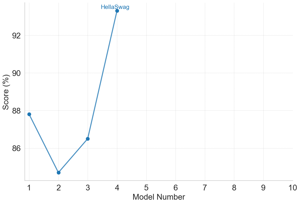
The image is a line chart showing the performance score (in percentage) of different models, numbered 1 through 10. The chart displays a single data series, represented by a blue line, that illustrates the score of each model. The model "HellaSwag" is specifically labeled at its data point.
### Components/Axes
* **X-axis:** "Model Number", with tick marks at each integer from 1 to 10.
* **Y-axis:** "Score (%)", ranging from 86 to 92, with tick marks at each integer value.
* **Data Series:** A single blue line representing the performance score of each model.
* **Label:** "HellaSwag" is written in blue text above the data point for Model Number 4.
### Detailed Analysis
The blue line represents the performance of the models.
* **Model 1:** Score is approximately 87.8%.
* **Model 2:** Score is approximately 84.8%.
* **Model 3:** Score is approximately 86.5%.
* **Model 4 (HellaSwag):** Score is approximately 93.2%.
* **Models 5-10:** No data is shown for these models.
The line initially slopes downward from Model 1 to Model 2, then slopes upward from Model 2 to Model 4.
### Key Observations
* Model 4, labeled "HellaSwag", has the highest score among the models shown.
* Model 2 has the lowest score.
* There is a significant increase in score from Model 3 to Model 4.
* The chart only shows data for models 1 through 4.
### Interpretation
The chart compares the performance scores of different models. "HellaSwag" (Model 4) significantly outperforms the other models shown in the chart. The initial dip in performance from Model 1 to Model 2 suggests that some models may perform worse than others, but subsequent improvements are possible, as seen with Model 3 and "HellaSwag". The absence of data for models 5-10 makes it impossible to compare their performance to the first four models.