TECHNICAL ASSET FINGERPRINT
51e938cdc2183d924c1831f9
Click to view fullscreen
Press ESC or click to close
FOUND IN PAPERS
EXPERT: gemini-2.5-flash-free VERSION 1
RUNTIME: google-free/gemini-2.5-flash
INTEL_VERIFIED
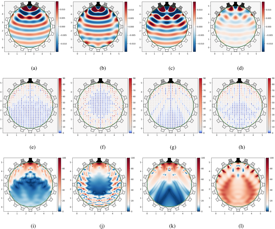
## Grid of Acoustic Field Visualizations
### Overview
The image displays a 12-panel grid of scientific visualizations, arranged in 3 rows and 4 columns, labeled (a) through (l). Each panel depicts a physical field within a circular domain, approximately 5 units in diameter, with a series of 16 grey rectangular elements (likely transducers or sensors) and a larger black irregular shape positioned along the top edge of the circle. The plots in the first row (a-d) are scalar field contour plots with a bipolar color scale. The plots in the second row (e-h) are vector field plots overlaid on a scalar field, using a unipolar color scale. The plots in the third row (i-l) are scalar field contour plots, also using a unipolar color scale.
### Components/Axes
* **Overall Structure**: The image is a 3x4 grid of subplots, labeled (a) through (l) from left to right, top to bottom, centered below each plot.
* **Domain**: Each subplot features a circular domain, outlined in green, approximately centered within the plot area. The domain spans roughly from x=0 to x=5 and y=0 to y=5.
* **Transducers/Sensors**: Along the top edge of the circular domain, there is a black, irregular, somewhat jagged shape, and 16 distinct grey rectangular elements arranged in an arc. These elements are consistently present across all 12 subplots.
* **X-axis**: For all subplots, the horizontal axis is labeled from 0 to 5, with major ticks at 0, 1, 2, 3, 4, 5.
* **Y-axis**: For all subplots, the vertical axis is labeled from 0 to 5, with major ticks at 0, 1, 2, 3, 4, 5.
* **Color Legends**: Each subplot has a vertical color bar (legend) positioned on its right side, indicating the mapping of colors to numerical values.
### Detailed Analysis
#### Row 1: Scalar Field Contour Plots (a-d)
These plots visualize a scalar field with both positive and negative values.
* **Color Legend**: Ranges from -0.010 (dark blue) at the bottom to 0.010 (dark red) at the top. The midpoint, 0.000, is represented by a light beige/white color. Intermediate ticks are at -0.005 and 0.005.
* **(a)**: Shows horizontal wave-like patterns. Strong positive values (red) are observed in bands around y=4.0 and y=2.5. Strong negative values (blue) are in bands around y=3.2 and y=1.5. The pattern is largely symmetrical across the vertical midline.
* **(b)**: Similar horizontal wave patterns to (a), but with a slight vertical shift or phase difference. Strong positive values (red) are prominent around y=4.5 and y=2.8. Strong negative values (blue) are around y=3.5 and y=1.8.
* **(c)**: Displays a more complex, localized pattern. A strong red region is near the top-center (y~4.5). Two smaller, distinct red regions are located symmetrically around y=2.5, at x~1.5 and x~3.5. Blue regions are more concentrated in the lower half, forming a "W" or "M" shape, with strong negative values around y=1.0-2.0.
* **(d)**: Features a pattern with a central red region near y=4.0, flanked by blue regions, then red regions, then blue regions towards the bottom. The patterns are more concentrated and less uniform than (a) and (b), showing distinct lobes of positive and negative values.
#### Row 2: Vector Field Plots (e-h)
These plots visualize a vector field, with arrows indicating direction, overlaid on a scalar field represented by color.
* **Color Legend**: Ranges from 0 (dark blue) at the bottom to 90 (dark red) at the top. Intermediate ticks are at 10, 20, 30, 40, 50, 60, 70, 80. This scale likely represents the magnitude of the vectors or an associated scalar quantity.
* **(e)**: Vectors predominantly point downwards. The upper half of the circular domain shows lighter colors (yellow/orange, values ~50-70), indicating higher scalar values, with dense downward-pointing vectors. The lower half is darker blue (values ~10-30), with less dense or shorter downward-pointing vectors.
* **(f)**: Similar to (e), vectors generally point downwards. The region of higher scalar values (reddish, ~50-70) is more concentrated towards the top-center, forming a "V" or inverted "U" shape. The lower region remains darker blue (lower values).
* **(g)**: Vectors generally point downwards, exhibiting a clear divergence pattern. Vectors near the top-center point straight down. Vectors towards the sides point downwards and slightly inwards. The scalar field shows a central dark blue (low value) region extending downwards, flanked by lighter blue/red (higher value) regions.
* **(h)**: Vectors generally point downwards, with a more pronounced inward curvature towards the bottom compared to (g). The scalar field shows a central dark blue (low value) region extending downwards, similar to (g), but the higher value regions are more spread out laterally.
#### Row 3: Scalar Field Contour Plots (i-l)
These plots visualize a scalar field with only positive values.
* **Color Legend**: Ranges from 0 (dark blue) at the bottom to 100 (dark red) at the top. Intermediate ticks are at 20, 40, 60, 80.
* **(i)**: Shows a strong blue (low value) region in the lower half of the domain, forming a broad "U" shape opening upwards. The upper half, particularly near the transducers, shows red (high value) regions.
* **(j)**: Displays a complex, intricate pattern. A central blue (low value) region forms an irregular "blob" in the middle-lower part of the domain. Red (high value) regions are concentrated near the transducers and form complex, swirling patterns around the central blue region.
* **(k)**: Features a distinct "V" shape of dark blue (low values) originating from the top-center and extending downwards towards the bottom of the circle. The regions outside this "V" are predominantly red (high values), especially near the transducers and along the sides of the "V".
* **(l)**: Shows a dominant red (high value) region covering most of the domain, particularly the lower half, forming a broad "U" shape. Blue (low value) regions are concentrated near the transducers and form thin, intricate patterns around the edges of the red regions, especially in the upper half.
### Key Observations
* The circular domain and the transducer-like elements at the top suggest these plots represent physical fields (e.g., acoustic, electromagnetic) within a confined space.
* The first row (a-d) shows oscillating fields (positive and negative values), characteristic of wave amplitudes or potentials. The patterns evolve from more uniform horizontal waves to more complex, localized interference patterns.
* The second row (e-h) visualizes vector fields, likely representing flux or velocity, with a general downward propagation from the transducer region. The scalar background in this row seems to represent the magnitude of this field or a related quantity.
* The third row (i-l) shows fields with only positive values, possibly representing intensity, power, or squared amplitude. These plots demonstrate various focusing and spreading patterns, including broad low-intensity regions (i), complex distributions (j), a highly focused low-intensity beam (k), and a broad high-intensity region (l).
* The progression across columns (a-d, e-h, i-l) indicates a systematic change in the field patterns, which could correspond to different excitation modes, frequencies, or time steps of the transducers.
### Interpretation
The collection of plots likely illustrates different aspects of wave propagation or field distribution generated by an array of transducers positioned at the top of a circular medium.
* **Wave Phenomena**: The bipolar nature of the first row (a-d) strongly suggests the visualization of wave amplitudes (e.g., pressure, displacement). The transition from relatively simple, horizontal wavefronts in (a) and (b) to more complex, localized patterns in (c) and (d) could represent different modes of excitation, interference patterns from multiple sources, or snapshots of a propagating wave at different times.
* **Energy/Flux Distribution**: The vector fields in the second row (e-h) likely represent the direction and magnitude of energy flow or particle velocity within the medium. The consistent downward direction of the vectors indicates that the transducers are acting as sources, directing energy into the circular domain. The variations in vector density and underlying scalar field (color) suggest different beamforming or focusing capabilities. For instance, (g) and (h) show patterns indicative of a more focused or channeled energy propagation.
* **Intensity/Power Maps**: The unipolar scalar fields in the third row (i-l) are consistent with visualizations of wave intensity or power, which are always non-negative. These plots demonstrate the spatial distribution of energy. Plot (k), with its distinct "V" shape of low intensity, strongly suggests a focused "null" or region of destructive interference, while the surrounding red areas indicate high intensity. Conversely, (l) shows a broad region of high intensity, possibly a wide beam or diffuse field. These variations highlight the ability to control the spatial distribution of energy within the medium using the transducer array.
In summary, the images provide a comprehensive view of how an array of transducers can generate and shape various physical fields within a circular domain, showcasing wave amplitudes, energy flow, and intensity distributions under different operational conditions or modes. The green circle defines the boundary of the medium, which likely influences the observed wave patterns through reflection or absorption.
DECODING INTELLIGENCE...