TECHNICAL ASSET FINGERPRINT
51e938cdc2183d924c1831f9
Click to view fullscreen
Press ESC or click to close
FOUND IN PAPERS
EXPERT: gemini-2.5-flash-lite-free VERSION 1
RUNTIME: google-free/gemini-2.5-flash-lite
INTEL_VERIFIED
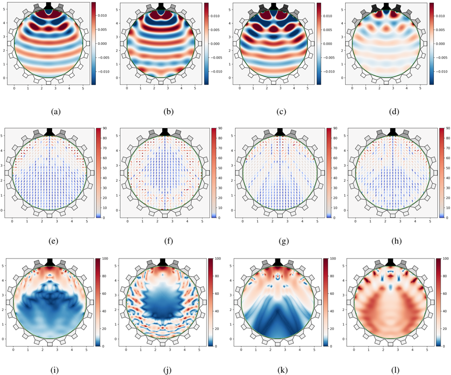
## Multiple Plots: Analysis of Circular Domain Phenomena
### Overview
This image displays a 3x4 grid of plots, each depicting a circular domain with a series of external elements resembling speakers or sensors arranged around its perimeter. The plots are labeled (a) through (l) and appear to visualize different physical phenomena within this circular domain, likely related to wave propagation, field distributions, or vector quantities. The plots can be broadly categorized into three rows: the top row (a-d) shows scalar field distributions, the middle row (e-h) shows vector fields represented by arrows, and the bottom row (i-l) shows another type of scalar field distribution, possibly related to magnitude or intensity.
### Components/Axes
**General Components across all plots:**
* **Circular Domain:** A green circle representing the boundary of the area of interest.
* **External Elements:** A series of grey, gear-like shapes are positioned around the top and sides of the circular domain, with some black elements at the very top center. These likely represent sources or detectors.
* **Radial and Angular Axes:** Each plot has a radial axis (y-axis) ranging from 0 to 5, and an implied angular axis represented by the circular arrangement. The x-axis appears to represent a linear projection or a specific angular slice, also ranging from 0 to 5.
* **Colorbars/Legends:** Each plot has an associated colorbar on its right side, indicating the scale and mapping of colors to values.
* **Labels:** Each plot is individually labeled with a letter from (a) to (l) below it.
**Specific Axes and Legends:**
* **Plots (a) - (d):**
* **Y-axis (Radial):** Labeled from 0 to 5.
* **X-axis:** Labeled from 0 to 5.
* **Colorbar:** Ranges from -0.010 to 0.010, with ticks at -0.010, -0.005, 0.000, 0.005, 0.010. The color mapping is from blue (negative values) through white (zero) to red (positive values).
* **Plots (e) - (h):**
* **Y-axis (Radial):** Labeled from 0 to 5.
* **X-axis:** Labeled from 0 to 5.
* **Colorbar:** Ranges from 0 to 90, with ticks at 0, 10, 20, 30, 40, 50, 60, 70, 80, 90. The color mapping is from blue (low values) through white/light red to red (high values).
* **Vector Arrows:** Arrows are overlaid on the color map. The color of the arrow appears to correspond to the color map, and the length and direction of the arrow represent a vector quantity.
* **Plots (i) - (l):**
* **Y-axis (Radial):** Labeled from 0 to 5.
* **X-axis:** Labeled from 0 to 5.
* **Colorbar:** Ranges from 0 to 100, with ticks at 0, 20, 40, 60, 80, 100. The color mapping is from blue (low values) through white/light red to red (high values).
### Detailed Analysis or Content Details
**Row 1: Scalar Fields (a-d)**
These plots visualize a scalar field within the circular domain. The patterns suggest wave-like phenomena or modes.
* **(a):** Shows a pattern with strong positive (red) and negative (blue) regions, with nodal lines (white, near zero). The pattern is roughly symmetric, with maxima and minima concentrated towards the top and bottom of the circle. Approximately 3-4 horizontal wave crests/troughs are visible.
* **(b):** Similar to (a) but with a slightly different phase or mode. The wave patterns are more elongated horizontally. Approximately 3-4 horizontal wave crests/troughs are visible.
* **(c):** Displays a more complex, multi-lobed pattern. There are distinct regions of positive and negative values, with more intricate nodal lines. The pattern appears to have more angular variation. Approximately 4-5 distinct lobes are visible.
* **(d):** Shows a pattern with fewer, broader oscillations compared to (c). The positive and negative regions are more spread out. Approximately 2-3 broad wave crests/troughs are visible.
**Row 2: Vector Fields (e-h)**
These plots visualize vector fields. The arrows indicate direction, and their color (and potentially length, though not explicitly stated) indicates magnitude. The color scale ranges from 0 to 90.
* **(e):** The arrows are predominantly pointing radially inwards towards the center of the circle, especially in the upper half. The magnitudes are generally higher in the upper half (indicated by redder colors, ~60-80) and decrease towards the bottom (bluer colors, ~0-40).
* **(f):** Similar to (e) but with more variation in arrow direction, particularly in the upper regions. Some arrows show a slight tangential component. Magnitudes are still higher in the upper half.
* **(g):** The vector field shows a more complex flow pattern. Arrows are directed inwards and also have a significant tangential component, creating a swirling or rotational motion, particularly in the upper half. Magnitudes are high in the upper regions.
* **(h):** The vector field shows a pattern with arrows predominantly pointing radially outwards from the center, especially in the upper half. Magnitudes are high in the upper regions.
**Row 3: Scalar Fields (i-l)**
These plots visualize another scalar field, likely representing magnitude, intensity, or a derived quantity. The color scale ranges from 0 to 100.
* **(i):** Shows high values (red, ~80-100) concentrated in the upper central region, tapering down towards the sides and bottom. There is a distinct V-shaped region of lower values (blue, ~0-40) extending from the top center downwards.
* **(j):** Displays a more fragmented and oscillatory pattern of high and low values. High values (red) are present in the upper regions, but with significant fluctuations and localized peaks. Blue regions (low values) are interspersed.
* **(k):** Shows a pattern with high values (red, ~80-100) concentrated in the upper central region, with distinct radial "beams" or streaks of high values extending downwards and outwards. There are also significant blue regions (low values) between these beams.
* **(l):** Displays a broad, symmetric distribution of high values (red, ~80-100) concentrated in the upper central region, with a gradual decrease in magnitude towards the sides and bottom. The pattern is smoother than in (j) and (k).
### Key Observations
* **Symmetry:** Many of the patterns exhibit some degree of radial or angular symmetry, particularly in the first and third rows.
* **Top-Center Dominance:** In the vector plots (e-h) and the scalar plots of the third row (i-l), the phenomena are most pronounced in the upper central region, directly below the black elements at the top.
* **Wave-like Behavior:** The first row clearly depicts wave phenomena with crests, troughs, and nodes.
* **Directional Flow:** The second row illustrates directional flow, with patterns of inward, outward, and tangential movement.
* **Intensity/Magnitude:** The third row likely represents the magnitude or intensity of a field, showing localized peaks and distributions.
* **Correlation between Rows:** There appears to be a correlation between the rows. For example, the regions of high magnitude in row 3 (e.g., plot (i)) might correspond to areas of strong vector activity in row 2 (e.g., plot (e)). The wave patterns in row 1 might be related to the underlying fields visualized in rows 2 and 3.
### Interpretation
The collection of plots suggests a simulation or experimental measurement of a physical system within a circular boundary, likely driven by sources or influenced by conditions at the perimeter.
* **Row 1 (a-d):** These plots likely represent different modes or frequencies of a wave phenomenon, such as acoustic waves, electromagnetic fields, or fluid dynamics. The distinct patterns indicate the spatial distribution of a scalar quantity (e.g., pressure, electric potential, velocity component) at specific conditions. The variation from (a) to (d) suggests changes in frequency, source configuration, or boundary conditions.
* **Row 2 (e-h):** These plots visualize vector fields, which could represent forces, velocities, or gradients. The arrows indicate direction, and their color suggests magnitude.
* Plots (e) and (f) show predominantly inward-pointing vectors, suggesting a convergence or absorption of some quantity.
* Plot (g) shows a rotational or swirling component, indicating a more complex flow or interaction.
* Plot (h) shows outward-pointing vectors, suggesting a divergence or emission.
The concentration of high magnitudes in the upper region implies that the driving forces or phenomena are strongest there, possibly originating from the black elements at the top.
* **Row 3 (i-l):** These plots likely represent the magnitude or intensity of a field, or perhaps a derived quantity like energy density or power.
* The V-shaped or beam-like structures in (i) and (k) suggest focused energy or propagation along specific paths.
* The more diffuse and oscillatory patterns in (j) and (l) might represent interference, scattering, or different excitation states.
**Interrelation:** The data suggests a system where external inputs (represented by the perimeter elements) generate complex internal fields. The wave patterns in row 1 might be the result of these fields. The vector fields in row 2 describe the motion or forces associated with these phenomena, and the scalar fields in row 3 quantify their strength or impact. For instance, a strong inward flow (e) might be associated with a region of high energy density (i) and a particular wave mode (a). The black elements at the top are likely the primary sources or activators of these phenomena, as the effects are most pronounced directly below them. The circular arrangement of external elements suggests a system that could be used for directional control, focusing, or sensing within the circular domain. The variations across the plots within each row indicate that different parameters (e.g., frequency, amplitude, phase of the external sources) lead to distinct internal field configurations.
DECODING INTELLIGENCE...