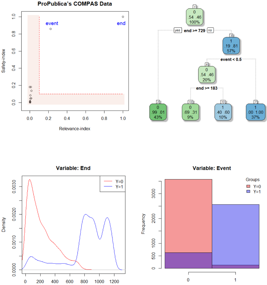
## Chart/Diagram Type: Multi-Panel Data Visualization of ProPublica's COMPAS Data
### Overview
The image presents a multi-panel visualization of ProPublica's COMPAS data, including a scatter plot, a decision tree, density plots, and a bar chart. These visualizations explore the relationships between variables such as "Relevance-index," "Safety-index," "End," and "Event."
### Components/Axes
**Panel 1: Scatter Plot**
* **Title:** ProPublica's COMPAS Data
* **X-axis:** Relevance-index (scale: 0.0 to 1.0, increments of 0.2)
* **Y-axis:** Safety-index (scale: 0.0 to 1.0, increments of 0.2)
* **Data Points:**
* A cluster of points near (0.0, 0.0)
* A point labeled "event" at approximately (0.2, 0.8)
* A point labeled "end" at approximately (0.95, 0.95)
* **Highlighted Region:** A red dashed L-shaped region extending from (0,0) to (0.2, 1) and (1, 0.1).
**Panel 2: Decision Tree**
* **Root Node (Node 0):**
* Value: 0, 54.46
* Percentage: 100%
* **First Split:** "end >= 729"
* **Yes Branch:** Leads to Node 1
* **No Branch:** Leads to Node 3
* **Node 1:**
* Value: 1, 19.81
* Percentage: 57%
* **Second Split (from Node 1):** "event < 0.5"
* **Yes Branch:** Leads to Node 6
* **No Branch:** Not explicitly shown, but implied
* **Node 6:**
* Value: 0, 54.46
* Percentage: 20%
* **Third Split (from Node 6):** "end >= 183"
* **Yes Branch:** Leads to Node 2
* **No Branch:** Splits into Node 12 and Node 13
* **Node 2:**
* Value: 0, 99.01
* Percentage: 43%
* **Node 12:**
* Value: 0, 69.31
* Percentage: 9%
* **Node 13:**
* Value: 1, 40.60
* Percentage: 10%
* **Node 7:**
* Value: 1, 00 1.00
* Percentage: 37%
**Panel 3: Density Plot**
* **Title:** Variable: End
* **X-axis:** (Implied, likely a continuous variable related to "End")
* **Y-axis:** Density (scale: 0.0000 to 0.0030)
* **Data Series:**
* Red Line (Y=0): Peaks around x=100, then decreases.
* Blue Line (Y=1): Peaks around x=800 and x=1100.
**Panel 4: Bar Chart**
* **Title:** Variable: Event
* **X-axis:** 0, 1
* **Y-axis:** Frequency (scale: 0 to 3000)
* **Legend:**
* Red: Y=0
* Blue: Y=1
* **Bars:**
* For x=0: Red bar extends to approximately 3000, blue bar extends to approximately 500.
* For x=1: Red bar extends to approximately 200, blue bar extends to approximately 2500.
### Detailed Analysis
**Scatter Plot:**
* The majority of data points are clustered near the origin (low Relevance-index and low Safety-index).
* The "event" and "end" points are located in the top-right quadrant, indicating high Relevance-index and high Safety-index.
* The red L-shaped region highlights a zone of low Relevance-index or low Safety-index.
**Decision Tree:**
* The tree uses "end" and "event" variables to classify data.
* The first split is based on whether "end" is greater than or equal to 729.
* The second split is based on whether "event" is less than 0.5.
* The percentages at each node indicate the proportion of data that falls into that category.
**Density Plot:**
* The density plot shows the distribution of the "End" variable for Y=0 and Y=1.
* When Y=0, the density is highest at lower values of "End".
* When Y=1, the density is highest at higher values of "End".
**Bar Chart:**
* The bar chart shows the frequency of Y=0 and Y=1 for different values of the "Event" variable.
* When "Event" is 0, Y=0 is much more frequent than Y=1.
* When "Event" is 1, Y=1 is much more frequent than Y=0.
### Key Observations
* The scatter plot suggests a potential trade-off between Relevance-index and Safety-index.
* The decision tree provides a rule-based approach to classifying data based on "end" and "event".
* The density plot shows distinct distributions of "End" for different values of Y.
* The bar chart indicates a strong association between "Event" and Y.
### Interpretation
The multi-panel visualization provides insights into the relationships between different variables in ProPublica's COMPAS data. The scatter plot highlights the distribution of data points based on Relevance-index and Safety-index, while the decision tree offers a classification model based on "end" and "event". The density plot reveals the distribution of "End" for different values of Y, and the bar chart shows the frequency of Y=0 and Y=1 for different values of "Event".
The data suggests that "Event" and "End" are important factors in determining the outcome variable Y. The decision tree uses these variables to create a classification model, while the density plot and bar chart show the distributions and frequencies of these variables for different values of Y. The scatter plot provides a visual representation of the relationship between Relevance-index and Safety-index, which may be relevant to the overall analysis of the COMPAS data.