## Chart/Diagram Type: COMPAS Data Visualization
### Overview
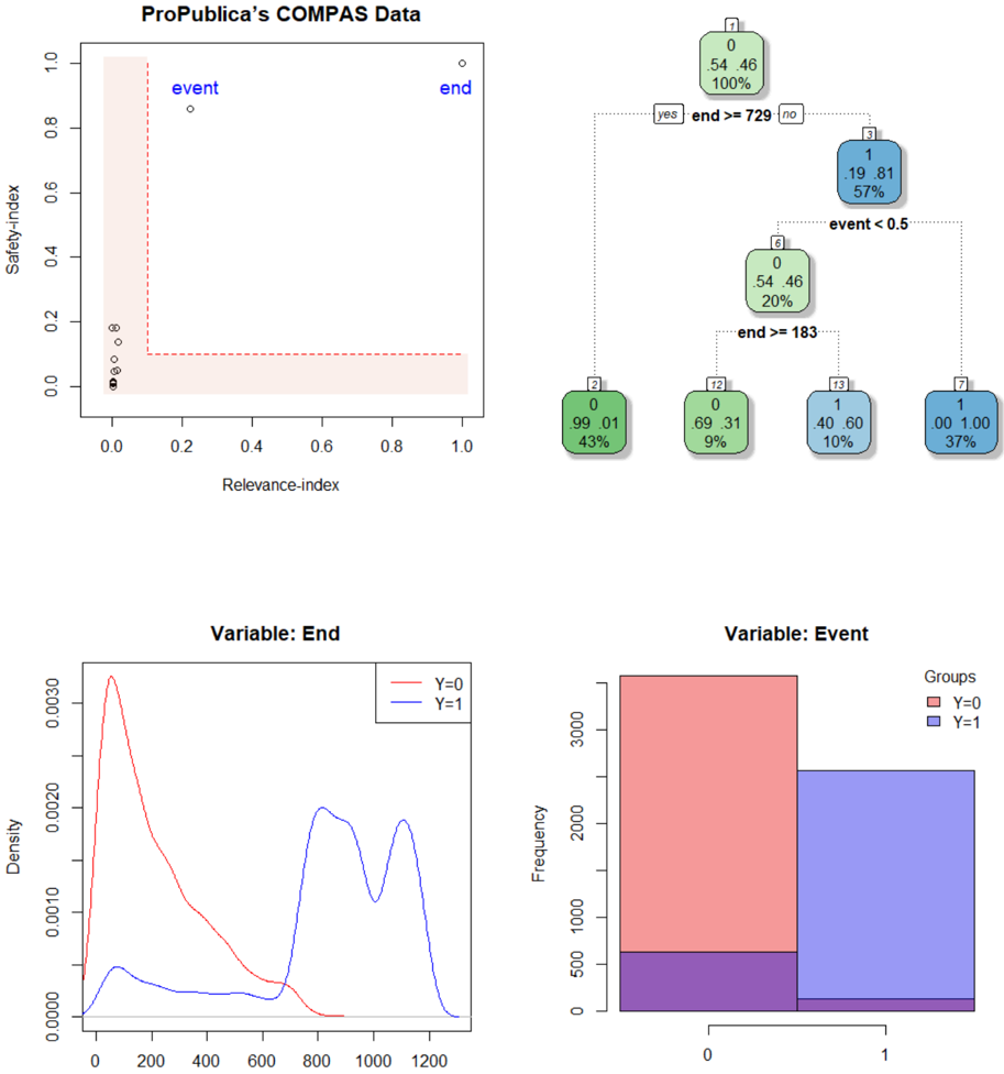
The image presents a multi-panel visualization of ProPublica's COMPAS data, likely related to risk assessment in the criminal justice system. It includes a scatter plot, a decision tree, and two density/frequency plots. The visualization aims to show the relationship between "Relevance Index", "Safety Index", "Event" and "End" variables, and how they relate to recidivism (represented by "Event").
### Components/Axes
* **Scatter Plot:**
* X-axis: Relevance Index (Scale: 0.0 to 1.0)
* Y-axis: Safety Index (Scale: 0.0 to 1.0)
* Data Points: Labeled "event" and "end".
* Shaded Area: Represents a region of interest, potentially highlighting areas of higher risk.
* **Decision Tree:**
* Nodes: Represent decisions based on thresholds for "end" and "event".
* Branches: "yes" and "no" indicating whether a condition is met.
* Leaf Nodes: Display counts, percentages, and labels.
* **Density Plot (Variable: End):**
* X-axis: Values of "End" (Scale: 0 to 1200)
* Y-axis: Density
* Lines: Represent density curves for Y=0 (red) and Y=1 (blue).
* **Frequency Plot (Variable: Event):**
* X-axis: Values of "Event" (0 or 1)
* Y-axis: Frequency (Scale: 0 to 3000)
* Bars: Represent frequency counts for Y=0 (red) and Y=1 (blue).
* **Legend:**
* Density/Frequency Plots: Groups labeled Y=0 (red) and Y=1 (blue).
### Detailed Analysis or Content Details
**Scatter Plot:**
The scatter plot shows a sparse distribution of points. The "event" points are clustered near the origin (low Relevance Index, low Safety Index). The "end" points are more dispersed, with some extending towards higher Relevance and Safety Index values.
**Decision Tree:**
The decision tree splits based on two conditions: "end >= 729" and "event < 0.5".
* **Top Node:** "end >= 729"
* "yes" branch: 0/46 (100%)
* "no" branch: 1/19 (8.1%)
* **Second Level (from "no" branch):** "event < 0.5"
* "yes" branch: 6/0 (20%)
* "no" branch: 12/13 (9%)
* **Third Level (from "no" branch):** "end >= 183"
* "yes" branch: 2/99 (43%)
* "no" branch: 13/40 (10%)
* **Final Node:** 7/1 (37%)
**Density Plot (Variable: End):**
The red line (Y=0) shows a higher density around the lower end of the "End" scale (approximately 0-400), with a peak around 200. The blue line (Y=1) shows a lower density overall, with a broader peak around 600-800.
**Frequency Plot (Variable: Event):**
The red bar (Y=0) is significantly taller than the blue bar (Y=1), indicating a much higher frequency of Event=0. The frequency for Y=0 is approximately 2500, while the frequency for Y=1 is approximately 500.
### Key Observations
* The "event" points in the scatter plot are concentrated in the lower-left corner, suggesting a correlation between low Relevance and Safety Index and the occurrence of an event.
* The decision tree shows that the "end" variable is a strong predictor, with the "end >= 729" split having a significant impact on the outcome.
* The density plot indicates that higher "End" values are more common when "Event" is 1 (Y=1).
* The frequency plot clearly shows that "Event=0" is much more frequent than "Event=1".
### Interpretation
This visualization appears to be exploring the predictive power of the COMPAS risk assessment tool. The scatter plot suggests that individuals assessed as having lower relevance and safety scores are more likely to re-offend ("event"). The decision tree demonstrates how the tool uses thresholds on the "end" and "event" variables to categorize individuals. The density and frequency plots provide further insight into the distribution of "End" and "Event" values, highlighting the imbalance between the two groups (Y=0 and Y=1).
The data suggests that the COMPAS tool may be able to identify individuals at higher risk of re-offending, but the decision tree reveals a complex set of rules and thresholds. The imbalance in the frequency of "Event" values (more non-events than events) could potentially bias the tool's predictions. The visualization raises questions about the fairness and accuracy of the COMPAS tool, and the potential for disparate impact on different groups. The spatial arrangement of the plots suggests a flow of analysis: starting with a broad overview (scatter plot), then refining the prediction with a decision tree, and finally examining the distributions of the key variables.