TECHNICAL ASSET FINGERPRINT
5215fcd7d4f684b041ab6c1d
Click to view fullscreen
Press ESC or click to close
FOUND IN PAPERS
EXPERT: healer-alpha-free VERSION 1
RUNTIME: free/openrouter/healer-alpha
INTEL_VERIFIED
\n
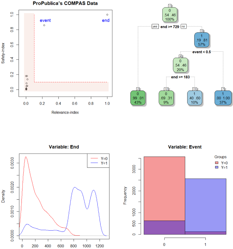
## Multi-Panel Figure: ProPublica's COMPAS Data Analysis
### Overview
The image is a composite figure containing four distinct panels that analyze data from ProPublica's COMPAS (Correctional Offender Management Profiling for Alternative Sanctions) dataset. The panels include a scatter plot, a decision tree, a density plot, and a bar chart, each exploring different aspects of the data, likely related to recidivism prediction and variable distributions.
### Components/Axes
The figure is divided into four quadrants:
1. **Top-Left:** A scatter plot titled "ProPublica's COMPAS Data".
* **X-axis:** "Relevance-index" (scale: 0.0 to 1.0).
* **Y-axis:** "Safety-index" (scale: 0.0 to 1.0).
* **Annotations:** Two labeled points: "event" (blue text, near coordinates (0.2, 0.85)) and "end" (blue text, near coordinates (1.0, 1.0)).
* **Other Elements:** A dashed red line forming an L-shape, starting near (0.0, 1.0), dropping vertically to ~(0.1, 0.1), then running horizontally to (1.0, 0.1). A cluster of black data points is concentrated near the origin (0.0, 0.0).
2. **Top-Right:** A decision tree diagram.
* **Nodes:** Rectangular nodes containing a class label (0 or 1), class probabilities (e.g., .54 .46), and the percentage of samples reaching that node.
* **Split Conditions:** Text labels on the branches indicate the splitting rules (e.g., "end >= 729", "event < 0.5", "end >= 183").
* **Color Coding:** Nodes are colored green (for class 0) or blue (for class 1), with intensity varying.
3. **Bottom-Left:** A density plot titled "Variable: End".
* **X-axis:** Unlabeled, but represents values of the "End" variable (scale: 0 to 1200).
* **Y-axis:** "Density" (scale: 0.0000 to 0.0030).
* **Legend:** Located in the top-right corner of the plot. "Y=0" (red line), "Y=1" (blue line).
4. **Bottom-Right:** A bar chart titled "Variable: Event".
* **X-axis:** Categories labeled "0" and "1".
* **Y-axis:** "Frequency" (scale: 0 to 3000).
* **Legend:** Located in the top-right corner. "Groups": "Y=0" (red square), "Y=1" (blue square).
* **Bars:** Two primary bars (red for category 0, blue for category 1) with an overlapping purple region at the bottom.
### Detailed Analysis
**1. Scatter Plot (Top-Left):**
* **Data Distribution:** The vast majority of data points are densely clustered in the bottom-left corner, with both Relevance-index and Safety-index values near 0.0.
* **Outliers:** Two distinct outlier points are labeled: "event" at approximately (Relevance: 0.2, Safety: 0.85) and "end" at approximately (Relevance: 1.0, Safety: 1.0).
* **Reference Line:** The dashed red line creates a boundary. The area above and to the right of this L-shaped line is shaded in a very light pink. This likely represents a region of interest or a decision boundary.
**2. Decision Tree (Top-Right):**
* **Root Node (1):** Class 0 (54% probability), Class 1 (46% probability). Contains 100% of samples. Splits on `end >= 729`.
* **Left Branch (Yes):** Leads to terminal node (2). Class 0 (99% probability), Class 1 (1% probability). Contains 43% of samples. Color: Dark green.
* **Right Branch (No):** Leads to node (3). Class 0 (19% probability), Class 1 (81% probability). Contains 57% of samples. Color: Blue. Splits on `event < 0.5`.
* **Node (3) Left Branch (Yes, event < 0.5):** Leads to node (4). Class 0 (54% probability), Class 1 (46% probability). Contains 20% of samples. Color: Light green. Splits on `end >= 183`.
* **Node (4) Left Branch (Yes, end >= 183):** Leads to terminal node (t2). Class 0 (69% probability), Class 1 (31% probability). Contains 9% of samples. Color: Medium green.
* **Node (4) Right Branch (No, end < 183):** Leads to terminal node (t3). Class 0 (40% probability), Class 1 (60% probability). Contains 10% of samples. Color: Light blue.
* **Node (3) Right Branch (No, event >= 0.5):** Leads to terminal node (7). Class 0 (0% probability), Class 1 (100% probability). Contains 37% of samples. Color: Dark blue.
**3. Density Plot (Bottom-Left):**
* **Y=0 (Red Line):** Shows a sharp, high peak at a low "End" value (approximately 50-100). The density then decays rapidly, approaching zero by "End" ≈ 800. This indicates that for the Y=0 group, the "End" variable is heavily concentrated at low values.
* **Y=1 (Blue Line):** Shows a much lower, broader initial peak around "End" ≈ 100. It then displays a bimodal distribution with two significant peaks at higher values: one around "End" ≈ 800 and another around "End" ≈ 1100. This indicates the Y=1 group has a more spread-out distribution with a substantial proportion of high "End" values.
**4. Bar Chart (Bottom-Right):**
* **Category 0:** The red bar (Y=0) is very tall, reaching a frequency of approximately 3500. A smaller purple segment at its base suggests an overlap or subset.
* **Category 1:** The blue bar (Y=1) is shorter, with a frequency of approximately 2500. It also has a small purple segment at its base.
* **Overlap:** The purple region at the bottom of both bars (frequency ~500 for category 0, ~200 for category 1) likely represents a shared subset or a different grouping not explicitly defined in the legend.
### Key Observations
1. **Extreme Class Imbalance in Tree Leaves:** The decision tree produces highly pure terminal nodes, especially node (7) (100% class 1) and node (2) (99% class 0).
2. **Bimodal Distribution for Y=1:** The "End" variable for the Y=1 class has a distinctive bimodal shape at high values, which is a strong differentiating feature from the Y=0 class.
3. **Concentration at Origin:** The scatter plot shows an extreme concentration of data points with very low scores on both indices, with only a few notable outliers.
4. **Variable Importance:** The tree structure suggests that `end` is the most important splitting variable (used at the root and another node), followed by `event`.
### Interpretation
This composite figure provides a multi-faceted view of the COMPAS data, likely used for predicting recidivism (Y=1).
* **Scatter Plot & Decision Boundary:** The L-shaped dashed line may represent a proposed or learned decision boundary in the Relevance-Safety index space. The labeled points "event" and "end" are significant outliers that lie far from the main data cluster and on the "high-risk" side of this boundary.
* **Predictive Model (Tree):** The decision tree reveals a clear, interpretable model for classification. It prioritizes the `end` variable (likely a sentence length or time until an event). Individuals with a very high `end` value (>=729) are almost never classified as Y=1. For others, the `event` variable (likely a binary flag) is critical: if `event` is 1 (>=0.5), the model predicts Y=1 with 100% confidence in this sample.
* **Variable Distributions:** The density and bar charts explain *why* the tree works. The `end` variable is a powerful separator because its distribution is fundamentally different for the two classes. The `event` variable shows a clear frequency difference, with Y=0 being more common in category 0 and Y=1 in category 1.
* **Underlying Message:** The analysis highlights potential biases or stark patterns in the data. The model's 100% confidence for a large subset (37% of data) based on a single variable (`event`) and the extreme separation in the `end` variable distribution could indicate systemic factors influencing the COMPAS scores or the outcomes they predict. The scatter plot's dense cluster at (0,0) suggests many individuals receive low scores on both indices, while the outliers represent rare but high-profile cases.
DECODING INTELLIGENCE...