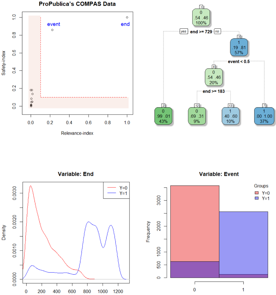
## Scatter Plot: ProPublica’s COMPAS Data
### Overview
A scatter plot with two labeled points ("event" and "end") plotted on a coordinate system with axes labeled "Relevance-index" (x-axis) and "Safety-index" (y-axis). A pink shaded rectangle spans from (0,0) to (1,1), but the points lie outside this area.
### Components/Axes
- **X-axis**: Relevance-index (0 to 1)
- **Y-axis**: Safety-index (0 to 1)
- **Legend**: Not explicitly labeled, but points are marked with white circles and black dots.
- **Shaded Area**: Pink rectangle covering the lower-left quadrant (0 ≤ x ≤ 1, 0 ≤ y ≤ 1).
### Detailed Analysis
- **Event Point**: White circle at (0.2, 0.85).
- **End Point**: White circle at (0.95, 0.95).
- **Shaded Area**: Covers the lower-left quadrant, but both points are in the upper-right region.
### Key Observations
- The "event" and "end" points are positioned outside the shaded area, suggesting they may represent outliers or anomalies.
- The "end" point is closer to the top-right corner, indicating higher relevance and safety indices.
### Interpretation
The scatter plot highlights two distinct data points ("event" and "end") that deviate from the shaded region, which may represent critical thresholds or anomalies in the COMPAS data. The positioning of these points could indicate specific cases of interest in the dataset.
---
## Decision Tree: ProPublica’s COMPAS Data
### Overview
A decision tree with nodes labeled by values, percentages, and conditions. The tree splits based on "end" and "event" thresholds, with nodes colored green (Y=0) and blue (Y=1).
### Components/Axes
- **Root Node (1)**: 0, 54.46, 100%
- **Splits**:
- **Yes (end >=729)**: Leads to node 2.
- **No (event <0.5)**: Leads to node 3.
- **Leaf Nodes**:
- Node 2: 0, 99.01, 43% (Y=0)
- Node 12: 0, 0.69, 9% (Y=0)
- Node 13: 1, 0.40, 10% (Y=1)
- Node 14: 0, 0.00, 37% (Y=0)
- Node 15: 1, 1.00, 37% (Y=1)
- **Legend**: Green for Y=0, blue for Y=1 (top-right corner).
### Detailed Analysis
- **Root Node**: 100% of data starts here, with 54.46% of cases.
- **First Split**:
- **Yes (end >=729)**: 43% of data (Y=0).
- **No (event <0.5)**: 57% of data splits further.
- **Second Split (event <0.5)**:
- **Y=0 (green)**: 20% of data (node 6).
- **Y=1 (blue)**: 57% of data (node 7).
- **Final Splits**:
- Node 6 splits into Y=0 (9%) and Y=1 (10%).
- Node 7 splits into Y=0 (37%) and Y=1 (37%).
### Key Observations
- The tree prioritizes "end >=729" as a primary split, with 43% of data falling into this category.
- The "event <0.5" split leads to a mix of Y=0 and Y=1 outcomes, with Y=1 dominating in the final nodes.
- The purple bar in the bar chart (bottom-right) for Y=1 (~500) is not reflected in the decision tree, suggesting a potential inconsistency.
### Interpretation
The decision tree demonstrates how the COMPAS data is segmented based on "end" and "event" thresholds. The dominance of Y=1 in later nodes suggests that higher "end" values are more likely to correspond to Y=1, while lower "end" values are split between Y=0 and Y=1. The purple bar in the bar chart may indicate an unaccounted category or error in the data.
---
## Density Plot: Variable: End
### Overview
A density plot showing the distribution of the "End" variable for two groups (Y=0 and Y=1). The x-axis is labeled "Density," and the y-axis is also labeled "Density."
### Components/Axes
- **X-axis**: Density (0 to 1200)
- **Y-axis**: Density (0 to 0.003)
- **Legend**: Red for Y=0, blue for Y=1 (top-right corner).
### Detailed Analysis
- **Y=0 (Red Line)**: Peaks at ~200, with a gradual decline.
- **Y=1 (Blue Line)**: Peaks at ~800 and ~1000, with a secondary peak.
### Key Observations
- Y=0 has a narrower distribution centered around ~200.
- Y=1 has a bimodal distribution, with peaks at ~800 and ~1000.
### Interpretation
The density plot reveals that the "End" variable for Y=1 is more spread out and has higher values compared to Y=0. This suggests that Y=1 cases may involve more extreme or varied outcomes in the "End" variable.
---
## Bar Chart: Variable: Event
### Overview
A bar chart showing the frequency of the "Event" variable for two groups (Y=0 and Y=1). The x-axis is labeled "Groups" (0 and 1), and the y-axis is labeled "Frequency."
### Components/Axes
- **X-axis**: Groups (0 and 1)
- **Y-axis**: Frequency (0 to 3500)
- **Legend**: Red for Y=0, blue for Y=1 (top-right corner).
- **Additional Element**: A purple bar at the bottom for Y=1 (~500).
### Detailed Analysis
- **Y=0 (Red Bar)**: ~3000 frequency.
- **Y=1 (Blue Bar)**: ~2500 frequency.
- **Purple Bar**: ~500 frequency (unlabeled in the legend).
### Key Observations
- Y=0 has a higher frequency of events (~3000) compared to Y=1 (~2500).
- The purple bar for Y=1 (~500) is not explained by the legend, indicating a potential data inconsistency.
### Interpretation
The bar chart shows that Y=0 cases are more frequent in the "Event" variable than Y=1. However, the presence of the purple bar for Y=1 suggests an unaccounted category or error in the data, which may require further investigation.