TECHNICAL ASSET FINGERPRINT
52307391455b80dfab0c4093
Click to view fullscreen
Press ESC or click to close
FOUND IN PAPERS
EXPERT: gemini-2.0-flash VERSION 1
RUNTIME: nugit/gemini/gemini-2.0-flash
INTEL_VERIFIED
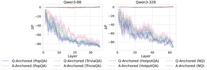
## Line Chart: Delta P vs Layer for Qwen3-8B and Qwen3-32B
### Overview
The image contains two line charts comparing the performance of Qwen3-8B and Qwen3-32B models across different layers. The charts plot the change in performance (Delta P) against the layer number for various question-answering tasks, using both question-anchored (Q-Anchored) and answer-anchored (A-Anchored) approaches. The shaded regions around the lines indicate the uncertainty or variability in the performance.
### Components/Axes
* **Titles:**
* Left Chart: "Qwen3-8B"
* Right Chart: "Qwen3-32B"
* **X-axis (Layer):**
* Left Chart: Ranges from 0 to 30, with tick marks at intervals of 10.
* Right Chart: Ranges from 0 to 60, with tick marks at intervals of 20.
* Label: "Layer"
* **Y-axis (ΔP):**
* Both Charts: Ranges from -80 to 0, with tick marks at intervals of 20.
* Label: "ΔP"
* **Legend (bottom):**
* Q-Anchored (PopQA): Solid Blue Line
* A-Anchored (PopQA): Dashed Brown Line
* Q-Anchored (TriviaQA): Dotted Green Line
* A-Anchored (TriviaQA): Dash-Dotted Green Line
* Q-Anchored (HotpotQA): Dash-Dot Blue Line
* A-Anchored (HotpotQA): Dotted Blue Line
* Q-Anchored (NQ): Dash-Dotted Pink Line
* A-Anchored (NQ): Dotted Pink Line
### Detailed Analysis
**Left Chart (Qwen3-8B):**
* **Q-Anchored (PopQA):** (Solid Blue) Starts at approximately -15 at layer 0 and decreases to approximately -80 by layer 30.
* **A-Anchored (PopQA):** (Dashed Brown) Remains relatively constant around 0 across all layers.
* **Q-Anchored (TriviaQA):** (Dotted Green) Starts at approximately -20 at layer 0 and decreases to approximately -75 by layer 30.
* **A-Anchored (TriviaQA):** (Dash-Dotted Green) Starts at approximately -20 at layer 0 and decreases to approximately -75 by layer 30.
* **Q-Anchored (HotpotQA):** (Dash-Dot Blue) Starts at approximately -15 at layer 0 and decreases to approximately -80 by layer 30.
* **A-Anchored (HotpotQA):** (Dotted Blue) Starts at approximately -15 at layer 0 and decreases to approximately -80 by layer 30.
* **Q-Anchored (NQ):** (Dash-Dotted Pink) Starts at approximately -20 at layer 0 and decreases to approximately -70 by layer 30.
* **A-Anchored (NQ):** (Dotted Pink) Starts at approximately -20 at layer 0 and decreases to approximately -70 by layer 30.
**Right Chart (Qwen3-32B):**
* **Q-Anchored (PopQA):** (Solid Blue) Starts at approximately -20 at layer 0 and decreases to approximately -90 by layer 60.
* **A-Anchored (PopQA):** (Dashed Brown) Remains relatively constant around 0 across all layers.
* **Q-Anchored (TriviaQA):** (Dotted Green) Starts at approximately -20 at layer 0 and decreases to approximately -80 by layer 60.
* **A-Anchored (TriviaQA):** (Dash-Dotted Green) Starts at approximately -20 at layer 0 and decreases to approximately -80 by layer 60.
* **Q-Anchored (HotpotQA):** (Dash-Dot Blue) Starts at approximately -20 at layer 0 and decreases to approximately -90 by layer 60.
* **A-Anchored (HotpotQA):** (Dotted Blue) Starts at approximately -20 at layer 0 and decreases to approximately -90 by layer 60.
* **Q-Anchored (NQ):** (Dash-Dotted Pink) Starts at approximately -20 at layer 0 and decreases to approximately -70 by layer 60.
* **A-Anchored (NQ):** (Dotted Pink) Starts at approximately -20 at layer 0 and decreases to approximately -70 by layer 60.
### Key Observations
* For both models, the A-Anchored (PopQA) performance remains relatively constant near 0 across all layers.
* The Q-Anchored and A-Anchored lines for TriviaQA, HotpotQA, and NQ datasets show a decreasing trend as the layer number increases.
* The Qwen3-32B model generally shows a steeper decline in Delta P compared to the Qwen3-8B model for Q-Anchored datasets.
* The shaded regions indicate variability in performance, which appears to be more pronounced in the Qwen3-32B model.
### Interpretation
The charts suggest that the performance of the Qwen3 models, particularly when anchored to the question, decreases as the layer number increases for TriviaQA, HotpotQA, and NQ datasets. This could indicate that deeper layers are not effectively contributing to the question-answering task for these datasets, or that the model is overfitting to the training data in later layers. The A-Anchored (PopQA) performance remaining constant suggests that anchoring to the answer provides a stable baseline. The Qwen3-32B model, being larger, shows a more pronounced decline, potentially indicating a greater susceptibility to overfitting or a need for more regularization. The variability in performance, as indicated by the shaded regions, highlights the importance of considering the uncertainty in these measurements.
DECODING INTELLIGENCE...
EXPERT: gemma-3-27b-it-free VERSION 1
RUNTIME: google-free/gemma-3-27b-it
INTEL_VERIFIED
\n
## Line Chart: ΔP vs. Layer for Qwen Models
### Overview
The image presents two line charts comparing the change in performance (ΔP) across different layers of two Qwen language models: Qwen3-8B and Qwen3-32B. The charts display performance differences for question-answering tasks using different anchoring methods (Q-Anchored and A-Anchored) and datasets (PopQA, TriviaQA, HotpotQA, and NQ). Each line represents a specific combination of anchoring method and dataset. The charts are positioned side-by-side for easy comparison.
### Components/Axes
* **X-axis:** Layer (ranging from 0 to approximately 35 for Qwen3-8B and 0 to approximately 65 for Qwen3-32B).
* **Y-axis:** ΔP (ranging from approximately -90 to 0).
* **Models:** Qwen3-8B (left chart), Qwen3-32B (right chart).
* **Legend:** Located at the bottom of the image, detailing the data series:
* Blue Line: Q-Anchored (PopQA)
* Orange Line: A-Anchored (PopQA)
* Green Line: Q-Anchored (TriviaQA)
* Purple Line: A-Anchored (TriviaQA)
* Brown Dashed Line: Q-Anchored (HotpotQA)
* Gray Dashed Line: A-Anchored (HotpotQA)
* Teal Line: Q-Anchored (NQ)
* Red Line: A-Anchored (NQ)
### Detailed Analysis or Content Details
**Qwen3-8B (Left Chart):**
* **Q-Anchored (PopQA) - Blue Line:** Starts at approximately -5, decreases steadily to approximately -80 by layer 35.
* **A-Anchored (PopQA) - Orange Line:** Starts at approximately -20, decreases to approximately -70 by layer 35.
* **Q-Anchored (TriviaQA) - Green Line:** Starts at approximately -10, decreases to approximately -75 by layer 35.
* **A-Anchored (TriviaQA) - Purple Line:** Starts at approximately -25, decreases to approximately -75 by layer 35.
* **Q-Anchored (HotpotQA) - Brown Dashed Line:** Starts at approximately -10, decreases to approximately -60 by layer 35.
* **A-Anchored (HotpotQA) - Gray Dashed Line:** Starts at approximately -20, decreases to approximately -65 by layer 35.
* **Q-Anchored (NQ) - Teal Line:** Starts at approximately -15, decreases to approximately -70 by layer 35.
* **A-Anchored (NQ) - Red Line:** Starts at approximately -25, decreases to approximately -75 by layer 35.
**Qwen3-32B (Right Chart):**
* **Q-Anchored (PopQA) - Blue Line:** Starts at approximately -5, decreases to approximately -80 by layer 65.
* **A-Anchored (PopQA) - Orange Line:** Starts at approximately -20, decreases to approximately -70 by layer 65.
* **Q-Anchored (TriviaQA) - Green Line:** Starts at approximately -10, decreases to approximately -75 by layer 65.
* **A-Anchored (TriviaQA) - Purple Line:** Starts at approximately -25, decreases to approximately -75 by layer 65.
* **Q-Anchored (HotpotQA) - Brown Dashed Line:** Starts at approximately -10, decreases to approximately -60 by layer 65.
* **A-Anchored (HotpotQA) - Gray Dashed Line:** Starts at approximately -20, decreases to approximately -65 by layer 65.
* **Q-Anchored (NQ) - Teal Line:** Starts at approximately -15, decreases to approximately -70 by layer 65.
* **A-Anchored (NQ) - Red Line:** Starts at approximately -25, decreases to approximately -75 by layer 65.
All lines in both charts exhibit a downward trend, indicating a decrease in ΔP as the layer number increases. The shaded areas around each line represent the uncertainty or variance in the data.
### Key Observations
* The performance decrease (ΔP) is more pronounced in the initial layers (0-20) for both models.
* The Q-Anchored methods generally start with higher ΔP values than the A-Anchored methods for all datasets.
* The HotpotQA dataset consistently shows the least negative ΔP values (closest to 0) across all layers and anchoring methods.
* The trends are remarkably similar between the Qwen3-8B and Qwen3-32B models, suggesting that increasing model size doesn't fundamentally alter the performance degradation pattern across layers.
* The uncertainty bands are relatively wide, especially in the initial layers, indicating higher variability in the performance measurements.
### Interpretation
The charts demonstrate a consistent performance degradation across layers for the Qwen models when evaluated on various question-answering datasets. This suggests that deeper layers may not contribute as significantly to performance on these tasks, or that the benefits of increased depth are offset by other factors like overfitting or vanishing gradients.
The difference between Q-Anchored and A-Anchored methods indicates that the method used to anchor the questions influences performance, with Q-Anchored generally performing better. The dataset-specific performance differences (HotpotQA being the least negative) suggest that the complexity and characteristics of the dataset play a role in how performance degrades across layers.
The similarity in trends between the 8B and 32B models is noteworthy. It implies that simply increasing model size does not necessarily address the underlying issue of performance degradation with depth. Further investigation is needed to understand the root cause of this phenomenon and explore techniques to mitigate it, such as more effective regularization or architectural modifications. The wide uncertainty bands suggest that the observed trends may not be statistically significant in some cases, and further experimentation with larger sample sizes may be necessary to confirm these findings.
DECODING INTELLIGENCE...
EXPERT: healer-alpha-free VERSION 1
RUNTIME: free/openrouter/healer-alpha
INTEL_VERIFIED
\n
## Line Charts: Qwen3-8B and Qwen3-32B Layer-wise ΔP Analysis
### Overview
The image displays two side-by-side line charts comparing the layer-wise change in probability (ΔP) for two different model sizes: Qwen3-8B (left) and Qwen3-32B (right). Each chart plots ΔP against the model layer number for eight different experimental conditions, categorized by anchoring method (Q-Anchored vs. A-Anchored) and dataset (PopQA, TriviaQA, HotpotQA, NQ).
### Components/Axes
* **Chart Titles:** "Qwen3-8B" (left chart), "Qwen3-32B" (right chart).
* **X-Axis:** Labeled "Layer". The Qwen3-8B chart ranges from 0 to approximately 35. The Qwen3-32B chart ranges from 0 to approximately 65.
* **Y-Axis:** Labeled "ΔP" (Delta P). Both charts share the same scale, ranging from 0 at the top to -80 at the bottom, with major gridlines at intervals of 20 (0, -20, -40, -60, -80).
* **Legend:** Positioned at the bottom of the image, spanning both charts. It defines eight series using a combination of color and line style:
* **Solid Lines (Q-Anchored):**
* Blue: `Q-Anchored (PopQA)`
* Green: `Q-Anchored (TriviaQA)`
* Purple: `Q-Anchored (HotpotQA)`
* Pink: `Q-Anchored (NQ)`
* **Dashed Lines (A-Anchored):**
* Orange: `A-Anchored (PopQA)`
* Red: `A-Anchored (TriviaQA)`
* Gray: `A-Anchored (HotpotQA)`
* Cyan: `A-Anchored (NQ)`
* **Data Series:** Each chart contains eight lines (four solid, four dashed) with shaded regions around them, likely representing confidence intervals or standard deviation.
### Detailed Analysis
**Qwen3-8B Chart (Left):**
* **Trend for Q-Anchored (Solid Lines):** All four solid lines show a strong, consistent downward trend. They start near ΔP = 0 at Layer 0 and decline steeply.
* **Blue (PopQA):** Drops most sharply, reaching approximately ΔP = -60 by Layer 10 and continuing to a final value near -80 by Layer 35.
* **Green (TriviaQA):** Follows a similar path but generally stays slightly above the blue line, ending near -75.
* **Purple (HotpotQA) & Pink (NQ):** Show more volatility but follow the same overall downward trajectory, ending in the -70 to -80 range.
* **Trend for A-Anchored (Dashed Lines):** All four dashed lines remain very close to ΔP = 0 across all layers, showing negligible change. They form a tight cluster along the top of the chart.
**Qwen3-32B Chart (Right):**
* **Trend for Q-Anchored (Solid Lines):** The pattern is qualitatively identical to the 8B model but extended over more layers.
* **Blue (PopQA):** Again shows the steepest initial decline, crossing ΔP = -60 before Layer 20 and approaching -80 by Layer 60.
* **Green, Purple, Pink:** All follow the same steep downward slope, with significant overlap and volatility, converging in the -70 to -80 range by the final layers.
* **Trend for A-Anchored (Dashed Lines):** As in the 8B model, all dashed lines remain flat near ΔP = 0 throughout all ~65 layers.
### Key Observations
1. **Fundamental Dichotomy:** There is a stark, consistent difference between the two anchoring methods. Q-Anchored conditions lead to a large, layer-dependent decrease in ΔP, while A-Anchored conditions show almost no change.
2. **Model Size Scaling:** The trend observed in the 8B model is faithfully reproduced in the larger 32B model, suggesting the phenomenon is consistent across model scales. The primary difference is the x-axis extent, corresponding to the greater number of layers in the 32B model.
3. **Dataset Variation:** Among the Q-Anchored lines, the PopQA dataset (blue) consistently shows the most pronounced initial drop. The other datasets (TriviaQA, HotpotQA, NQ) are tightly clustered, indicating similar behavior.
4. **Volatility:** The Q-Anchored lines, especially in the 32B model, exhibit considerable point-to-point volatility (jaggedness), though the overall downward trend is unmistakable. The shaded error bands are also wider for these lines.
### Interpretation
This data demonstrates a critical and systematic difference in how language model representations evolve across layers depending on the anchoring point used in the analysis.
* **Q-Anchored vs. A-Anchored:** The "ΔP" metric likely measures a shift in probability or representation. The dramatic decline for Q-Anchored (Question-Anchored) series suggests that as information propagates through the network layers, the model's internal state moves significantly away from its initial question-focused representation. In contrast, the stability of the A-Anchored (Answer-Anchored) series indicates that the answer-focused representation remains relatively constant throughout the network.
* **Implication for Model Processing:** This could imply that the model's processing involves a transformation from a question-oriented state to a different, possibly answer-oriented, state in deeper layers. The fact that the A-Anchored line is stable near zero might mean the final answer representation is established early and maintained, or that the metric is less sensitive to changes in that subspace.
* **Consistency Across Scale and Data:** The replication of the pattern from 8B to 32B parameters suggests this is a fundamental architectural or training characteristic of the Qwen3 model family, not an artifact of a specific model size. The similarity across four distinct QA datasets (PopQA, TriviaQA, HotpotQA, NQ) further indicates this is a general property of the model's question-answering behavior, not specific to one data distribution.
* **Outlier/Anomaly:** There are no true outliers; all series within their respective groups (Q-Anchored or A-Anchored) behave consistently. The main "anomaly" is the stark contrast between the two groups itself, which is the central finding of the visualization.
DECODING INTELLIGENCE...
EXPERT: nemotron-free VERSION 2
RUNTIME: free/nvidia/nemotron-nano-12b-v2-vl:free
INTEL_VERIFIED
## Line Graph: ΔP vs Layer for Qwen3-8B and Qwen3-32B Models
### Overview
The image contains two side-by-side line graphs comparing the performance of Q-Anchored and A-Anchored methods across different datasets (PopQA, TriviaQA, HotpotQA, NQ) for two versions of the Qwen3 model (8B and 32B parameters). The y-axis represents ΔP (change in performance), and the x-axis represents model layers. Each graph shows multiple colored lines with shaded confidence intervals.
### Components/Axes
- **Left Chart**: Qwen3-8B model
- **Right Chart**: Qwen3-32B model
- **Y-Axis**: ΔP (range: -80 to 0)
- **X-Axis**: Layer (0 to 30 for 8B, 0 to 60 for 32B)
- **Legend**: Located at the bottom, with six entries:
- Solid blue: Q-Anchored (PopQA)
- Dashed green: Q-Anchored (TriviaQA)
- Dotted red: Q-Anchored (HotpotQA)
- Solid orange: A-Anchored (PopQA)
- Dashed purple: A-Anchored (TriviaQA)
- Dotted pink: A-Anchored (HotpotQA)
- Solid gray: A-Anchored (NQ)
- Dashed gray: Q-Anchored (NQ)
### Detailed Analysis
#### Qwen3-8B Chart
- **Q-Anchored Lines**:
- PopQA (solid blue): Starts at 0, declines sharply to ~-80 by layer 30 with oscillations.
- TriviaQA (dashed green): Similar trend to PopQA but less steep (-60 to -70 by layer 30).
- HotpotQA (dotted red): Gradual decline to ~-60 by layer 30.
- NQ (dashed gray): Sharpest drop to ~-90 by layer 30.
- **A-Anchored Lines**:
- PopQA (solid orange): Remains near 0 throughout.
- TriviaQA (dashed purple): Slight decline to ~-10 by layer 30.
- HotpotQA (dotted pink): Minimal change (~-5 by layer 30).
- NQ (solid gray): Stable near 0.
#### Qwen3-32B Chart
- **Q-Anchored Lines**:
- PopQA (solid blue): Starts at 0, drops to ~-80 by layer 60 with volatility.
- TriviaQA (dashed green): Declines to ~-70 by layer 60.
- HotpotQA (dotted red): Gradual decline to ~-60 by layer 60.
- NQ (dashed gray): Sharp drop to ~-90 by layer 60.
- **A-Anchored Lines**:
- PopQA (solid orange): Stable near 0.
- TriviaQA (dashed purple): Slight decline to ~-10 by layer 60.
- HotpotQA (dotted pink): Minimal change (~-5 by layer 60).
- NQ (solid gray): Stable near 0.
### Key Observations
1. **Q-Anchored vs A-Anchored**: Q-Anchored methods show significant ΔP degradation across layers, while A-Anchored methods remain stable.
2. **Model Size Impact**: The 32B model exhibits more pronounced ΔP declines for Q-Anchored methods compared to the 8B model.
3. **Dataset Sensitivity**: NQ dataset shows the steepest ΔP decline for Q-Anchored methods in both models.
4. **Confidence Intervals**: Shaded regions indicate variability, with Q-Anchored methods showing wider intervals in deeper layers.
### Interpretation
The data suggests that Q-Anchored methods are more sensitive to layer depth, with performance degradation (ΔP) increasing as layers progress. This trend is amplified in the larger 32B model, indicating potential scalability challenges. A-Anchored methods maintain stability, implying robustness to layer depth variations. The NQ dataset consistently drives the largest ΔP declines, highlighting its role as a critical factor in performance degradation. The results may reflect architectural differences in how anchoring strategies interact with model scale and dataset complexity.
DECODING INTELLIGENCE...