## Line Chart: Correctness vs. Number of Retries
### Overview
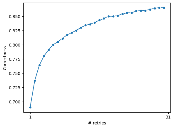
The image is a line chart showing the relationship between the number of retries and correctness. The chart displays a single data series, with correctness increasing as the number of retries increases, eventually plateauing.
### Components/Axes
* **X-axis:** "# retries" - Number of retries, ranging from 1 to 31.
* **Y-axis:** "Correctness" - Correctness value, ranging from 0.70 to 0.86.
* **Data Series:** A single blue line with circular markers representing the correctness value for each number of retries.
### Detailed Analysis
The blue line represents the correctness value. The line starts at approximately 0.69 at 1 retry and increases rapidly initially. As the number of retries increases, the rate of increase in correctness slows down, and the line plateaus around 0.86.
Here are some approximate data points:
* 1 retry: Correctness ≈ 0.69
* 5 retries: Correctness ≈ 0.79
* 10 retries: Correctness ≈ 0.82
* 15 retries: Correctness ≈ 0.84
* 20 retries: Correctness ≈ 0.85
* 25 retries: Correctness ≈ 0.855
* 31 retries: Correctness ≈ 0.86
### Key Observations
* The correctness increases significantly with the initial retries.
* The rate of increase in correctness diminishes as the number of retries increases.
* The correctness plateaus after a certain number of retries, indicating diminishing returns.
### Interpretation
The chart suggests that increasing the number of retries initially leads to a significant improvement in correctness. However, after a certain point, the improvement becomes marginal, indicating that there is a limit to how much correctness can be improved by simply increasing the number of retries. This could be due to other factors limiting the correctness, such as inherent limitations in the system or the quality of the data. The data demonstrates a diminishing return on investment for increasing retries beyond a certain point.