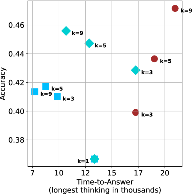
## Scatter Plot: Accuracy vs. Time-to-Answer
### Overview
This image presents a scatter plot visualizing the relationship between "Accuracy" and "Time-to-Answer (longest thinking in thousands)". Data points are color-coded and labeled with the value of 'k'. The plot appears to explore how accuracy changes as the time taken to answer increases, potentially in the context of a problem-solving or decision-making process.
### Components/Axes
* **X-axis:** "Time-to-Answer (longest thinking in thousands)". Scale ranges from approximately 7 to 21.
* **Y-axis:** "Accuracy". Scale ranges from approximately 0.38 to 0.47.
* **Data Points:** Scatter plot points, color-coded as follows:
* Blue: Represents data points with k=1, k=3, k=5, and k=9.
* Red: Represents data points with k=3, k=5, and k=9.
* Green: Represents data points with k=3, k=5, and k=9.
* **Labels:** Each data point is labeled with "k=" followed by a numerical value.
### Detailed Analysis
Let's analyze the data points and their corresponding values:
* **k=1:** Located at approximately (7.5, 0.38).
* **k=3 (Blue):** Located at approximately (10.5, 0.41).
* **k=3 (Green):** Located at approximately (16.5, 0.40).
* **k=3 (Red):** Located at approximately (17.5, 0.40).
* **k=5 (Blue):** Located at approximately (10.5, 0.42).
* **k=5 (Green):** Located at approximately (14.5, 0.45).
* **k=5 (Red):** Located at approximately (19.5, 0.44).
* **k=9 (Blue):** Located at approximately (10.5, 0.46).
* **k=9 (Green):** Located at approximately (12.5, 0.46).
* **k=9 (Red):** Located at approximately (20.5, 0.47).
**Trends:**
* Generally, as "Time-to-Answer" increases, "Accuracy" tends to increase, but this is not a strictly linear relationship.
* For lower values of 'k' (k=1), accuracy is relatively low and time-to-answer is short.
* For higher values of 'k' (k=9), accuracy is generally higher, and time-to-answer is longer.
* There is overlap in data points for different values of 'k', indicating that similar accuracy levels can be achieved with varying time-to-answer and 'k' values.
### Key Observations
* The data points are not evenly distributed. There's a concentration of points around the x-values of 10-12 and 17-20.
* The red data points, representing k=3, k=5, and k=9, generally have higher accuracy values for longer time-to-answer.
* The blue data points, representing k=1, k=3, k=5, and k=9, show a wider range of accuracy values for shorter time-to-answer.
* The green data points, representing k=3, k=5, and k=9, are clustered in the middle range of both axes.
### Interpretation
This scatter plot likely represents the performance of a system or model (potentially an AI or human decision-maker) as a function of the time allowed for "thinking" or processing, and a parameter 'k'. The parameter 'k' could represent the number of options considered, the complexity of the model, or a similar factor.
The positive correlation between "Time-to-Answer" and "Accuracy" suggests that allowing more time for processing generally leads to better results. However, the scatter suggests that this relationship is not deterministic. The value of 'k' appears to influence the accuracy achieved for a given time-to-answer.
The clustering of points and the overlap between different 'k' values indicate that there are trade-offs between time, accuracy, and the parameter 'k'. For example, achieving high accuracy might require both a longer time-to-answer and a higher value of 'k'. The data suggests that increasing 'k' beyond a certain point may not yield significant improvements in accuracy, as seen by the overlapping points.
The presence of multiple data points for the same 'k' value suggests that there is variability in performance even under the same conditions. This could be due to random factors or other variables not captured in the plot.