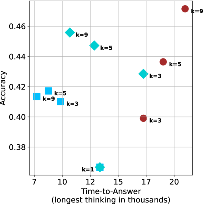
## Scatter Plot: Accuracy vs. Time-to-Answer for Different 'k' Values
### Overview
The image is a scatter plot comparing the performance of different models or configurations, parameterized by a variable 'k'. It plots "Accuracy" on the vertical axis against "Time-to-Answer (longest thinking in thousands)" on the horizontal axis. The plot uses three distinct marker shapes and colors to represent different categories or model families, with each data point labeled with its specific 'k' value.
### Components/Axes
* **Y-Axis (Vertical):**
* **Label:** "Accuracy"
* **Scale:** Linear, ranging from approximately 0.37 to 0.47.
* **Major Ticks:** 0.38, 0.40, 0.42, 0.44, 0.46.
* **X-Axis (Horizontal):**
* **Label:** "Time-to-Answer (longest thinking in thousands)"
* **Scale:** Linear, ranging from approximately 7 to 21.
* **Major Ticks:** 7, 10, 12, 15, 17, 20.
* **Data Series & Legend (Inferred from markers):**
* **Series 1 (Cyan Squares):** Located in the left-center region of the plot.
* **Series 2 (Teal Diamonds):** Scattered across the center and upper-left of the plot.
* **Series 3 (Dark Red Circles):** Located in the right half of the plot.
* **Note:** There is no explicit legend box. The categories are defined by the consistent use of marker shape and color.
### Detailed Analysis
**Data Points (Approximate Coordinates: [Time-to-Answer, Accuracy]):**
* **Cyan Square Series:**
* `k=9`: [~7.5, ~0.415]
* `k=5`: [~8.5, ~0.418]
* `k=3`: [~9.5, ~0.412]
* *Trend:* This series shows a relatively flat or very slightly increasing trend in accuracy as time increases within a narrow range (7.5 to 9.5 thousand).
* **Teal Diamond Series:**
* `k=9`: [~10.5, ~0.456]
* `k=5`: [~12.5, ~0.448]
* `k=3`: [~16.5, ~0.428]
* `k=1`: [~13.0, ~0.370] (This is a distinct outlier, plotted with a different, star-like teal marker).
* *Trend:* Excluding the `k=1` outlier, this series shows a clear **downward trend**: as Time-to-Answer increases from ~10.5 to ~16.5 thousand, Accuracy decreases from ~0.456 to ~0.428.
* **Dark Red Circle Series:**
* `k=9`: [~20.5, ~0.470]
* `k=5`: [~18.5, ~0.436]
* `k=3`: [~17.0, ~0.400]
* *Trend:* This series shows a strong **upward trend**: as Time-to-Answer increases from ~17.0 to ~20.5 thousand, Accuracy increases significantly from ~0.400 to ~0.470.
### Key Observations
1. **Performance Trade-off Variability:** The relationship between time and accuracy is not consistent across model types. The red circle series shows a positive correlation (more time yields higher accuracy), while the teal diamond series (excluding k=1) shows a negative correlation.
2. **The `k=1` Outlier:** The teal diamond point for `k=1` is a significant outlier. It has the lowest accuracy (~0.370) and a moderate time-to-answer (~13.0 thousand), breaking the trend of its series.
3. **Highest Accuracy:** The highest accuracy point (~0.470) belongs to the red circle series with `k=9`, but it also has the longest time-to-answer (~20.5 thousand).
4. **Efficiency Cluster:** The cyan square series (`k=3,5,9`) forms a cluster representing models with relatively low time-to-answer (7.5-9.5k) and moderate accuracy (~0.41-0.42).
5. **Impact of 'k':** Within each colored series, a higher 'k' value generally corresponds to a position further to the right (higher time) and, for the red circles, higher up (higher accuracy). For teal diamonds, higher 'k' corresponds to higher accuracy but lower time.
### Interpretation
This chart visualizes a multi-faceted performance benchmark, likely for different AI model architectures or reasoning strategies (represented by color/shape) tested with varying depths or iterations of a process (parameter 'k').
* **The data suggests a fundamental design choice:** One can optimize for speed (low time-to-answer, like the cyan squares) or for peak accuracy (high time, like the red circles at k=9), but not both simultaneously with the same model family.
* **The divergent trends are critical:** The red series's positive slope implies a model that benefits from "thinking longer." The teal series's negative slope is counter-intuitive and suggests that for that model type, increased computation time may lead to overfitting, confusion, or inefficient resource use, degrading accuracy. The `k=1` point for this series is particularly inefficient.
* **The 'k' parameter acts as a control knob:** Increasing 'k' consistently increases computational cost (time). Its effect on accuracy is model-dependent: beneficial for the red series, detrimental for the teal series, and neutral for the cyan series within its narrow range.
* **Practical Implication:** A user must select a model family based on their priority. If latency is critical, the cyan square models are optimal. If maximum accuracy is paramount and time is less constrained, the red circle model at high 'k' is best. The teal diamond models, especially at low 'k', appear to be a poor choice, offering neither top speed nor top accuracy.