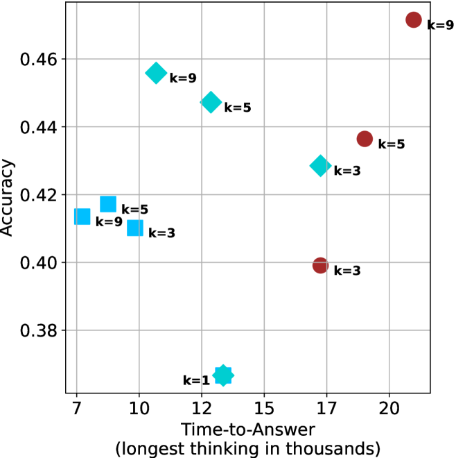
## Scatter Plot: Accuracy vs. Time-to-Answer (Longest in Thousands)
### Overview
The chart visualizes the relationship between **accuracy** (y-axis) and **time-to-answer** (x-axis, in thousands of units) for different values of a parameter `k`. Data points are color-coded and shaped by `k` values, with annotations indicating specific `k` labels. The plot suggests a trade-off between accuracy and computational time, with higher `k` values generally associated with higher accuracy but longer processing times.
---
### Components/Axes
- **X-axis (Time-to-Answer)**: Labeled "Time-to-Answer (longest in thousands)", scaled from 7 to 20 (in thousands).
- **Y-axis (Accuracy)**: Labeled "Accuracy", scaled from 0.38 to 0.46.
- **Legend**:
- **Red circles**: `k=9`
- **Cyan diamonds**: `k=5`
- **Blue squares**: `k=3`
- **Blue star**: `k=1` (unlabeled in legend but present in data).
---
### Detailed Analysis
#### Data Points by `k` Value:
1. **`k=9` (Red Circles)**:
- (10, 0.455)
- (9, 0.415)
- (20, 0.46)
- **Trend**: Higher `k=9` values cluster at the top-right, indicating high accuracy with longer time-to-answer.
2. **`k=5` (Cyan Diamonds)**:
- (12, 0.445)
- (8, 0.415)
- (15, 0.43)
- **Trend**: Moderate accuracy with mid-range time-to-answer.
3. **`k=3` (Blue Squares)**:
- (10, 0.41)
- (15, 0.43)
- (17, 0.40)
- **Trend**: Lower accuracy than `k=5`/`k=9`, with similar time ranges.
4. **`k=1` (Blue Star)**:
- (12, 0.38)
- **Trend**: Outlier with the lowest accuracy and moderate time-to-answer.
---
### Key Observations
1. **Accuracy-Time Trade-off**:
- Higher `k` values (e.g., `k=9`) achieve higher accuracy but require significantly longer time-to-answer (e.g., 20k vs. 10k for `k=5`).
- `k=1` is an outlier with poor accuracy (0.38) despite a mid-range time (12k), suggesting inefficiency or instability at low `k`.
2. **Non-linear Relationships**:
- `k=5` at 15k time (0.43 accuracy) underperforms `k=9` at 10k time (0.455 accuracy), indicating diminishing returns for very high `k`.
- `k=3` shows inconsistent performance, with accuracy fluctuating between 0.40–0.43 despite similar time ranges.
3. **Outliers**:
- The `k=1` point (blue star) deviates from the trend, suggesting potential anomalies in data collection or model behavior at low `k`.
---
### Interpretation
The chart demonstrates that increasing `k` improves accuracy but at the cost of higher computational time. However, the relationship is not strictly linear:
- **Optimal `k`**: `k=9` achieves the highest accuracy (0.46) but requires the longest time (20k). For applications prioritizing speed, `k=5` or `k=3` may offer a better balance.
- **Anomaly**: The `k=1` point (0.38 accuracy at 12k time) contradicts the general trend, possibly indicating a failure mode or edge case in the system.
- **Practical Implications**: The data supports tuning `k` based on application needs—high-accuracy tasks may justify longer wait times, while real-time systems might prioritize lower `k` values despite reduced accuracy.
This analysis highlights the importance of balancing model complexity (`k`) with performance requirements in practical deployments.