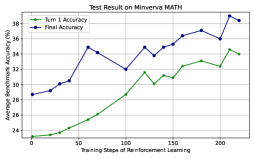
## Line Chart: Test Result on Minerva MATH
### Overview
The image displays a line chart tracking the performance accuracy of two metrics over the course of reinforcement learning training. The chart demonstrates a general upward trend for both metrics, indicating that training improves performance on the Minerva MATH benchmark.
### Components/Axes
* **Chart Title:** "Test Result on Minerva MATH" (centered at the top).
* **Y-Axis (Vertical):**
* **Label:** "Average Performance Accuracy (%)"
* **Scale:** Linear, ranging from 24 to 36, with major tick marks every 2 units (24, 26, 28, 30, 32, 34, 36).
* **X-Axis (Horizontal):**
* **Label:** "Training Steps of Reinforcement Learning"
* **Scale:** Linear, ranging from 0 to 200, with major tick marks every 50 steps (0, 50, 100, 150, 200).
* **Legend:** Located in the top-left corner of the plot area.
* **Blue Line with circular markers:** Labeled "Num 1 Accuracy".
* **Green Line with circular markers:** Labeled "Num 2 Accuracy".
* **Grid:** A light gray grid is present, aligning with the major ticks on both axes.
### Detailed Analysis
**Data Series 1: "Num 1 Accuracy" (Blue Line)**
* **Trend Verification:** The blue line shows a clear, albeit noisy, upward trend from left to right. It starts lower, experiences several peaks and valleys, but finishes at its highest point.
* **Approximate Data Points (Step, Accuracy %):**
* (0, ~28.5)
* (25, ~29.0)
* (50, ~30.5)
* (75, ~32.0)
* (100, ~31.0) - A notable dip.
* (125, ~32.5)
* (150, ~32.0)
* (175, ~33.0)
* (200, ~36.5) - The peak value.
**Data Series 2: "Num 2 Accuracy" (Green Line)**
* **Trend Verification:** The green line also shows a consistent upward trend. It starts at the lowest point on the chart and climbs steadily, with less pronounced volatility compared to the blue line.
* **Approximate Data Points (Step, Accuracy %):**
* (0, ~24.0)
* (25, ~24.5)
* (50, ~26.0)
* (75, ~28.0)
* (100, ~29.5)
* (125, ~30.5)
* (150, ~30.0)
* (175, ~31.5)
* (200, ~34.5)
### Key Observations
1. **Consistent Performance Gap:** The "Num 1 Accuracy" (blue) is consistently higher than the "Num 2 Accuracy" (green) at every measured training step. The gap appears to narrow slightly towards the end of training.
2. **Parallel Growth:** Both lines follow a broadly similar trajectory, suggesting the factors driving improvement affect both metrics, though not equally.
3. **Volatility:** The "Num 1 Accuracy" series exhibits more volatility, with a significant dip around step 100, while the "Num 2 Accuracy" series has a smoother ascent.
4. **Final Surge:** Both lines show their steepest increase in the final segment, between steps 175 and 200.
### Interpretation
This chart visualizes the learning curve for a model undergoing reinforcement learning on mathematical tasks. The data suggests that the training process is effective, as measured by both "Num 1" and "Num 2" accuracy metrics.
* **What the data suggests:** The model's ability to solve Minerva MATH problems improves with more training steps. The parallel rise of both lines indicates they are likely measuring related but distinct aspects of performance (e.g., different problem types, difficulty levels, or solution formats). The consistent gap implies "Num 1" represents a metric where the model has an inherent advantage or is easier to optimize.
* **Notable Anomalies:** The dip in "Num 1 Accuracy" at step 100 is an outlier in its trend. This could indicate a period of instability in training, a change in the training data distribution, or simply noise in the evaluation process. The fact that "Num 2 Accuracy" did not dip at the same point suggests the anomaly may be specific to the "Num 1" metric.
* **Underlying Meaning:** The chart provides evidence for the efficacy of the applied reinforcement learning method. The final values (~36.5% and ~34.5%) represent the model's performance after 200 steps, serving as a benchmark for this training run. The lack of a plateau suggests that further training steps might yield additional improvements.