## Network Graph: Abstract Connectivity Visualization
### Overview
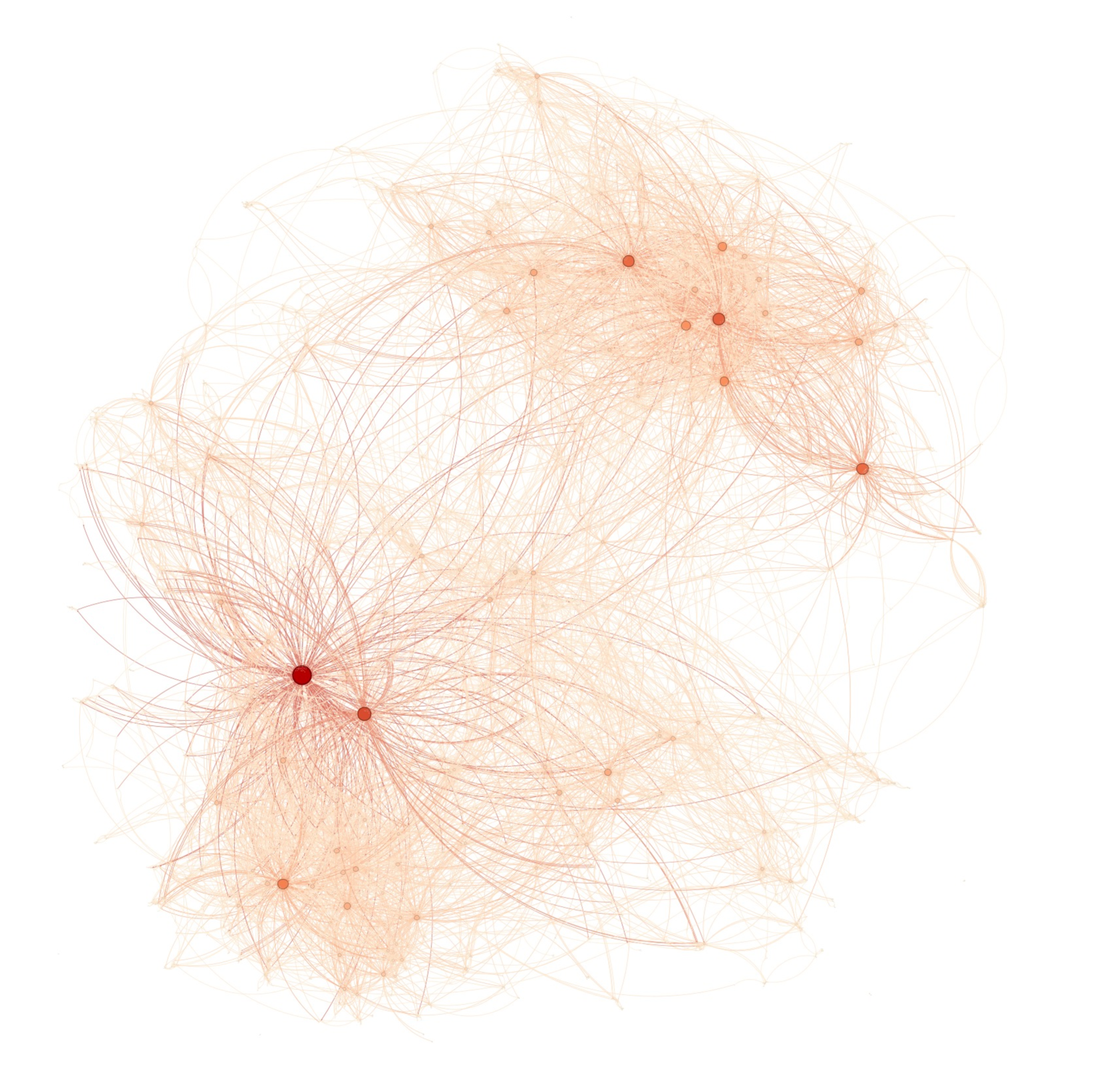
The image displays a complex, abstract network graph visualization rendered in a monochromatic orange color palette against a plain white background. It consists of numerous nodes (points) connected by a dense web of curved edges (lines). The visualization appears to be generated by a force-directed layout algorithm, where connected nodes attract each other and all nodes repel each other, resulting in a clustered, organic structure. There is no accompanying text, labels, axes, titles, or legend present in the image.
### Components
* **Nodes:** Represented as circular dots. They vary significantly in size and color intensity (saturation/value).
* **Size:** Ranges from very small, faint points to large, prominent circles. The largest node is located in the lower-left quadrant.
* **Color:** All nodes are shades of orange. Larger nodes are a deeper, more saturated red-orange, while smaller nodes are a pale, light orange.
* **Edges:** Represented as thin, curved lines connecting the nodes. They also vary in opacity and thickness.
* **Opacity/Thickness:** Lines connected to larger, more central nodes appear darker and slightly thicker. Lines in peripheral or less dense areas are very faint and thin. The curvature suggests an attempt to minimize line crossings in a dense network.
* **Spatial Layout:** The graph is not uniformly distributed. It features distinct clusters and several highly connected central hubs.
* **Primary Hub:** A very large, dark red-orange node in the lower-left quadrant acts as a major focal point, with a dense starburst of connections radiating from it.
* **Secondary Hubs:** Several medium-sized, darker orange nodes are visible, particularly in the upper-right quadrant and near the center, each serving as a local center for their own cluster of connections.
* **Periphery:** The outer edges of the graph are populated by many small, faint nodes with fewer connections, creating a diffuse, cloud-like boundary.
### Detailed Analysis
* **Node Hierarchy:** The visualization implies a clear hierarchy or importance metric, likely based on **degree centrality** (number of connections). The size and color intensity of a node are directly correlated with its connectivity.
* **Largest Node (Lower-Left):** Approximate diameter is 5-7 times that of the smallest nodes. Its deep red-orange color and the sheer density of edges emanating from it mark it as the most significant entity in this network.
* **Medium Nodes (e.g., Upper-Right Cluster):** Several nodes are approximately 2-3 times the diameter of the smallest nodes, colored a standard orange. They form the cores of smaller clusters.
* **Small Nodes:** The vast majority of nodes are very small and pale, indicating low connectivity.
* **Edge Density:** The density of connections is highest around the major hubs, creating visually opaque regions of overlapping lines. The density decreases markedly towards the periphery of the graph.
* **Cluster Identification:** At least three major clusters are discernible:
1. A large, dense cluster anchored by the primary hub in the lower-left.
2. A significant cluster in the upper-right quadrant, centered around 2-3 medium hubs.
3. A more diffuse, less tightly knit cluster in the lower-right area.
### Key Observations
1. **Monochromatic Encoding:** All data is encoded using a single hue (orange) with variations in saturation and lightness. This creates a cohesive visual but makes precise differentiation between many nodes challenging without interactive tools.
2. **Absence of Metadata:** The graph is entirely abstract. There are no labels for nodes, no title, no legend explaining what the nodes or edges represent, and no scale. This limits interpretation to structural analysis only.
3. **Force-Directed Layout Characteristics:** The organic, clustered appearance with curved edges is typical of algorithms like Fruchterman-Reingold or Force Atlas, which prioritize showing community structure and relative importance.
4. **Visual Weight Imbalance:** The composition is heavily weighted towards the lower-left due to the primary hub, creating a strong visual anchor point.
### Interpretation
This image is a pure visualization of **network topology and relative node importance**. It demonstrates the following structural principles:
* **Scale-Free Network Properties:** The presence of a few highly connected hubs (the large nodes) amidst many poorly connected nodes is characteristic of scale-free networks, common in social networks, biological pathways, and the internet.
* **Community Structure:** The clear clustering indicates the network contains communities or modules—groups of nodes more densely connected to each other than to the rest of the network.
* **Centrality Visualization:** The design effectively uses pre-attentive visual attributes (size, color intensity) to immediately draw the viewer's eye to the most central nodes, providing an instant understanding of the network's backbone.
**Limitations & Missing Information:** The complete lack of semantic labels is the critical limitation. We cannot determine if this represents a social network, a citation network, a neural network, a protein interaction map, or any other type of relational data. The visualization shows *that* structure exists and *what* its relative properties are, but not *what it is*. To derive factual meaning, this graph would need to be paired with a data table mapping node IDs to labels and a description of the edge relationships.