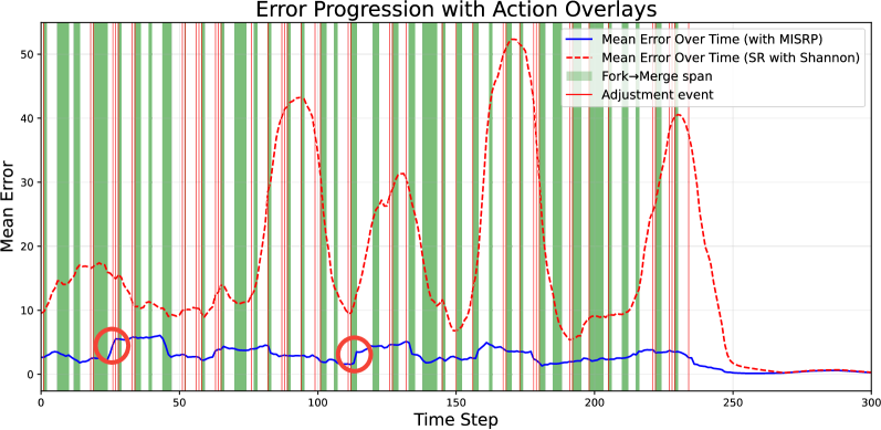
## Line Chart: Error Progression with Action Overlays
### Overview
The image is a line chart showing the progression of mean error over time for two different methods: one using MISRP and the other using SR with Shannon. The chart also includes vertical bands indicating "Fork->Merge span" and "Adjustment event".
### Components/Axes
* **Title:** Error Progression with Action Overlays
* **X-axis:** Time Step, ranging from 0 to 300 in increments of 50.
* **Y-axis:** Mean Error, ranging from 0 to 50 in increments of 10.
* **Legend (Top-Right):**
* Blue solid line: Mean Error Over Time (with MISRP)
* Red dashed line: Mean Error Over Time (SR with Shannon)
* Green vertical bands: Fork->Merge span
* Red vertical lines: Adjustment event
### Detailed Analysis
* **Mean Error Over Time (with MISRP) - Blue Solid Line:**
* General Trend: Relatively stable and low error over time.
* Specific Points:
* Starts at approximately 4 at Time Step 0.
* Dips slightly around Time Step 30 to approximately 2.
* Rises slightly around Time Step 40 to approximately 4.
* Dips again around Time Step 110 to approximately 1.
* Remains relatively stable between 2 and 4 until Time Step 240.
* Decreases to approximately 0 at Time Step 270 and remains there.
* **Mean Error Over Time (SR with Shannon) - Red Dashed Line:**
* General Trend: Higher error and more volatile compared to the MISRP method. Exhibits cyclical peaks and troughs.
* Specific Points:
* Starts at approximately 12 at Time Step 0.
* Dips to approximately 8 at Time Step 50.
* Peaks at approximately 43 at Time Step 90.
* Dips to approximately 8 at Time Step 120.
* Peaks again at approximately 52 at Time Step 170.
* Dips to approximately 10 at Time Step 210.
* Peaks sharply at approximately 40 at Time Step 240.
* Decreases rapidly to approximately 0 at Time Step 270 and remains there.
* **Fork->Merge span - Green Vertical Bands:**
* These bands are distributed throughout the chart, indicating periods where a "Fork->Merge" event is occurring.
* They appear to be more frequent in the earlier time steps (0-200).
* **Adjustment event - Red Vertical Lines:**
* These lines are also distributed throughout the chart, indicating specific "Adjustment" events.
* They appear to coincide with some of the peaks and troughs in the "SR with Shannon" error line.
* **Red Circles:**
* Two red circles are present on the graph.
* One is located around Time Step 30, highlighting a point on the blue line.
* The other is located around Time Step 110, also highlighting a point on the blue line.
### Key Observations
* The MISRP method consistently maintains a lower mean error compared to the SR with Shannon method.
* The SR with Shannon method exhibits significant fluctuations in mean error, suggesting instability or sensitivity to certain events.
* The "Fork->Merge span" events are more frequent in the first half of the time series.
* "Adjustment events" appear to correlate with changes in the error rate of the SR with Shannon method.
### Interpretation
The chart suggests that the MISRP method is more stable and reliable in terms of error reduction compared to the SR with Shannon method. The fluctuations in the SR with Shannon method's error, coupled with the "Adjustment events," indicate that this method may require more frequent interventions or adjustments to maintain performance. The "Fork->Merge span" events may represent periods of increased complexity or uncertainty in the system, which could contribute to the higher error rates observed in the SR with Shannon method. The red circles highlight specific points of interest on the MISRP line, possibly indicating times where the error briefly deviates from its generally low level.