## Line Chart: Error Progression with Action Overlays
### Overview
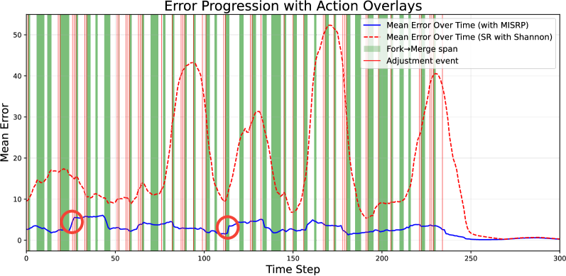
This chart depicts the progression of mean error over time, comparing two methods (MISRP and SR with Shannon) and overlaying action events (Fork->Merge span and Adjustment event). The x-axis represents time steps, and the y-axis represents the mean error. The chart visualizes how error changes over time and how specific actions correlate with these changes.
### Components/Axes
* **Title:** Error Progression with Action Overlays
* **X-axis:** Time Step (Scale: 0 to 300, increments of approximately 25)
* **Y-axis:** Mean Error (Scale: 0 to 50, increments of approximately 10)
* **Legend:**
* Blue Solid Line: Mean Error Over Time (with MISRP)
* Red Dashed Line: Mean Error Over Time (SR with Shannon)
* Green Vertical Bars: Fork->Merge span
* Red Vertical Bars: Adjustment event
### Detailed Analysis
The chart displays three distinct data series and two types of action overlays.
**1. Mean Error Over Time (with MISRP) - Blue Solid Line:**
This line generally remains low, fluctuating around the 0-5 error range. It exhibits a slight upward trend from time step 0 to approximately 20, then stabilizes. There's a small dip around time step 40 (approximately error value of 2), and another around time step 190 (approximately error value of 1). The line decreases sharply after time step 250, approaching 0.
**2. Mean Error Over Time (SR with Shannon) - Red Dashed Line:**
This line shows significantly higher error values and more pronounced fluctuations. It starts at approximately 15 error at time step 0, rises to a peak of around 45-50 error at time step 80, then drops sharply. It then oscillates between approximately 10 and 40 error for the remainder of the chart, with a final sharp decrease after time step 250, approaching 0.
**3. Fork->Merge span - Green Vertical Bars:**
These bars are consistently present throughout the chart, appearing at regular intervals, approximately every 10-15 time steps. They indicate the frequent occurrence of Fork->Merge spans.
**4. Adjustment event - Red Vertical Bars:**
These bars appear less frequently than the green bars, occurring at time steps approximately 80, 160, and 250. They signify the occurrence of Adjustment events.
**Specific Data Points (Approximate):**
* Time Step 0: MISRP ~ 2, SR ~ 15
* Time Step 40: MISRP ~ 2, SR ~ 10
* Time Step 80: MISRP ~ 3, SR ~ 50
* Time Step 120: MISRP ~ 4, SR ~ 30
* Time Step 160: MISRP ~ 2, SR ~ 40
* Time Step 200: MISRP ~ 3, SR ~ 20
* Time Step 240: MISRP ~ 1, SR ~ 10
* Time Step 280: MISRP ~ 0, SR ~ 0
### Key Observations
* The MISRP method consistently exhibits lower mean error compared to the SR with Shannon method.
* Adjustment events (red bars) often coincide with peaks in the SR with Shannon error curve.
* Fork->Merge spans (green bars) do not appear to have a strong correlation with either error curve.
* Both methods show a significant reduction in error towards the end of the time period (after time step 250).
### Interpretation
The data suggests that the MISRP method is more effective at maintaining low error rates than the SR with Shannon method. The frequent occurrence of Fork->Merge spans doesn't seem to significantly impact error levels, while Adjustment events appear to be associated with increased error in the SR with Shannon method. The sharp decrease in error for both methods towards the end of the time period could indicate a convergence or stabilization of the system.
The correlation between Adjustment events and error spikes in the SR with Shannon method suggests that these events may introduce instability or require further refinement in the SR with Shannon approach. The consistent low error of MISRP suggests it is more robust to these events, or handles them more effectively.
The chart provides valuable insights into the performance of these two methods and highlights potential areas for improvement in the SR with Shannon approach. Further investigation into the nature of Adjustment events and their impact on error could lead to more effective error mitigation strategies.