## Candlestick Chart: Price Movement (Dec 2021 - Apr 2022)
### Overview
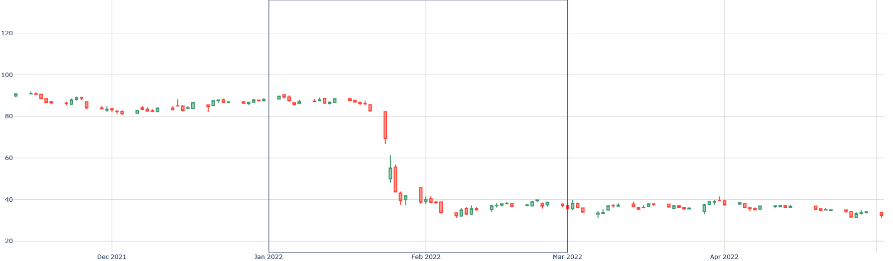
The image displays a financial candlestick chart tracking the price of an unspecified asset over a period from approximately early December 2021 to mid-April 2022. The chart shows a period of relative stability followed by a dramatic price collapse in late January 2022, after which the price consolidates at a significantly lower level.
### Components/Axes
* **Chart Type:** Candlestick chart.
* **X-Axis (Time):** The horizontal axis represents time. Major date markers are visible at the bottom: "Dec 2021", "Jan 2022", "Feb 2022", "Mar 2022", and "Apr 2022". The data spans from before December 2021 to after April 2022.
* **Y-Axis (Price/Value):** The vertical axis represents a numerical value, likely price. It has labeled grid lines at intervals of 20: 20, 40, 60, 80, 100, 120.
* **Legend:** There is no explicit legend. The candlestick colors follow standard financial convention: **Green** (or teal) candles indicate a period where the closing price was higher than the opening price (bullish). **Red** candles indicate a period where the closing price was lower than the opening price (bearish).
* **Other Text:** No chart title, asset name, or data source is present in the image.
### Detailed Analysis
The price action can be segmented into three distinct phases:
1. **Phase 1: Consolidation (Dec 2021 - Late Jan 2022)**
* **Trend:** The price moves sideways within a relatively narrow range.
* **Range:** Approximately between 80 and 95 on the y-axis.
* **Characteristics:** A mix of small green and red candles, indicating indecision and low volatility. The price repeatedly tests the ~90-95 level but fails to break out significantly higher.
2. **Phase 2: Sharp Decline (Late Jan 2022 - Early Feb 2022)**
* **Trend:** A severe, near-vertical downward move.
* **Key Movement:** A very large red candle appears in late January, opening near 90 and closing near 65. This is followed by another large red candle opening near 65 and closing near 45.
* **Range:** The price plummets from ~90 to a low near 35 within a very short timeframe (likely a few trading sessions).
* **Characteristics:** Dominated by large red candles with long bodies, indicating strong selling pressure and high volatility. A few small green candles appear during the descent, suggesting brief, failed recovery attempts.
3. **Phase 3: Low-Level Consolidation (Feb 2022 - Apr 2022)**
* **Trend:** The price stabilizes and moves sideways again, but at a much lower level.
* **Range:** Approximately between 30 and 40 on the y-axis.
* **Characteristics:** Similar to Phase 1 but at a depressed price level. Candles are generally small, with a mix of colors, indicating a new period of equilibrium and reduced volatility after the crash.
### Key Observations
* **The Dominant Feature:** The most significant event is the **precipitous drop in late January 2022**. The price lost over 50% of its value in what appears to be a very short period.
* **Support/Resistance:** The ~90 level acted as resistance in Phase 1. After the crash, the ~40 level appears to act as new resistance, while ~30 acts as support in Phase 3.
* **Volatility Shift:** Volatility was low in Phase 1, spiked to extreme levels during the Phase 2 crash, and returned to low levels in Phase 3.
* **Absence of Context:** The chart lacks a title, asset label, or volume data, making it impossible to identify the specific instrument or the fundamental reason for the price action.
### Interpretation
This chart visually narrates a classic "breakdown" or "crash" scenario in a financial market. The prolonged consolidation in Phase 1 suggests a market in equilibrium, building energy. The failure to break above resistance (~95) likely led to a loss of confidence, triggering the massive sell-off in Phase 2. The speed and magnitude of the decline suggest a catalytic event—such as an earnings miss, regulatory news, broader market sell-off, or a breach of a key technical level—that prompted a rush for the exits.
The subsequent Phase 3 consolidation indicates the market has found a new, lower equilibrium. The asset is now trading in a "depressed" range, suggesting that the negative catalyst has been fully priced in, but there is no immediate catalyst for a recovery. The chart demonstrates how market sentiment can shift violently from complacency to panic and then to apathy. Without additional data (like volume or news), the chart alone tells a story of a severe loss of value and a market that has reset to a new, lower baseline.