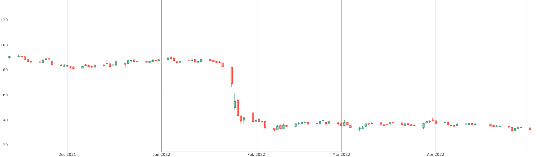
## Candlestick Chart: Stock Price Over Time
### Overview
The image is a candlestick chart showing the price fluctuations of a stock or asset over time, from December 2021 to April 2022. The chart uses red and green candlesticks to represent price decreases and increases, respectively, within each time period.
### Components/Axes
* **Y-axis (Vertical):** Represents the price, ranging from approximately 20 to 120. Gridlines are present at intervals of 20.
* **X-axis (Horizontal):** Represents time, with labels for December 2021, January 2022, February 2022, March 2022, and April 2022.
* **Candlesticks:** Each candlestick represents a specific time period.
* **Green Candlesticks:** Indicate that the closing price was higher than the opening price.
* **Red Candlesticks:** Indicate that the closing price was lower than the opening price.
* The body of the candlestick represents the range between the opening and closing prices.
* The "wicks" or lines extending above and below the body represent the highest and lowest prices during that period.
### Detailed Analysis
* **December 2021 - January 2022:** The price fluctuates around 80-90, with both red and green candlesticks indicating periods of increase and decrease. The price appears relatively stable during this period.
* **Late January 2022 - Early February 2022:** There is a significant drop in price. A large red candlestick indicates a substantial decrease in price within a single period. The price falls from approximately 80 to around 40.
* **February 2022 - April 2022:** The price remains relatively stable, fluctuating between approximately 30 and 40. There are both red and green candlesticks, but the overall trend is sideways with a slight downward drift.
### Key Observations
* **Significant Price Drop:** The most notable event is the sharp price decrease between late January and early February 2022.
* **Volatility:** The period from December 2021 to January 2022 shows more volatility compared to the period from February 2022 to April 2022.
* **Sideways Trend:** After the price drop, the stock enters a sideways trend with relatively small price fluctuations.
### Interpretation
The candlestick chart illustrates the price movement of an asset over a five-month period. The initial stability gives way to a sharp decline, followed by a period of low volatility and sideways movement. This could indicate a significant event or change in market sentiment that impacted the asset's value. The subsequent stabilization suggests that the market has adjusted to the new price level, but there is no clear indication of a recovery.