\n
## Density Plot: Distribution Comparison
### Overview
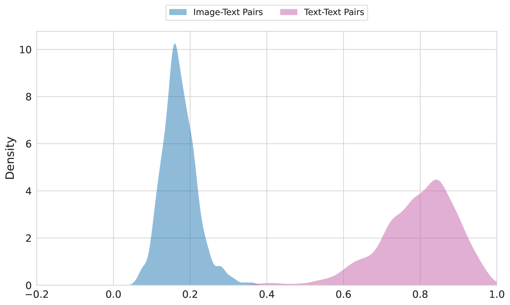
The image presents a density plot comparing the distributions of two datasets: "Image-Text Pairs" and "Text-Text Pairs". The plot visualizes the probability density of values ranging from approximately -0.2 to 1.0.
### Components/Axes
* **X-axis:** Represents the range of values, labeled implicitly as a score or metric from -0.2 to 1.0. The axis is divided into increments of 0.2.
* **Y-axis:** Represents the density, ranging from 0 to approximately 10. Labeled "Density".
* **Legend:** Located at the top-center of the image.
* "Image-Text Pairs" - Represented by a light blue fill.
* "Text-Text Pairs" - Represented by a light purple/pink fill.
* **Gridlines:** A light gray grid is present to aid in reading values.
### Detailed Analysis
The plot shows two distinct distributions.
**Image-Text Pairs (Light Blue):**
The distribution is unimodal, peaking at approximately 0.18-0.20 with a density of around 10. The curve slopes downward on both sides of the peak. The density decreases to approximately 0.5 at x = 0.0 and x = 0.4.
**Text-Text Pairs (Light Purple/Pink):**
This distribution is also unimodal, but is shifted towards higher values. It peaks at approximately 0.82-0.84 with a density of around 4.5. The curve descends more gradually than the "Image-Text Pairs" distribution. The density is approximately 1.5 at x = 0.6 and x = 0.9.
### Key Observations
* The "Image-Text Pairs" distribution is centered around lower values than the "Text-Text Pairs" distribution.
* The "Image-Text Pairs" distribution has a higher peak density than the "Text-Text Pairs" distribution.
* Both distributions appear to be bounded between -0.2 and 1.0.
* There is a noticeable gap between the two distributions, with relatively low density in the range of 0.4 to 0.7.
### Interpretation
The data suggests that the scores or metrics represented on the x-axis are generally lower for "Image-Text Pairs" compared to "Text-Text Pairs". This could indicate that the task of relating images to text is more challenging or results in lower scores than relating text to text. The higher peak density for "Image-Text Pairs" suggests that a larger proportion of these pairs achieve scores within a narrow range around 0.2. The gap between the distributions suggests a clear separation in performance or quality between the two types of pairs.
The nature of the metric is not explicitly stated, but it could represent a similarity score, a relevance score, or a quality score. Without further context, it is difficult to determine the precise meaning of the data. However, the visualization clearly demonstrates a difference in the distributions of the two datasets.