\n
## Charts/Graphs: Time Series Diagrams
### Overview
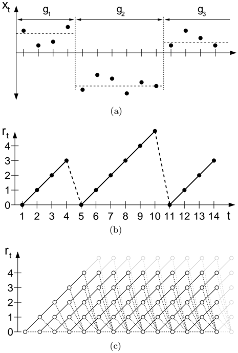
The image presents three separate time series diagrams, labeled (a), (b), and (c). Diagram (a) shows a scatter plot with grouped data points. Diagram (b) displays a step-like function with discrete jumps. Diagram (c) shows a grid of points representing a two-dimensional time series.
### Components/Axes
* **Diagram (a):**
* X-axis: Labeled with `g1`, `g2`, and `g3` indicating groupings or time intervals. No numerical scale is present.
* Y-axis: Labeled `Xt`. The scale ranges from approximately 0 to 4, with markings at 0, 1, 2, 3, and 4.
* Data Points: Black dots scattered across the plot.
* **Diagram (b):**
* X-axis: Labeled `t`. The scale ranges from 1 to 14, with markings at each integer value.
* Y-axis: Labeled `rt`. The scale ranges from 0 to 5, with markings at 0, 1, 2, 3, 4, and 5.
* Data Line: A black line connecting discrete points, forming a step function.
* **Diagram (c):**
* X-axis: Labeled `t`. The scale ranges from 1 to 14, with markings at each integer value.
* Y-axis: Labeled `rt`. The scale ranges from 0 to 5, with markings at 0, 1, 2, 3, 4, and 5.
* Data Points: Light gray circles forming a grid pattern.
### Detailed Analysis or Content Details
* **Diagram (a):**
* Group `g1`: Contains approximately 5 data points, with Y-values ranging from approximately 1 to 3.
* Group `g2`: Contains approximately 6 data points, with Y-values ranging from approximately 0 to 2.
* Group `g3`: Contains approximately 5 data points, with Y-values ranging from approximately 0 to 3.
* **Diagram (b):**
* The line starts at (1, 0).
* It increases linearly to (3, 2).
* It decreases linearly to (5, 0).
* It increases linearly to (8, 2).
* It increases linearly to (10, 4).
* It decreases linearly to (12, 0).
* It increases linearly to (14, 3).
* **Diagram (c):**
* The diagram shows a grid of points where the x-coordinate ranges from 1 to 14 and the y-coordinate ranges from 0 to 5.
* Each point (t, rt) is represented by a light gray circle.
* The points form a regular grid, indicating a possible representation of all possible combinations of `t` and `rt` within the specified ranges.
### Key Observations
* Diagram (a) shows clustered data, potentially representing observations grouped by time or condition.
* Diagram (b) represents a piecewise linear function with distinct steps, suggesting a system that changes state at specific time points.
* Diagram (c) represents a complete set of possible states for the system defined by `t` and `rt`.
### Interpretation
The three diagrams likely represent different aspects of a time series analysis or a state-space representation of a dynamic system. Diagram (a) could be raw data, diagram (b) a simplified model of the system's behavior, and diagram (c) a visualization of the system's possible states. The step function in diagram (b) suggests a system with discrete transitions, while the grid in diagram (c) provides a complete picture of the system's state space. The lack of numerical scales on the x-axis of diagram (a) suggests that the groupings `g1`, `g2`, and `g3` are categorical rather than quantitative. The diagrams together suggest an attempt to model or understand a system that evolves over time with discrete changes in state.